Apple's iOS: In desperate need of a facelift

Apple's iOS home screens are looking a bit dated. This occurred to me as I put down my iPhone and picked up the iPad mini. The home screen is certainly clean and functions well, but it looks much the same as it has for years. It desperately needs some pizzazz to modernize the interface. The problem is, I'm not sure Apple can easily do that.
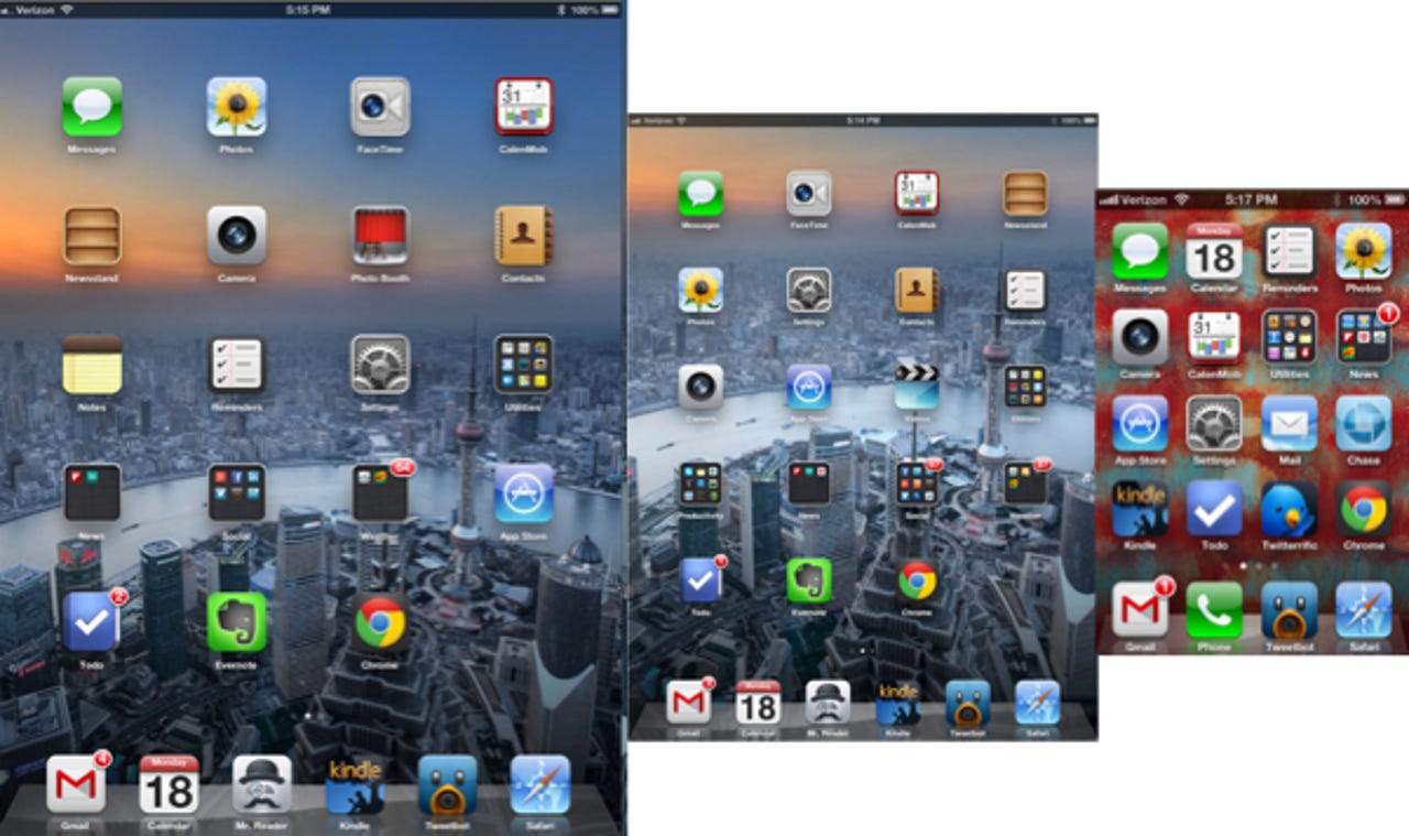
The iOS interface with screens full of icons is not bad, it's just not very compelling anymore. This is apparent when you compare it to other mobile interfaces. Whether you look at an Android device, Windows Phone, or even a BlackBerry 10, you realize the iOS home screen is pretty blah in comparison.
The interface full of icons was fine back when iOS first launched as it improved on interfaces that preceded it. That's no longer the case.
The mobile home screen has evolved to offer pertinent information to the user at a glance. On Android, this information comes by way of widgets, on Windows Phones it is the live tiles that lets the user know what's happening in his/her world.
With iOS, you get none of that useful information at a glance; you have to run an app. Then you only get the information or updates from that one app. If you want other information, you have to return to the screen full of static icons and run something else.
The interface full of icons was fine back when iOS first launched, as it improved on interfaces that preceded it. That's no longer the case.
That's readily apparent when I bounce between Android and iOS. When I'm using the iPhone or the iPad, the screens full of icons seem OK, but are not compelling. Then I pick up my Android phone or the Nexus 7 tablet, and I realize the home screen user experience (UX) is much better. I get information I want about the people and things I care about, just by glancing at the home screen.
I'm not a UX design expert, so I'm not sure what Apple can do to update the iOS home screen. The only experience I have designing a UI is in building my Android home screens using all the widgets at my disposal. That's not really designing a UI, but it is building my personal UX on each Android device I use.
The problem I see facing Apple with a redesign is the control it exhibits over the iOS system. There are no third-party widgets that can be used by the user or by Apple. Apple is going to have to build any control, or widget, from scratch and determine how it's going to be implemented.
Such design modernization will be radical in the simple iOS home screen environment. What makes Android and Windows Phone home screens so personal is how each user can assemble the widgets, or building blocks, into just the layout and functionality they desire. There is nothing currently in the iOS tool box that can approach this system used by the competition. That whole multi-tasking thing may get in the way, too.
The days of wowing consumers with hardware are winding down for Apple as the competition has caught up or passed it. The innovations we are seeing in the smartphone and tablet space are now coming largely from software. And several screens full of icons no longer can be considered to be innovative, no matter what Apple thinks.
Don't misunderstand me; I like my iPhone, iPad, and iPad mini. I just want them to offer me a better UX on the home screen. When I look at my Note 2 or Nexus 7 home screen, it's common to see an update that makes me smile. When I look at the iPhone or iPad I just see icons. That's nothing to smile about.