3 rules for a good user experience (UX)

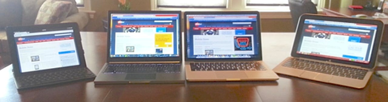
Mobile computers come in all sizes creating a big challenge for system designers to make them work well for users. The addition of touch to smartphones, tablets, and laptops has appealed to users but increases the need for OS architects to implement touch operation in a way that makes sense. There are three rules that should never be violated when designing mobile user interfaces (UI) that go a long way to making for a good UX.
I'm not a mobile UI designer nor do I play one on TV, but having used thousands of mobile devices over the years I have seen first-hand what works and more importantly what doesn't work when it comes to a good UX. There are three rules of UX design that have come out of this experience with mobile devices.
- The user should never, ever have to stop to think how to do something. It must be natural and intuitive.
- Operation must be consistent in all areas of the UI.
- See rule 1.
It must be natural
The ability to pick up a gadget and do things without overthinking how it works is not only a good thing, it's what buyers have come to expect.
Mobile devices can be used in several different styles, from in the hand to on a table in front of the user. No matter how the UI will be manipulated, the operation must feel natural to the user at all times. The only way to accomplish this is to make all aspects of the operation as intuitive as possible.
Few things affect the perception that operating a mobile device is a good UX than making such operation possible without forcing the user to stop and think about it. When operating a specific control is required, a good UX lets the user activate it without pause. Muscle memory becomes a big part of a good UX and that means operation requires no active thought.
This is especially important with systems that offer more than one way to manipulate the OS. Microsoft has designed Windows 8 to handle various methods of controlling the OS, an ambitious project which it has executed reasonably well. Users can use the touch screen on devices that have one, use a multitouch trackpad, or use a mouse.
See related: Windows 8 hybrids: Hot to build the perfect laptop and tablet combo | MacBook Air and Pro: No touch screen required
Perhaps most importantly, users of Windows 8 systems can interchange use of these different input methods. That Microsoft has made this possible is a fantastic achievement, but even so, at times operating a Windows 8 device can be a bit overwhelming. That's the price of designing the OS to handle such different usage scenarios. That sometimes makes working with a system with multiple input methods less natural feeling than I like.
Other mobile OSes have it easier than Windows 8 in this area, simply because they only handle touch operation. They don't handle mobile devices with trackpads or mice, so they don't have to design intuitive controls for them. They are touch screen only, and that makes things easier for users, albeit more restrictive in use cases.
To sum up rule one of UX design, all aspects of supported operation must be intuitive which leads to controls that feel natural. Users should be able to fire up a mobile device and be able to start doing things without having to futz around to figure out where the UI controls are located. Those controls should be manipulated intuitively as it feels unnatural when using systems that make you constantly stop and figure out how to accomplish a simple task.
Consistency is the key
A major part of creating a UX that is natural and intuitive is to make common system controls consistent throughout operation. While handling different input methods mey require building multiple methods to execute tasks, these should operate the same way across all of those methods.
If you have to do things on a touch screen that are radically different using a mouse for example, the UX suffers. These are the sort of design choices that stop the user cold as they must learn two different ways to do the same thing. This directly impacts the perception of the UX as a whole.
Perhaps the best example of how a lack of consistency across system operation affects the UX is the back button in the Android OS. This button (physical or soft) is designed into the Android OS and is present on every device, both phones and tablets. It allows the user to get back to the last screen they were using with a simple tap of the button, at least in theory.
While this sounds like the very definition of consistency, being present on every Android device and always available to the user, its implementation is anything but consistent. Usually the back button works as expected, and it steps back one screen within the app being used. Sometimes however, instead of stepping back in the app it throws the user back to the Android home screen unexpectedly. This completely stops the user in his/her tracks, something that is never a good UX. It would almost be better for the back button to do nothing in this situation.
A good UX offers consistent operation across all input control metods, and in both apps and the OS. Users should be able to use the same touch/mouse gestures in apps as they do on the home screen. This consistency will lead to a good, natural UX.
Conclusion
Building an OS that is intuitive to use is the cornerstone to making a UX that users will come to love. That's a big reason that mobile devices have been adopted by millions of consumers. The ability to pick up a gadget and do things without overthinking how it works is not only a good thing, it's what buyers have come to expect. This is so important it bears repeating over and over, thus rule 3.
A good UX is one that allows the user to interact with the system consistently no matter what he/she is doing. No fumbling trying to find system controls, no manipulating them in different ways depending on where in the system the user is working. One touch, one gesture, in both apps and the OS desktop.
This sounds easy but designing a UI that yields a good UX is incredibly difficult. I have great respect for system designers and engineers who are tasked with such a monumental task. I do believe that following these guidelines can help make their job easier, and the user's life much better.