Google testing new interface on main and results page

One thing that hasn't officially changed (at least significantly) for a very long time is the classic front page and the result pages on Google. When they start tinkering around and trying new things -- people tend to notice.
Tony Ruscoe on Google Blogoscoped reports that a new way to show the service links has started showing up for some people. The new format puts those links (like images, video, blogs, news) at the very top of the page rather than above the search box. In my opinion, this is one "test" that has done something very right -- as long as this same bar exists on all Google properties that is.
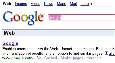
To be sure, I would like to see this test myself, but from what I can tell in this screenshot sent to Tony, this could add the consistency Google needs and an excellent platform to promote their numerous services. What's happening here is the creation of a new standard -- something usability experts will tell you isn't easy to do.
Right now, the standard that users follow is "if I need information about images, I'll click the images link above the search box". This is currently very functional, but in order to effectively promote your other services, you need the eyes of users to look to the top left corner first since this bar should exist on every Google property.