Grown up Facebook redesigns and simplifies its Help Center

Facebook has today released an updated and redesigned version of its Help Centre to help users find the information they need.
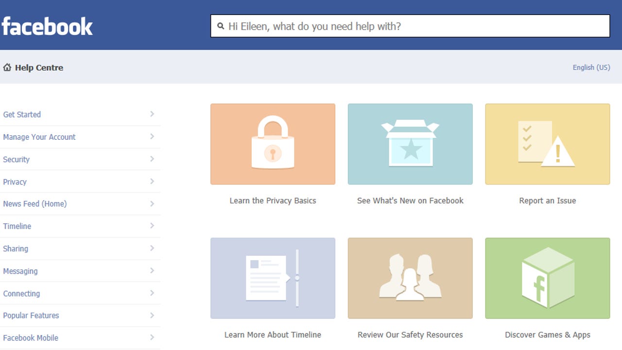
The Help Center homepage is simplified, with graphics instead of links. It features six major topics: Learn the Privacy Basics, See What's New on Facebook, Report an Issue, Learn more about Timeline, Review our Safety Resources and Discover Games and Apps.
Each graphic links to a simplified help page with jump links to Help Centre articles.
Facebook also announced that the Support Dashboard, is being rolled out globally today after being available to users in the US since April 2012.
Facebook says:
‘We believe this new design will allow you to find the information you’re looking for faster. We’ll continue to improve on this experience in the months ahead.
The redesign of the Help Center and the Support Dashboard are just two examples of our continuous effort to provide you with resources to help you better understand and use Facebook’.
The new Help Centre interface looks clean and easy to navigate -- much more intuitive than the mish-mash of hyperlinks and comments in previous iterations of the Help Centre pages.
The Home page focuses on top questions and users needs. The link to Facebook and Privacy gets its own logo in the ‘More Help’ area. Overall there are a lot of improvements over the previous Help pages.
Originally launched in 2007, the Help Centre has been a chaotic jumble of links and comments. Searching for help topics often brought up questions and spurious answers from the community. Nothing seemed to be authoritative, nothing seemed ‘managed’.
Individual sections now have a ‘Was this answer helpful?’ and a Yes / No option instead of the ability to post comments on the topic. You no longer have to wade through thousands of user comments, spam and advertising to try to find out the answer.
The left hand side of the screen covers easily navigable sections such as ‘Managing a Page’, or Timeline. All content is consistent in theme and links. Finally the site is easy to navigate.
It looks like Facebook has stepped up to evolve the site, and has made careful consideration of its users’ needs.
It has been a long time coming. Facebook has been available to anyone with a valid email address since September 2006. Facebook is now bringing consistency across its UI design and showing a maturity and sensitivity to its 955 million accounts around the world.
As the Facebook executives get older and the investors mature, Facebook looks like it is finally growing up.