Six Vista annoyances fixed in Windows 7

I sometimes wonder how Microsoft's interface designers find the strength to go to work every day. It certainly isn't for the external validation. In the past two-plus years, I’ve read countless complaints about the Windows Vista user interface. It has too many options for ordinary users. It doesn’t offer enough options for advanced users. It’s dumbed down and overcomplicated, sometimes all at the same time. To listen to the critics, Vista’s designers succeeded in making every feature worse than XP. In fact, the latest complaint is that Vista and the upcoming Windows 7 are even worse than Windows 98.
In this post, I’ll show you six specific annoyances from Windows Vista that are fixed in Windows 7. Each one represents an easier, more efficient way to accomplish a common task. Collectively, they constitute some pretty persuasive evidence that “have it our way” is no longer the controlling design principle among Windows’ designers.
Vista Annoyance #1: That awkward Preview pane In Vista, it takes at least three mouse clicks, plus a selection from a cascading menu, to show the Preview pane, and you have to repeat the process to hide it again. With Windows 7 you can preview a file with one quick click.
Vista Annoyance #2: The overcomplicated Shutdown button Vista’s Shutdown menu has been roundly criticized for its cryptic icons and unintuitive options. In Windows 7, it’s been simplified dramatically to an easy-to-read, easy-to-customize text menu.
Vista Annoyance #3: Arranging windows, awkwardly Ever try to arrange two windows side by side in Windows Vista (or XP, or Windows 98, for that matter)? Windows 7 makes it dead simple with some genuinely innovative new window management gestures.
Vista Annoyance #4: Unpleasant User Account Control UAC is the Vista feature everyone loves to hate. Security always involves trade-offs with convenience, but with Windows 7, there’s a lot less to dislike about UAC.
Vista Annoyance #5: The ultra-minimalist Defrag utility The colorful, almost mesmerizing progress display from the XP-and-earlier Defrag utility is gone and never coming back. But Windows 7 does restore some much-needed progress indicators and offer more control than the stark Vista version.
Vista Annoyance #6: The no-options backup program In Windows Vista, every edition has a file backup program, but you can’t choose individual files or folders to back up. Windows 7 restores that option, courtesy of a “Let me choose” option that indicates a refreshing change of attitude for Microsoft’s UI designers.
Vista Annoyance #1: That awkward Preview pane -->
Vista Annoyance #1: That awkward Preview pane
At least once a week for the past two or three years I have cursed the interface designer who was in charge of the Preview pane in Vista’s Windows Explorer. It’s a great idea and a big improvement over Windows XP. Instead of guessing at a file’s contents, you select it in an Explorer listing and then preview it. The trouble is, it takes three clicks and one cascading menu to show Vista’s Preview pane.To hide the Preview pane, you go through the same rigmarole. So if you want to quickly preview the contents of a file and then get the preview pane out of the way, you’ll need to go through six clicks of the mouse.
Windows 7 adds a Show/Hide Preview button on the command bar just above the contents pane in every Explorer window.
Click to make the preview pane visible, click again to hide it. No menus (cascading or otherwise) required.
My index finger feels better already.
Vista Annoyance #2: The overcomplicated Shutdown button -->
Vista Annoyance #2: The overcomplicated Shutdown button
Back when Vista was finally shoved out the door in late 2006, one of the most frequently criticized interface features was its shutdown button.Programmer/curmudgeon extraordinaire Joel Spolsky said it was an example of Microsoft's interface designers making Windows too complex for ordinary users:
Every time you want to leave your computer, you have to choose between nine, count them, nine options: two icons and seven menu items. ... Inevitably, you are going to think of a long list of intelligent, defensible reasons why each of these options is absolutely, positively essential. Don't bother. I know. Each additional choice makes complete sense until you find yourself explaining to your uncle that he has to choose between 15 different ways to turn off a laptop.
Apparently someone in Redmond was listening, because here’s what the same feature looks like in Windows 7:
Text, no confusing icons. And if you want to change the default, it’s the first thing you see in the dialog box where you customize Start Menu properties.
Hopefully, Joel Spolsky (and his notebook) will sleep better.
Vista Annoyance #3: Arranging windows, awkwardly -->
Vista Annoyance #3: Arranging windows, awkwardly
The mechanics of opening, moving, arranging, and closing windows haven’t changed much since the debut of the 32-bit Windows desktop in 1995. Maximizing a window is easy, but how about arranging two windows side by side, so you can (for example) drag files from one folder to another? Not so simple.In Vista, the official technique involves this complex set of steps:
- Open both windows.
- Click the taskbar button for the first window and then hold down the Ctrl key and click the taskbar button for the second window,
- Right-click the taskbar button and choose Arrange Side By Side.
Cumbersome enough for you? And good luck if you want to control which window goes on the left and which goes on the right.
In Windows 7, the process is dead simple. Drag the title bar of one window to the left edge of the screen until the mouse pointer hits the edge, and then release the mouse button. The window snaps into position, occupying the left half of the window. Now do the same with the second window, snapping it to the right edge of the screen.
That’s just one of at least a half-dozen cool new techniques for resizing and repositioning windows, including a few I haven’t seen documented anywhere yet. Amazingly, as far as I can tell, these techniques aren’t borrowed from some other OS but actually represent fresh thinking.
Vista Annoyance #4: Unpleasant User Account Control -->
Vista Annoyance #4: Unpleasant User Account Control
When the anti-Vista mobs assemble with pitchforks and torches, their most popular target is, inevitably, User Account Control. It’s the most hated and most misunderstood addition to Windows Vista.UAC is a good idea, poorly implemented. No, it’s not just another annoying confirmation dialog box. That’s a single, annoying portion of a fairly complex set of features designed to keep unwanted executables from running on your system without the explicit permission of you, the administrator.
You can count me among those who are annoyed by persistent UAC prompts, especially for system-level tweaks that are unlikely to have been triggered by hostile foreign code:
A single request for permission doesn’t bother most people. What gets under the skin is the second UAC prompt, and the third, and the fourth, and so on. The closer together those dialog boxes arrive, the more annoying the phenomenon.
Getting rid of UAC isn’t an option, but providing more fine-grained control over its prompts is a must. In Windows Vista, the only easily accessible control is an on-off switch, which requires a reboot after each change:
There’s also a more complicated set of workarounds to tame UAC, but none of them are easy, especially for nontechnical users.
Windows 7 offers a more granular set of controls over UAC, designed to focus its protections strictly on third-party software.
I’m composing this post on a notebook running Windows 7 Beta 1. Using the default UAC settings, I have yet to see a UAC prompt for at least the past week. That’s a major improvement that should go a long way toward placating critics.
Vista Annoyance #5: The ultra-minimalist Defrag utility -->
Vista Annoyance #5: The ultra-minimalist Defrag utility
When Windows Vista debuted in 2006, even Windows enthusiasts were united in their scorn for the interface of the new Defrag utility. Or, to be more accurate, the complete lack of interface. Vista’s ultra-minimalist Defrag tool has essentially no interface. It runs in the background and provides none of the colorful, almost mesmerizing progress displays that Windows users had grown accustomed to for the previous 10 years. Purportedly, they represent blocks of data on the disk, although in reality the display is mostly conceptual and fairly inaccurate.I’d show you a picture of the Vista interface, but frankly, there’s nothing much to see.
All of which inspired one commenter to write:
The absolute lack of information in Vista’s defrag is insulting. No reporting, no progress bar, no GUI. And no the command line is NOT a substitute for any of this.
The absolute ONLY thing good about it, is the automatic scheduling option. Microsoft really seems to be screwing over enthusiasts, first with their licensing which still screws over OEM users and now this.
The Tetris-style defragmentation map isn’t making a comeback, but the Defrag utility’s interface in Windows 7 is far more informative, with details about the last defragmentation for each drive, a live progress display (text only) for current operations, and options to adjust the automatic scheduling settings.
Meanwhile, if you’re looking for a mesmerizing set of visuals to amuse you while the disk defrags, might I suggest the Gigertron 3D Blacklight effect from the Psychedelia Viz Pack for Windows Media Player?
Vista Annoyance #6: The no-options backup program -->
Vista Annoyance #6: The no-options backup program
Windows XP includes a backup program that’s the very antithesis of usability. And that’s if you can even find it in the first place, because it isn’t even installed by default on XP Home Edition; you have to dig it out of the Valueadd\Msft\Ntbackup folder on the XP installation media.The trouble with the XP backup program is that it’s strictly location-based. You have to manually select folders to be backed up, and then hope that you haven’t missed a hidden folder that contains important stuff, like your e-mail.
Windows Vista improved that situation by including a file backup program in every edition. But it inspired complaints from critics like David Pogue of the New York Times, who complained loudly about its inability to specify individual folders to be backed up:
Windows finally comes with a prominent backup program. That’s great, except that you can specify only which categories of things to back up (pictures, e-mail, and so on), not which specific files or folders.
As I noted at the time, the Vista file backup program was designed to address a specific complaint from users (including David Pogue!) who had been tripped up by folder-based backups. But offering no choice isn’t fair to those who understand what they’re doing.
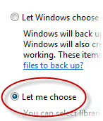
The solution, as embodied in the new Windows 7 Backup program, is to offer both options.
The most telling part of that dialog box, and the one that directly speaks to Vista critics, is the simple “Let me choose” option. The default is to accept the setup that Microsoft’s designers came up with. But if you prefer to set up your own backup system, that’s your right. It’s a clean, easy-to-use compromise.
“Let me choose.” Has a nice ring to it, doesn’t it? More of this, please, Microsoft.