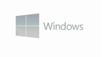
The Windows 8 logo is a widescreen tablet


New version of Windows, new logo; it's pretty routine. Except for Windows 7 which pretty much reinstated the Windows XP logo; if you see significance in everything you might feel that was an attempt to avoid the unfortunate associations with Vista (a version of Windows that had plenty of excellent improvements and advances, as long as you put it on a new PC with 4GB of RAM).

The new Windows 8 logo is a reflection of the Metro ethos; clean lines, strong typography, the clarity of isotypes with the maximum of abstraction and the minimum of distracting, ornate decoration. It's very obviously a window, but it makes you think of Metro Start screen tiles too. It's also a reflection of how misunderstood the Metro design language is and how difficult it is to experience a design language designed for interaction, customisation, personalisation and animation through still images of somebody else's computer.
Don't like the blue of the new logo? It won't be blue unless you've picked that as your accent colour. The logo will change to match the colours you choose in Windows 8 (incidentally, the strong green of the Developer Preview is the green of American dollar bills, designed to concentrate the minds of developers on the money they could make by building Windows 8 applications). The initial blue might be a nod to the original Windows 1.0 logo, or it might just be the default colour in the Consumer Preview (blue for the sky's the limit or cloud integration?) Think it's a bit boring? Watch the logo in action on the Pentagram site and it seems more like stylish simplicity, especially when it turns transparent - like an actual window.
Think it's a bit of an odd shape? The perspective is totally correct (the Pentagram site linked above has animations showing the flag transforming into the window, in perspective). It's just that it's the perspective on a window with the same aspect as a widescreen tablet - 16:9. That's the same as the 1366 by 768 resolution you have to have to get all the Metro features like seeing two applications side by side.
The fact that the Windows 8 logo will be most at home on new PCs is another reflection; of the fact that Windows 8 isn't an incremental update to the PC you use today and the PC using habits you have. This is the version of Windows for the next ten years (just, despite the success of Windows 7, XP has been the Windows for the last decade). It's the version of Windows for the PCs you'll be using in five to ten years time. Microsoft thinks those will be rather different from the PC you use now, and the 16:9 widescreen tablet is just the first example.
Mary Branscombe