Things that suck somewhat: Mac OS X Sheets


Apple this week released an update to its developer documentation on Mac OS X's Human Interface guidelines to cover changes in Leopard. Since, I've been annoyed about the behavior of the Save/Save As dialog windows (I almost called it a "box, which is the Classic Mac OS nomenclature), I decided to look at the rulebook.
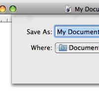
Mac users are familiar with Sheets, even if they don't know the name for them. It's the window that drops down from the title bar of the Save dialog window and holds the buttons and other relevant text.
How could such an innocuous element cause my ire? Easy.
Here's what the HI guidelines say about Sheets:
Sheets are displayed as an animation that appears to emerge from the window’s title bar. When a sheet opens on a window near the edge of the screen and the sheet is wider than the window it’s attached to, the sheet moves the window away from the edge; when the sheet is dismissed, the window returns to its previous position.
Only one sheet may be open for a window at any one time. A sheet prevents any other operation on that window until the sheet is dismissed. If, when the user responds to a sheet, another sheet for that document must open, the first sheet closes before the second one opens.
The ability to keep a dialog attached to its pertinent window helps users take full advantage of the Mac OS X window layering model. Sheets also allow users to perform other tasks before dismissing the dialog, with no sense of the system being "hijacked" by the application.
Sheets are used always for "document-modal" dialogs, that stop the user from doing anything else within a particular document until the dialog is released. Unlike, application modal dialogs that stop everything in the program, these document-specific dialogs let users click to other documents in the application.
My beef with them is that the Sheet covers up the document at the very moment that you might want to refer to it. Depending on the size of the document window and the content in the window, the Sheet can cover up all the content to make a decision about the name.
Yes, I should perhaps decide on the filename before I save, yet, I seem to remember about saving first and naming later. And I will often save all the currently unsaved documents one after the other. The Sheets make this difficult.
Now, some of you will suggest that I should make the document window wider. But I don't like it that way, I like writing and editing text in narrow windows. Besides, one of the great things about the Mac interface is that you should have "it" your way.
Apple's design crew seems to have considered this problem and made the Sheet a tiny bit transparent. The Sheet isn't transparent-enough to view what's underneath without considerable effort, squinting and guessing.
What is needed is a system preference that can control the transparency of Sheets. Or a command key that will make the Sheet transparent for a moment. (I should look and see if the level of transparency is a hidden pref).
I'm not usually much of a fan for transparent windows and menus, but this instance of transparency is way too conservative. This is odd considering that Apple has been so aggressive with transparency in Leopard.
Check out: Transparency returns with a vengeance in Mac OS X Leopard.
It doesn't suck just somewhat, it just plain sucks.