What makes a good IT logo?

The new logo for Microsoft's Windows 8 unveiled last week has generated much buzz, putting much spotlight on what makes a good design. Graphic designers note that while Win 8's new look may follow the fundamentals, tech symbols need more than adopting the basics to take off.
Jacob Cass, founder of Just Creative Design, said: "I'm on the fence about whether it is good or bad, however, if I had to choose, I'd say it's good in terms of Windows future design style." He noted that Microsoft had wanted a "metro" design style and the new logo, including its color, were indicative of that.
In its blog post, Microsoft said one of its main intentions was for the new logo to be both modern and classic, with its use of bold flat colors and clean lines and shapes, to reflect its Metro Style principles. This included doing away with its wavy flag theme, in favor of a cleaner look.

"It looks very slick, like a totally new product."
- Rob Goh
"What is it? It looks like a Nordic flag!" - Alison Ng
"It looks like four Blue Screens Of Death..."
- Max Lee
Cass explained that logos should be appropriate for their intended purpose in order to convey the right message. For example, when designing a logo for children's toys store, it would be appropriate to use "childish" font and color schemes. "This would not be so appropriate for a law firm," Cass said.
"It is also important to state that that a logo doesn't need to show what a business sells or offers as a service. For example, car logos don't need to show cars, and computer logos don't need to show computers. The Harley Davidson logo isn't a motorcycle, nor is the Nokia logo a mobile phone. A logo is purely for identification," he said, noting that 94 percent of logos do not describe what the company does.
According to Lawrence Lee, creative director at Lee Design, it is especially important for IT companies to have sharp and smart designs as it "depicts the quick paced and fast evolving nature of the IT business".
Keep things simple
Albert Lo, founder and mobile UX (user experience) consultant of Albertlo Design, agreed that the new Windows logo stays true to one of the fundamentals of keeping designs simple.
"I actually quite like it as it's simple, clean, fresh, and it ties in nicely to the Metro UI (user interface). It's so simple there is nothing to distract or hide behind. The brand and products will speak for itself.
"Keep the logo design simple with your own stamp on the design to make it unique, this allows the logo to be versatile to make them useable in many applications and print processes. Excessive use of detail in a logo will compromise the ability to be reproduced," Lo added.
According to James Kwan, creative director at Spinnaker360, the Win 8 logo scores well in the fundamentals of economy. "This is the principle of using the most economical way to communicate or convey the message. Extraneous elements should be removed to simplify the code. In this aspect the Win 8 logo also delivers, it has really used the absolute minimum visual information to convey the notion of a window."
Kwan, however, noted that it might be too simple and lacked punch.
"Technically, there is nothing wrong with the logo per se," he said. "[But] honestly, it's plain-jane boring. It may be 'clean and crisp' and espouses Bauhaus and International Typographic design philosophy, but it seriously lacks the sparkle and zing required to launch a new product in a marketplace where 'sexy' UIs and UXs sell."
"To bank on the everyday user to understand and care about the virtues of clean Bauhaus and International Typographic styles in their UI and UX seems a little spacey to us. What were they thinking?" he quipped.
Brand recall and stickiness
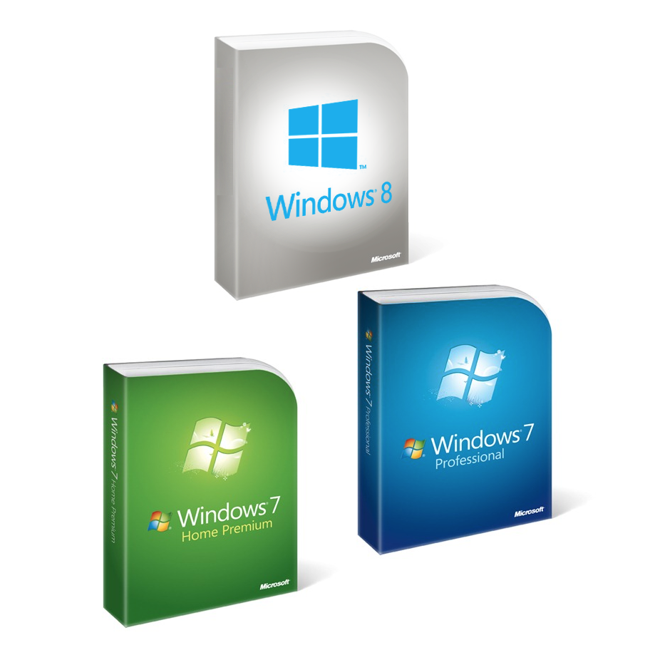
One of the key changes in the new Windows logo is the revamp in the color theme. Gone were the familiar red, green, yellow and blue hues from previous versions, and in came a cyan-colored rendition.
Frank Su, design director at Wishbone Design, also noted the implication on packaging and wondered how Microsoft would apply the new logo on storeshelves.
"I bet my last dollar the packaging will look like a Windows OEMs for Dell and Hewlett-Packard if they [were to] stick to white and grey [scheme] and the blue logo. They have to create a special print over the logo or deal with the packaging box design to pull this off," Su suggested.
Lo noted that while the overall logo reflected Microsoft's new direction, he said it might not sit well with some customers.
"The logo needs to be viewed in context to packaging or advertising. However, I think the design has drifted too far away from the familiarity and established previous incarnations of the logo.
"It would have been nice to inject some familiarity back into the logo, incorporating the Windows colours everyone is use to of red, green, blue and yellow," he added.
However, Just Creative's Cass felt the new change in color theme was a gamble that could pay off. "Based on their new 'Metro' design style I can see why they shifted into that direction.
"However, there is still a lot of brand equity being lost with the change, though, with a institution like Windows, they have enough visibility to build that equity back up and make such a simple logo work," he said.
According to Kwan, the introduction of a numeral, 8, into the design could work against brand recall. "The ability to create stickiness or brand recall is paramount in logo design. This is where I would score the new logo poorly.
"Again, it's harder to remember a number than, say, a big cat [like in Mac OS versions]. So, Win 8 has about the same stickiness as year-old gum," he said.
Siew Yaowei, a freelance designer, felt that the new logo was a winner regardless of design principles. "The changes have created so much marketing buzz and publicity. The fact that so many people are talking about it and debating shows how much brand awareness has been created."