Why Android Ice Cream Sandwich's virtual buttons suck

I know that I can't be the only person with an Android 4.0 device that's extremely annoyed by this.
One of the key improvements that Google has claimed for devices designed for the Android 4.x Ice Cream Sandwich (ICS) platform that was introduced in the previous version of the OS, Honeycomb 3.x (which was only used on tablet devices) is that the UI buttons are now all software-based.
This is in contrast to the previous-generation "Gingerbread" or "Froyo" 2.x devices which had physical buttons that performed the tasks of "Home", "Back", and "Option" as well as Apple's own iOS which has a singular physical main action button that complements the on-screen UI elements.
In theory, this virtualization of all the buttons allows Google as well as application developers to alter the functions and positions of commonly used UI elements depending on the type of app being used and also within the context of the UI function itself.
It also comes in handy when the orientation of the device is changed from portrait to landscape mode.
All of that is great in theory, except for one problem. As it stands today, very few Android developers are really taking advantage of it because there's not enough ICS devices in the wild yet to devote the effort towards optimizing smartphone apps for it.
So instead, what we're getting is a very generic default UI layout across all Android apps which use virtual keyboard and UI button input.
This includes the built-in Android 4.0 apps such as GMail, Messenger, Chat, Navigation, Google+ as well as many third-party applications which include popular social networking apps such as Twitter Clients, Facebook and Instagram.
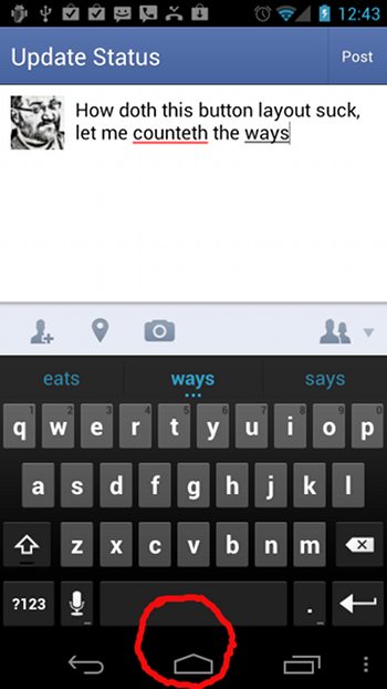
As you can see from the screen shot, the problem is fairly obvious. The virtual keyboard is arranged in such a manner so that the "spacebar" is in very close proximity to the "home" virtual button.
What happens in these text-intensive apps is that when you are typing and enter a space, your finger tends to accidentally hit the home button instead, which exits the app and sends you back to the home screen.
To say this is awfully frustrating when you are typing in a status update or when a reply to an email is being composed is an understatement.
There are a couple of ways these issues can be resolved. First, Google could make a setting within Android to allow the virtual UI buttons for Back, Home and Recent to be re-arranged or aligned further from or closer to each other based on user preference. There's certainly enough white space between these UI elements to permit this on smartphones as well as on tablets.
Yes, I'm aware any number of alternative keyboards and data entry methods exist which you can buy on the Google Play store. But the fact that the default text entry method is so broken on Ice Cream Sandwich is a complete failure on Google's part in my opinion.
And should you think I'm inclined to believe that Apple or Microsoft does things any better in this regard, I don't.
It doesn't really make sense in this day and age when we are using mobile devices that we should be using the exact same layout of a computer keyboard that was originally optimized for a desktop or a laptop device.
Why do we even need a "spacebar" in the same shape on a smartphone or does it need to even be in the same place? Doesn't it make sense to put the space button somewhere else in the keyboard layout, such as on the far left?
Given that touch-typing on a virtual screen is effectively impossible for many people, end-users need to be given a choice or the flexibility to modify the layout of the keyboard and the placement of the virtual buttons.
It's not like we have standardized sizes for these Android devices like we have for full-sized keyboards on laptops and desktops. And it's unlikely that any kind of form factor standardization for screen and device size is going to occur anytime soon, given the wide variety of products being released by the many Android vendors.
The width of the human fingertip also varies from person to person, depending on which finger is being used for data entry, as does the pressure being applied to the screen. Typing styles also vary, so to not have a customizable UI in my opinion is a detriment to any mobile platform, particularly for one as prolific as Android or even iOS or Windows Phone.
Do end-users of mobile devices need more flexibility in customizing the Android UI to suit their unique data-entry behavior and ergonomics? Talk Back and Let Me Know.