Why IE9 is too simple for me


The IE interface definitely needs improving, simplifying and de-crufting. The IE9 beta interface is an excellent start - but for some of us it's just too simple, because it makes things that were already confusing even more so. Yes, they're advanced features that people don't do the vast majority of the time - at least that the people who haven't turned of Microsoft's tracking system in Windows or aren't behind a corporate firewall that blocks it don't do. But why should it only be the things you do every day that are simple; should the things that you don't do very often be as simple as possible too? If you don't do them often, it's even more important that they're easy to do!
The three things I miss the most from the IE9 interface are buttons for Quick Tabs, OneNote and mailing a link to the current page; all things I personally do frequently. Yes, I can Send to OneNote by right-clicking and choosing that off a horribly cluttered context menu, but that makes it too easy for me to lose the selection I've made on the page and end up with the whole page instead - and did I mention it's a horribly cluttered context menu? This is the overflowing kitchen drawer of user interfaces
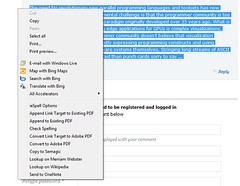
And it's even more horrible when you don't have anything selected.
For mailing a link, I can't even right-click; I have to turn on the whole command bar and select the button there, because Outlook hasn't wormed it's way into the context menu, although Windows Live has. Yes, I can copy the URL and go to Outlook and create a new message and paste it in; that's slower and less convenient than what I used to have in IE8.
Quick Tabs is now relegated to a keyboard shortcut. When I'm mousing around trying to think which tab I want to select, it's a context switch to use the keyboard. And somehow, I'm more likely to remember the Quick Tabs option when there's a button there to remind me of it - a button I see because my mouse is wandering around near the tabs. No, the Windows 7 taskbar previews aren't a replacement; once you have more than a certain number of those they turn into a list of titles, not thumbnails - and those of us who love Quick Tabs love the thumbnails. It's something visual…
There's a division between people who have sense memory of where things are and people who have to look every time; on my first Mac I could navigate programs blind by clicking where the menu item was going to be (in 1986 a Mac was pretty slow and yes, I did a similar thing in Word 2 for Windows 3). But then I watch a friend hunting up and down a menu for a command he uses *every day* and I'm reminded that some people can internalise navigation metaphors and some can't.
And while I'm at it, I'd like the New Tab page to be customisable with favourite pages, not just recent pages - I go to too wide a range of sites for the credit card site I visit once a month to make the recent list but I want an easy way to get to it.
And today I found something else I had to turn on the ugly old command bar for. I visited an FTP site and for some reason I don't even want to understand I had to open it in Explorer to actually see the files. And the instructions - displayed on the FTP page by IE automatically - were to click the Page menu and choose 'Open FTP site…' - and to do that I had to open the command bar.
Should the Open FTP in Explorer button be on the IE9 interface all the time? Of course not? Should it be easy to find? Yes! Should it go on the Settings menu? Not necessarily - because that could quickly get as horribly cluttered as the context menu. I have a better idea.
In fact I think I I have a solution for the whole IE9 interface issue* - and it's a solution Microsoft has already adopted. Many of us were expecting a ribbon interface for IE9 and wondering how that would work; I was expecting it would look a bit excessive but would be an excellent way to organise the cluttered interface with years of cruft that IE has become. I'm not suggesting that IE9 should have a ribbon - but how about giving it a Quick Access Toolbar to use some of that currently wasted title bar space? Office has it, Paint has it, WordPad has it; everything that gets a ribbon interface gets a toolbar of mini icons that you can customise to add just the buttons you happen to need - and if you don't need any of them you don't have to have any of them. It's the best of both worlds. Microsoft doesn't have to make a complex but easy to use interface for a handful of power users and us power users don't have to resent the over-simplified interface we're forced to use to get the superb rendering engine in IE9.
 The first view is the simple, elegant IE9 interface; the second is what it turns into when you add the ugly Command Bar. The third is my cheap and nasty mockup of IE9 with a Quick Access Toolbar; it doesn't look nearly as nice as the simple, elegant, stripped down look - but it doesn't look nearly as ugly as the command bar to me. What do you think?
I like the concepts of both graceful degradation and progressive enlightenment - make it much simpler as you need to, make it easy and elegant to get more complex options and info as you need them. The way I see it IE9 has nailed the first one and now badly needs to address the second.
M
*OK - not the whole interface issue. I don't know what to do about lots of tabs. Actually, if I can have the Quick Tab button I don't mind having the small tab space - if it scrolls at eight tabs or at 12, I'm still going to have to scroll through my tabs the majority of the time.