Windows 7: Mojave My Ass

While I agree with fellow columnist Adrian Kingsley-Hughes that the Beta 1 release is relatively stable, and they've done a number of things to improve performance (although on more powerful systems these changes are less noticeable) and have alleviated some issues which have caused much frustration with Vista (such as the default UAC behavior) I find that Microsoft has introduced a number of changes that will frustrate many users.
Also See: Windows XP to Windows 7 User Interface Transition Gallery
I find it difficult to believe that Windows 7 was created to be easier to use than Vista -- if anything, they've introduced a number of UI changes that make the system much harder to navigate, particularly if you've never used Vista and are going direct to Windows 7 from Windows XP, which is the path that many users will experience.Click on the "Read the rest of this entry" link below for more.
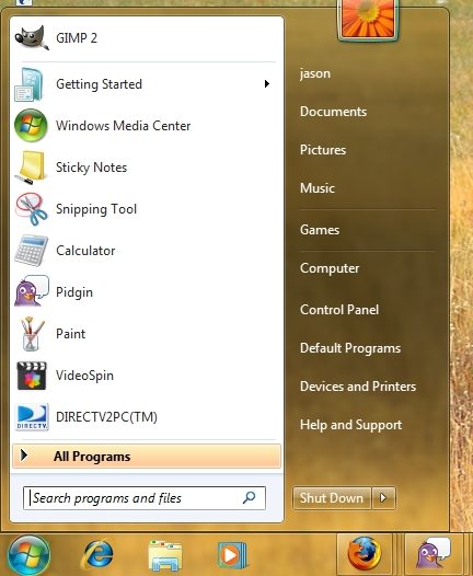
The Start Menu in Windows 7 will be an area of much consternation for veteran Windows XP users. Overall, the Windows 7 Start Menu is not a major change from the Vista SP1 Start Menu, so existing Vista users will not have much to complain about. However, Microsoft has now completely removed the ability to have a "Classic" Start Menu, which will anger many veteran Windows users that have been using the system that way since at least 1999 when Windows 2000 was released, and some of us since Windows 95.
To make matters even worse, the "Run" option is no longer directly accessible from the Start Menu as a default behavior, you have to get to it via a Search. Once you get to Run via Search, you can click on it to execute any commands you like, such as the CMD.EXE prompt, and you can drag it onto the Desktop, but you can't drag it onto the new Taskbar, like you can do with any add-on program, such as Firefox. You can turn the Run command on after the fact in the Start Menu options, but that in and of itself is extremely annoying, it's as if Microsoft has gone out of its way to make power users lives more difficult. (EDIT: The lack of a Run appearing by default appears to be a hold-over from Vista -- in other words, MS still isn't learning from its mistakes.)
Also See: My colleague Ed Bott's response to this article.
Another thing that greatly frustrated me was the fact that a fresh install of Windows 7 gives the end-user a blank slate on the Desktop, removing the familiar "Computer", "Network", "Control Panel" and "My Documents" icons, requiring users to get to those functions and folders via the Start Menu . I haven't tried doing an upgrade install over an existing SP1 or XP system, but I'd like to hope that the existing icons on a user's desktop are preserved and aren't wiped out. You can get the regular navigation icons back, but it's a manual step -- and it's not intuitive how to do it, since they changed the naming conventions from XP. (EDIT: While the "clean slate" look has been present in fresh Windows installs since XP, virtually all OEM configurations/system restore disks have the icons already enabled).As a general theme, Microsoft seems to have made changes for the sake of change, which was the case with Vista and is even more apparent with Windows 7, once you start digging into the OS dialogs and UI in depth.
It should also be noted that the current prerelease build Windows Server 2008 R2 (aka Windows Server 7) also includes many of these UI changes, but I'm more willing to accept them on Server because the OS is far less cluttered in general, is much more agile, and it is expected that Server OS users will want to do a lot of tweaking of their systems whereas typical end-users should be spoon fed the easiest to use environment possible. I still would like to see Server 2008 made available with Workstation licensing, for those of us on the "git er done" end of the sysadmin spectrum.
I also find the Windows 7 Control Panel to be less intuitive than XP's -- they've tried to simplify things, but in doing so, actually made it more frustrating, because you now need one additional mouse click to see all the Control Panel options -- of which there are now approximately double than which existed in XP. Clearly, they could have done a better job at consolidating functions, or at the very least, provided a better UI for navigating such a long list of stuff, such as a tree drill-down view that is used in the Computer Management control in the Microsoft Management Console.
Do you find the default Windows 7 UI changes an improvement or a productivity impediment? Talk Back and Let Me Know.