Google Reader gets its overdue interface refresh

Google Reader is finally getting its day in the sun. Just as promised earlier this month, the forgotten Google app for collecting and reading news articles all in one place is getting a revamped design.
Up until now, Google Reader has been a flat-out mess with widgets and links in a haphazard layout of frames, while other products in the Google Apps suite such as Docs and Calendar have all been treated to new looks in the last few months.
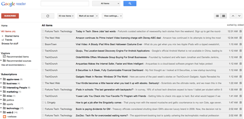
Now, Google Reader will look more like a combination of Google+ and the new Gmail user interface. Here's an example:
Reader will be following more in the suit of Google+ than anything else as Google is nixing the existing friending, following, shared items and comments features on Google Reader in favor of similar Google+ functionality. For example, the +1 button will be replacing "Like" option.
Google software engineer Alan Green expressed hope on the official Google Reader blog that users will "like the new Reader (and Google+) as much as we do, but we understand that some of you may not."
Retiring Reader's sharing features wasn't a decision that we made lightly, but in the end, it helps us focus on fewer areas, and build an even better experience across all of Google.
Green also promised that the new Google Reader will be up, live and running "before the day's over." For those who are not interested in the new look but still somehow stayed avid Google Readers this whole time, they can use the subscription export feature to take all of that data with them.
Related:
