Yahoo home page shuffle

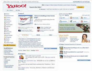
In the ongoing quest to optimize, tweak and refresh pages, Yahoo is testing a new home page look (image captured on Yahoo's Flickr site). Having worked on many home page redesigns, the big questions boil down to little items and block moves. Most sites are reluctant to make significant changes for fear of alienating users who have become accustomed to an interface. Is top navigation or left side navigation links better? Big icons, little icons? Lighten the page or load up on eye-catching graphics? Push lots of services (especially the sticky and revenue generating ones) prominently or just the few that really matter to users? Yahoo and its brethren should have more composable interfaces, beyond just moving things around and changing colors. Look at how Yahoo Photos has morphed with version 2...why not Home and My pages?
Proposed new home page
Today's home page