Microsoft Windows Phone 7 technical preview: A definitive guide

Welcome back into the smartphone arena Microsoft, it looks like you have a serious challenger entering the ring and I will definitely be purchasing a device as soon as I can. I spent an hour with the Windows Phone 7 team and was then given a Samsung developer phone (looks to be something like the i8910 Omnia HD device) with the latest Windows Phone 7 Technical Preview to use for about 3 weeks. As Terry Myerson posted on the Windows Phone blog Microsoft hit this Technical Preview milestone and is sending out thousands of prototype phones loaded with this "Technical Preview" to let developers test out their applications on functioning devices and get their applications ready for launch. The Samsung hardware this is running is not what you will see at launch so I won't focus on the hardware in this hands-on detailed look at the current version of Windows Phone 7.
We saw the official announcement of WP7 in February at Mobile World Congress and have seen various details revealed at events since that time. I was still skeptical of the functionality and capability of the new operating system and after the recent Kin disaster I honestly wasn't expecting much from Microsoft. After using the Technical Preview version of Windows Phone 7 in an up close and personal way I can honestly say that I am quite excited for the holiday season when we will see these devices launching from Microsoft. Check out my extensive image gallery (about 90 photos), several embedded YouTube videos, and detailed experiences below and through the next 8 pages.
| Image Gallery: Check out some hardware photos and about 80 actual screenshots of Windows Phone 7 Technical Preview running on a Samsung device. | 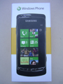 | |||||
- Intro to the Technical Preview
- Microsoft's philosophy and approach to Windows Phone 7
- Walk through the user interface
- What are the minimum hardware requirements?
- Detailed coverage of the six hubs
- Is Exchange support still good?
- What is in the device settings?
- How is WP7 different than Kin?
- Daily usage experiences
- What is missing in the Technical Preview?
- Closing thoughts on the current version of WP7
I have this particular developer phone to use for the next couple of weeks so please ask me any questions you want about the software and if I get enough interest I will create a Q&A follow-up post before I give the device back to Microsoft.
You will also find embedded videos covering the following:
- Unboxing the Windows Phone 7 developer phone from Samsung
- Initial startup, login, and setup of WP7
- Six hubs of the Windows Phone 7 OS
- User interface elements and performance of the UI
- Applications loaded in Windows Phone 7
- Settings in Windows Phone 7
Intro to the Technical Preview
I want to make it perfectly clear before you dive into the details that this is just a Technical Preview release of the Windows Phone 7 software and there is still some time before the release candidate will be complete so there are some functions that are not fully developed and there will most likely be bugs along the way. However, after using it as my primary device for five days I have yet to see ANY lockups, freezes, or resets on the Samsung device I am testing out. Actually, I am blown away by how stable this version of the software is because I have seen more issues with shipping devices running the iOS, Google Android OS, etc. than I have with this version of the software. It also helps that this Samsung Omnia HD-like device has a beautiful OLED display.While I will run through the operating system and my experiences, these may change a bit when Windows Phone 7 launches on devices so don't expect to see everything exactly as it is in this Technical Preview version. From what I understand of Microsoft's development process there are technical previews and betas, then release candidates, then release to manufacturer versions. This version is designed for developers to use and carriers to start testing out on their networks. It is still personally very encouraging to see how far along this version of the WP7 software is and to see it performing so well, with the understanding that there will be improvements before release.
Microsoft's philosophy and approach to WP7
Windows Mobile (Pocket PC before that) was based on the idea of bringing your desktop user experience to your hand and it worked well for years as Microsoft knocked Palm out of the PDA game (Palm had a hand in killing themselves off too). Over time, the technology improved and more and more people (not just your computer geeks) starting using handheld devices. Apple then gave the mobile community a shot in the arm when they showed how fluid a mobile phone UI could be and they brought millions of new users into the community. We then saw Google and Palm build on the iPhone user experience and now we have a completely new fast paced smartphone market. This market is actually still quite young with LOTS of room for expansion and I wouldn't begin to count Microsoft out yet.With Windows Phone 7, Microsoft really started over from scratch and gave up the idea of bringing the Windows desktop experience to the phone and decided to bring a great phone experience with the ability to work with your data, play your games, and interact with your social networks and friends wirelessly and naturally. They completely streamlined the experience (I will go into detail on this in the next section) and are centered on the essentials.
Microsoft is focused on thinking about tasks differently and recognizing the "explosion of more". The iPhone is completely focused on the application as a means to get things done as you can see with their user experience designed for you to tap on an app to do things with your iPhone. Android and webOS also have this, but have taken it a step further with widgets, notifications, and better service integration. With Windows Phone 7 Microsoft wants you to think about doing things naturally and holistically. They want your phone to model how you would do something in the real world so for example if you wanted to take a photo and then share it you simply press and hold the camera button (even when the phone is locked) to start the camera, take the photo, and then tap and hold to upload. You don't have to unlock the phone, start the camera application and then have to start a social networking application to do this. I understand that Android and the iPhone have some of this integrated as well in the camera now, but Microsoft thinks like this throughout Windows Phone 7 (I will cover this in more detail below) where the focus is on the things you do and the way you interact with people rather than on the applications you use and need to perform tasks.
The "explosion of more" is the idea that the customer will expect more out of the device and platform as they begin to use it and discover the capabilities. Microsoft will release updates and improve the device over time while also putting major efforts into helping developers launch applications that can tie into the operating system and continue to improve the end user experience.
User interface
If you own or have used a Zune HD then Windows Phone 7 will look familiar to you. Some of the user interface elements from Zune and Kin appear on Windows Phone 7 and the UI has been labeled Metro. There is swiping and panning, elements that flip in and out and zoom in and out dynamically, and motion control that is more fluid than ANY smartphone user interface I have ever used before. You will see text dynamically squeeze down or compact when tap and hold actions are taken, move right or left when menus and selection boxes appear, entire lists slide up quickly and sort of bounce to a halt visibly so you know you are at the end of the list, and many other slick user interface elements of feedback that help make the experience a good one. Check out my video below as I move around the device and you can see how well the interface performs. I showed the device to people around the office and the first thing every single person said was, "Wow that moves fast". It is refreshing to flick side to side and up and down and see a responsiveness on the display that is so smooth and natural.To start with, when the phone is locked you will see an image (you can choose whatever photo you want here if you don't like the default) with the time, day of the week, date, upcoming appointments, wireless carrier or connection status, battery level, profile status (silent, vibrate, ringer), missed call status, incoming email status (small icon of email inbox with number of new emails), and other notifications (text messages, etc.). If a call comes in when the screen is locked then the caller id photo appears with the words Slide up on the bottom to let you know what to do. After sliding up, you have the option to answer or ignore the call with a single tap. Things such as text messages come up on the top of the screen for several seconds before moving down to an icon and number on the lock screen. If you tap on the lock screen you will see the entire image bounce up just a bit to prompt you to slide it all the way up and just like the Zune HD you simply slide your finger up the display to unlock it.
After unlocking the phone you will see the main display that is still called Start, but it is very different than your Windows Start experience. Tiles take up the Start display in either a two wide or single wide arrangement. The tile size is determined by Microsoft or the developer with most all of them being single wide tiles. The double wide ones I have found so far are for your Calendar and Pictures. Microsoft has a requirement for ones that must be included out of the box, but carriers and manufactures will probably have some on there by default too. However, as the user you can pin or unpin whatever you desire from the Start screen and you can move the tiles around to your optimal positioning. You can create tiles that launch apps, tiles for people in your contact list, tiles of your favorite songs, artist, etc, tiles of your browser favorites, and more. There is no side-to-side motion to access tiles, but they appear in an infinitely long (there may actually be some limit) page going down. Tiles are also dynamic "living" objects so you will see album art flowing, contact status scrolling, calendar appointments appear and disappear, number of new emails, number of missed calls, number of new text messages, etc. appear as large numbers next to the icon on the tile. Most tiles have name at the bottom in case the image doesn't explain it enough. I do not see the browser favorite refreshing dynamically and am not sure if this will be present in the final release or not.
The tiles and some first level screens throughout WP7 look to be supported only in portrait orientation. I am not sure if the hardware with landscape QWERTY keyboards will support the Start screen and other screens better in landscape or if this is one area that is still being worked on that will change when the final devices hit the street. For apps and hubs that do support landscape orientation, you will find that Microsoft focused on even the minor details so that the icons that are at the bottom will rotate 90 degrees so that they appear upright on the right side. Also, when you tap the three dots in the bottom right to slide up the bottom buttons and menu items you will see a text description of the icons on the bottom in case you do not recognize the icon. Things like this show a definite fit and polish to the device that gave me a sense of completeness and consistency in the OS. Most mobile operating systems are inconsistent with elements that vary all over the place and as you can see on the last page of this article Microsoft did something else with Settings that greatly pleases me.
If you slide your finger from right to left on the Start screen (or tap the arrow in the upper right) you will see an alphabetical list of all the applications (and different email accounts) you have installed on the device. There is no way to reorder these, arrange them into folders, or customize this view in any way. With the Start screen able to function as your customizable launcher I don't see much need for doing more with this page and am OK with it for now. The geek in me would like to see headings for things like 3rd party apps, people, media, etc. where I could then arrange specific apps into these folders for a shorter list and more refined organization.
Like the Zune HD as you get into apps and utilities you will find words that extend beyond the display view, but I think this works very well to let the user know there is more to the left or right for them to discover. If these words and parts of pages did not appear on your active page then new WP7 users may not discover that they can flip right, left, up and down to access more content. Active page headings appear in bold or different color with other pages in lighter color so you know they are to your left and right. There are small icons on the bottom of some pages that give you access to more functions and these automatically rotate too as you change orientation of the device. There are three small dots on the bottom right that indicate a slide-up menu exists below the on screen buttons. There are tap and hold options throughout the operating system as well. Some things are even hidden at first with the operating system recognizing repeat actions that will inform you of hidden functions. For example, you can select an email (to move or delete) by just tapping at the front of the email sender name and then bam a checkbox magically appears. You could also have done this through a bottom icon/button action, but there are subtitles like this throughout.
The way the iPhone handles fine cursor placement is the best I have seen on a mobile operating system to date while it is almost impossible to control on Android. Microsoft put some thought into this too and rather than have a bubble appear with the text zoomed inside it, they give you a fairly standard cursor bar that is above your finger so you can easily and accurately place the cursor exactly where you want it in the text. You then can tap on the word to correct it and Microsoft's text recognition software will give you several possible options for the word. You then simply tap to replace it with the correct one. Automatic text correction/spell checker is on, like the iPhone, and if the software detects that you are misspelling something it will give you the likely correct word right above the keyboard in bold font. You can tap this before you finish entering the word too and if not then it will enter the bold font word in place. The algorithms for spelling seem to be quite good and in my few days of testing the software did well.
Speaking of text entry, Microsoft includes a fairly standard QWERTY keyboard that has the same layout and design in portrait and landscape orientation. You have to tap to get to a number keyboard, but common punctuation (? : ! -) can be accessed by tapping and holding on the period. A double tap on shift turns on caps lock with the shift key turning white when active. Unlike the stupid iPhone keyboard that is always in CAPS, the Windows Phone 7 one visibly changes with shift and caps lock so you know what type of character you are entering.
Themes are supported so that you can customize your experience and enjoy colors in menus and icons. You can choose from light or dark backgrounds (fonts switch to match) and select from four minimum required accent colors (red, blue, orange, and green). The Samsung test device I am using has the following color options, magenta, purple, teal, lime, brown, pink, orange, blue, red, and green. I have been trying out a different one every day and personally enjoy the brown accent color with dark background. You will notice that there appears to be a lot of empty space in the UI, but I honestly have not bothered by this. It is cool how the web browser switches to full screen mode in landscape orientation while the pixels are optimized as well.
You won't see your wireless signal strength, wireless carrier network, battery status, profile status (silent, vibrate, ringer one), etc. unless they are in a critical state or you slide down from the top of the device because they are automatically minimized since this information is not necessary for you to see at all times. The time will always appear in the upper right corner though so you won't have to hunt for that clock application. Another cool interface element found at the top of the screen occurs when an active data connection is being made. You will see colored dots (the same as your theme color) fly from left to the middle and then the middle to the right and off the screen. It is subtle, but lets you know a data connection is taking place and pretty slick.
If you press the volume button up or down you will see a small popup that shows your sound profile, volume slider, and currently playing or paused music track. You can tap and control music right here from this utility that appears so you do not have to dive into the Music + Videos hub.
When a call comes in the caller ID photo will appear as a pop-up with options to answer or ignore. If you ignore then you will be taken back to your active application or game that was frozen in state for the call.
Notifications appear similar to what I have seen on the Nokia N900 where they appear in the very top of the display a few pixels high for a few seconds. If you want to take action you tap on it to enter the app and if you want to ignore you do so and keep going with your current task. Other notifications appear as changing dynamic numbers on the personalized tiles of your Start screen. For example you will see your inbox count increase as emails come into your various accounts. I hate the limited notification system on the iPhone and like the way Google Android and Palm webOS handle these much better. Windows Phone 7 has a hybrid system that I think has the possibility of being one of the best notification systems on smartphones.
Minimum hardware requirements »
Minimum hardware requirements
Microsoft has always allowed manufacturers to create devices in a number of form factors that just had a few minimum specifications and requirements. This led to a huge variance in devices and appeal to people based on options in form, but it also made it difficult to update across the entire platform because of so many differences. There were even issues with 3rd party developers and software due to display resolutions, touch or non-touch screens, and even processor differences.To help control the Windows Phone 7 experience, Microsoft is imposing requirements on the hardware side that will greatly limit the variance in form factors while allowing people to get a consistent user experience and future update support. Here are the current hardware requirements:
- Display: 800x480 WVGA capacitive touchscreen with multi-touch support (4 contact points)
- Hardware buttons: Five are required for Start, Back, Search, Camera capture, and power/lock. You may find some devices with more buttons, but these are the minimum required.
- Chipset: Qualcomm Snapdragon CPU with DirectX 9 graphics support. Even though there are other fast mobile processors out there, Microsoft is launch with Qualcomm as the only option.
- RAM: At least 256MB
- Internal Flash storage: At least 8GB internal
- External storage: None is allowed. A manufacturer could embed a microSD card as the internal memory, but it cannot be user replaceable.
- Wireless radios: WiFi, Bluetooth, A-GPS, and FM radio (HD is not required, but a manufacturer can still use)
- Camera: 5 megapixel minimum and must include a flash
- Others: Accelerometer, compass, ambient light and proximity sensors, hardware keyboard is optional and allowed
The external storage support is one of the largest departures for Microsoft, but I have to tell you it makes no difference at all to me. I have devices now with 8GB and 16GB microSD cards in them that I NEVER remove. The iPhone and Palm Pre/Pixi have only internal memory support and consumers do not really seem to care. Android has support for external microSD cards, but they don't let you store apps on them so they might as well have gone with internal memory too and this is one thing I like about the Samsung Vibrant.
Another major departure from the Windows Mobile legacy is the lack of a directional pad, joystick, or hard coded soft keys. They are not required or allowed on WP7 devices. You use the specified hardware buttons to quick jump to places and the touchscreen to do everything else.
The Back button takes you back to a previous task and it looks like you can do this a few times until you eventually get back to the Start screen. Pressing the Start button take you back to the Start screen. Pressing and holding the Start menu launch the voice recognition software that is powered by Tellme. This voice recognition software lets you say things such as "Search pizza in Seattle", "Start Zune", "Call Dave at the office", "Open Calendar", "What is the score of the Sounders FC game?", and more. I was amazed by how accurate the software was at interpreting exactly what I was saying. This voice search works with the Bing Search engine and I actually found it to be a simpler solution for finding things I use dedicated 3rd party apps for on my Android devices. For example, I simply pressed and held the Start button and said, "Longston Place movie times". Tellme worked its magic with Bing Search and gave me an immediate listing of the movies at my local theater with star ratings for the movies. Tapping the top search result took me to the MSN Entertainment site with the specific theater (including the phone number and hyperlink to maps and directions), the movies that were playing, and the movie times. This was SO much easier than starting up a Fandango app and going through the search process, just one button press, a few spoken words and one tap. This is the kind of experiences that Microsoft is working hard to give you with Windows Phone 7 and I am really liking it.
Pressing the Search button takes you to Bing Search or search within selected applications such as Email and Contacts. There is currently no global search of the device, but I haven't found that to be an issue as long as there is search in the apps where I would normally conduct a search. Pressing the Camera button takes you to the camera application. Pressing the Power button once locks the device and pressing and holding will shut the device off.
Let's start checking out the hubs with People, Pictures, and Games »
People hub
As I mentioned earlier in the section about the user interface, Microsoft wants to help you perform functions like you would naturally without having to focus on a disjointed application-based approach to getting things done. In addition to the Phone utility, the People hub lives right next to it on my Start screen and I think this will be the case for many people since interactions with people are one of the main reasons to have a mobile phone in the first place, whether that be for phone calls, text messages, email, or social networking communications. The People hub brings in content from people in your various contact databases. As you can see in the email and account settings you can enter your account info and bring in email, contacts, and calendar data from Windows Live, Outlook/Exchange, Google, Facebook, and Yahoo (email only). Social networking support is currently provided only from Windows Live and Facebook. I sure hope they add in Twitter since this is an extremely popular social networking service and the one I actually use most of the time.After you tap on the People hub you will see there are three sub-categories in the People hub called all, what's new, and recent. The recent info can actually be multiple pages wide while the all and what's new pages are vertically scrollable. On the all screen you will see yourself on the top and tapping your picture takes you to your social networking feeds where you can review what you wrote or see comments left by others on your posts. You can also tap your status and update it to Windows Live or Facebook.
To get to another contact you can start scrolling up and down or tap on the colored title at the left that contains a letter. This pops up all the letters in the alphabet that have contacts in them. Tapping a letter takes you to the top of the list of names with that letter. In the settings you can select to sort contacts by first name or last name and have them displayed as first last or last first. You will still have to scroll up and down to find the specific person. Tapping on the selected person opens up their contact card with a screen of their profile (phone, email, website, hyperlink to map of address, and other contact info) and a screen labeled what's new. The what's new screen brings in their Windows Live and Facebook feeds. You can read and add comments to their updates if you desire. You can also pin people to the Start menu for quick access and communication.
The what's new page found from the main People screen shows status updates (currently from Facebook and Windows Live) of all of your associated contacts. The recent screen shows the contact image of the person and these move up and down to reveal the photo and contact name too. Tapping one of these photos takes you to that specific contact profile info.
Options and fields available to you when you add a new contact include, a photo, name (first, last, nickname, company, suffix, title), phone number (multiple types supported), email (personal, work, other), ringtone, and other (physical address, website, birthday, notes, anniversary, significant other, children, office location, and job title). Bing is well integrated so when you have a physical address entered you can easily tap the address to have it mapped on Bing Maps.
Pictures hub
The Pictures hub is one of those double wide tiles from your Start screen and launching it shows you a what's new page, index page, and recent page (much like People). Pictures are brought in based on your contact list through Facebook and Windows Live. Keep in mind though that Windows Live integrates several photo services such as SmugMug, Flickr, PhotoBucket, and more. You can zoom in and out on the photo and comment on it (if the service supports this). I don't see anyway to save the photo to your device locally or share it out with others.The index page shows you the photos you have associated with you, including categories for all, by date, or favorites. Selecting all shows you your photos on the camera roll, loaded on the device (through Zune on your desktop), and those associated with your Facebook or Windows Live social networks. Since these are your own photos you can save them from your social network services down to the phone. Once the photos are on your phone you can tap and hold on them to add to favorites, delete, upload to SkyDrive, share (via email, Facebook, or SkyDrive), or use as wallpaper. You can pinch, zoom, and pan through photos.
Games hub
The Games hub should be one of the most exciting hubs with a HUGE potential for marketing to the millions who have Xbox devices. At this time, the Technical Preview only shows you your Xbox gamer profile, achievements, and avatar. It was kind of cool to see my avatar on the phone and I look forward to the day when I can play Xbox games with friends over the network. This is one area where Microsoft can beat out Android since gaming has been something that you don't see as a focus of Android.How about the Music + Video, Marketplace, and Office hubs? »
Music + Videos hub
The Music + Videos hub is one of my personal favorites since I am a big fan of the Zune HD device and Zune Pass subscription model. I have a very small personal music collection and like to listen to music from several genres. With the Zune Pass I am growing my collection 10 songs a month and am able to experience and enjoy a ton of music. With a Windows Phone 7 device I will now have a complete music experience on my phone that is better than any other platform, even the iPhone with iTunes. Why do I state that the Music + Videos hub on a WP7 device is better than iTunes on an iPhone? In addition to songs you can buy (just like on iTunes), you can also listen to an unlimited number of full songs and keep 10 per month for only $15 with the Zune Pass. You can also listen to the FM radio and add songs you hear on the radio to your Zune Pass collection. Lastly, you can also stream music from the Zune Marketplace over the wireless network.You do have to connect to a PC for your initial Zune setup, but after that you can browse and download from the Zune Marketplace. Microsoft also supports wireless syncing to your PC via WiFi with your Windows Phone 7 device. Videos look great on WP7 and playback is flawless. I am a huge podcast fan and the one thing I want to see supported is the ability to discover and subscribe to podcasts from your device.
Marketplace hub
The Marketplace is where you discover and purchase applications with links to the Games hub and Music + Videos hub for buying games and music. There are only six applications currently in the Marketplace for people checking out the Technical Preview. The screens are broken up into new, featured, category index, and top pages for you to browse through. All apps are currently free in the Technical Preview, but I understand all transactions for apps will take place through your Windows Live ID.The apps in the Marketplace include a Shopping List, Stocks, Unit Converter, Translator, Level, and Weather. I downloaded the Translator, Level and Weather to try out and have to say the Translator is extremely impressive with the ability to enter text and have it translated into a foreign language with the option to have it spoken aloud too. You can then choose to swap this and see the written word in the box. Supported languages currently include English, Spanish, French, German, and Italian. If you are traveling in a country that speaks these languages you can enter a question or phrase and have your WP7 device speak it to the person you are trying to communicate with. The level is a handy tool with vertical and horizontal levels and the ability to calibrate the level. The Weather app includes a 10-day forecast and several pieces of data for the current condition. These early apps are pretty basic with usage of a few select colors and nothing flashy.
Office hub
I personally am very pleased that Microsoft chose to include a hub centered around the Office experience since I think their roots in the enterprise market are important to try to keep and grow. This is one area where they can differentiate from all the other current smartphone operating systems who only support Office through 3rd party application support. Microsoft makes Office and should have the best mobile Office solution. At this time it looks like they have the potential to achieve this, but the creation formatting tools are pretty basic so Office Mobile is definitely focused on the experience where you bring a document in and edit it on the go.When you tap the Office hub you are taken right to the OneNote page and from here you can easily create notes with text, images, and audio recordings. Bulleted lists, highlighting, and basic text formatting are supported as well. These notes sync to your Windows Live account so you can access them from any browser. You can also choose to send the note from one of your email accounts.
You can view, create and edit Word and Excel files and view & edit PowerPoint files on your WP7 device. At this time all documents you create appear in portrait only orientation. In Word Mobile there is a cool tool that automatically creates an outline of your document on the fly so you can quickly jump to different sections of your document. You can add comments, search the document, format the text, highlight the text, and change the font color. Excel Mobile has these same functions with additional function options and cell control options. Excel actually looks to be the more powerful application here and as an engineer this is definitely something I would use quite a bit.
Another feature that I hope to be able to use when WP7 devices launch is SharePoint integration. Our company is rolling out SharePoint and the ability to connect to a SharePoint Server and enjoy thing such as versioning control with documents is attractive to me. While SharePoint gives you an excellent way to access documents on the go, not everyone is a SharePoint user and there is no desktop cable support to drag documents to your device. There is not an Office tab in the Zune software either so there is no way to get documents onto or off your device with a cable.
Documents you create are synced up to your Windows Live Skydrive account so you can share them out through SkyDrive. I would love to see support for services like Dropbox, SugarSync, or Zumodrive in the future.
Outlook Mobile is also considered part of the Office hub, but I will discuss it on the next page as I walk through some of the apps not covered in the hubs.
Walk through included applications and the Exchange experience »
Included apps not in the hubs
If you slide over to the apps page you will find there are several apps and utilities included that are not directly part of a hub. These include the following:- Alarms
- Calculator
- Calendar
- Camera
- Maps
- Messaging
- Internet Explorer
- Various email accounts
- Phone
- Bing Search
- Settings (covered on the next page)
The Alarms is a very simple utility to just add an alarm with a repeat setting and custom ringtone selector. The Calculator is decent and when you flip into landscape orientation you will find a more scientific calculator appearing.
As I said earlier, when you press and hold on the camera hardware button the Camera application launches. In the upper right you will find a toggle for video or image capture. There is a large + and - bar for zooming in and out and a gear icon in the lower right. The gear icon opens up camera settings that include flash buttons, autofocus mode, white balance, image effects, contrast, saturation, sharpness, ISO, photo resolution and more. To the left of the viewfinder image you will see a static image overhanging just a bit and this lets you know you can simply slide from left to right and view the last photo you took. Swiping back right to left takes you to the camera capture mode again. I ilk that I don't have to launch a gallery or photos app to view the photos I just took with the camera and this seems like a natural extension of what you want to do. If you tap and hold on a photo you took then you can add to favorites, deleted, upload to SkyDrive, share via email or use as wallpaper.
Bing Maps is included and works much like Google Maps on various devices with a powerful search functionality and basic directions support. There is no voice guided navigation. The two buttons are for your position and directions to your destination. As you get to a certain zoom level the software automatically switches into satellite view of the surrounding area. Traffic views are also shown and Bing Search is powered by Bing Maps.
Threaded text Messaging is supported and the app is pretty basic. Theme colors appear in conversations and there isn't much flashy with this utility.
My first impression of the Internet Explorer browsing experience was that it is similar to the web browser on the Zune HD, but more functional. When you launch the browser you are taken to the default home screen and see the URL field up top with three icons along the bottom for add to favorites, view favorites and history, and toggle between the different tabs/browser windows. You can have up to 6 open tabs/windows in Internet Explorer. Tapping the 3 dots reveals options for forward, share page, find on page, pin to start, and settings. The browser settings are very basic with check boxes for cookies, let Bing suggest sites as I type, mobile or desktop version, and delete history.
Pages loaded up quite fast, even on the EDGE connection that I had with my T-Mobile SIM card. On my ZDNet Smartphones blog the entire page appeared on the display (even in mobile mode) and was actually mostly readable with tiny fonts. You can double tap to move into a selected area and of course pinch and zoom is supported. Like the iPhone though, pinching and zooming does NOT reflow the text to fit the page and this functionality is why I prefer the Google Android browser that does reflow for you to make reading a much more vertical experience that doesn't require you to move right, left, up, and down all over the place. Flash is currently not supported in the current version of the browser.
In portrait orientation, you see the top URL field and three bottom icons all the time without any way to minimize or hide them. If you flip the device into landscape mode, then it flies into full screen mode and page zooms in to fit the new display orientation. I understand that includes pixel rendering to make the experience quite good as well.
POP and IMAP email accounts are supported, as well as multiple Exchange accounts. There is no unified inbox, but the experience is the same for each email application with submenu heading for all, unread, flagged, and urgent messages. After opening an email the bottom control icons change so you can reply, forward, move, toggle flag, and more. Tapping an email sender opens their contact page too so you can interact in various ways. You can tap and hold on an email to delete it or tap the icon (second from right) to select multiple emails. Even easier you can tap to the left of the email and a check box will appear. While Gmail is supported, labels cannot be applied with the email remaining in the inbox. If you want to apply labels then you can move email to Gmail folders (aka labels) through the WP7 email app and they will receive a Gmail label and be moved to that label out of your inbox.
Speaking of Gmail, did you know you can enter credentials and have multiple accounts syncing email, contacts, and calendar data in seconds? You can sync the following:
- Windows Live: Email, contacts, calendar, photos, feeds
- Outlook/Exchange: Email, contacts, and calendar (no tasks or notes will sync)
- Google/Gmail: Email, contacts, and calendar
- Facebook: Contacts, photos, and feeds
- Yahoo!: Email only
There is also a Phone utility, of course, and I have that set as my top left app on the Start screen. Tapping on it takes you first to call history so you can easily connect with those who you recently called. Underneath their name (or number) it states if the call was incoming or outgoing and gives the time of the call. At the bottom of the display are three icons for voicemail, keypad, and people. If you tap the bottom right three dots you will see options to delete all and access your call settings. Call settings include showing you your phone number, voicemail number, when to show caller ID, call forwarding, international assist toggle, and SIM security. The dialer is very basic with just the 12 character keypad. I was disappointed to see there is no smart dialing feature here so entering numbers does just that without filtering your contact list.
When you place a call you will see a pop-up along the top of the device with the caller name and number and options to end the call, toggle the keypad, and access more caller options (speaker, mute, hold, and add call). These same options appear when a call comes in to the phone.
Bing Search is a beautiful experience on the Windows Phone 7 device with amazing background images, fun trivia associated with the images, and a powerful search/decision engine. Bing market share has been rising and I personally have been using it more and more lately as I find the search results to be accurate and helpful.
How is the Exchange/Outlook Mobile experience?
One of the main reasons I stuck with Windows Mobile for so long was the fantastic Exchange support. Now with Microsoft licensing Exchange ActiveSync to everyone the other smartphone players mostly all have decent Exchange experiences too. You will find that Windows Phone 7 is not as good as WM 6.5 when it comes to a complete Exchange experience, primarily due to lack of Task syncing. Also, you used to be able to sync Notes via a USB connection. The new experience is to sync OneNote notes to your cloud storage, SkyDrive, Windows Live account and actually this should be a better experience for the most part. I suppose you will have to change your habits and move from tasks to OneNote as well.For email, you will find an experience that is the same as I discussed above for other email accounts. The one thing currently missing here that I want to see is the ability to search the server for an email. When composing email you will be pleased to see you can search your Outlook directory (GAL) for email addresses. Priority settings and photo attachment are also supported. You can send Office documents from within the Office hub, but I did not see a way to attach anything other than a photo in the email program.
The calendar app is quite good, with a pretty basic color scheme and layout. Multiple calendars are supported and appear in different colors. You can toggle them on and off in the calendar application. Agenda, Day, and Month views are supported, but I never could find a week view. There are no options in month view and it is simply a way to get an overview before diving into the details. You can tap on the month name and select a month and year to jump to. There does not appear to be anyway to jump to a date in the day & agendar views so the month view serves as a date picker too and you will be in and out of it quite a bit. In the month view you can actually see the tiny fonts for appointments you have for each day so even if you cannot read it you can tell how busy that day is and see if something is scheduled. Tapping on it takes you to the Agenda view for that day with the ability to slide right and see the day calendar view. I like the way the day view shows the full block of time for appointments and is visually basic yet useful to me.
To create a new appointment you can simply tap somewhere in empty space on the day view or tap the + icon. Appointment options include subject, location, account, date, time, length, reminder, recurrence, status, attendees, privacy (YEAH!), and notes. I was personally very pleased to see the ability to make appointments private since I don't need to share my personal appointments with the office calendar and so few smartphone operating systems support privacy settings for appointments.
The contacts part of Outlook/Exchange is included in the People hub that I previously talked about.
What can you find in the Settings and how is WP7 different than Kin? »
What is in the device settings?
The geeky side of me always wants to know how I can customize and manage my device so I quickly dove into the Settings utility to see what was in there. When you launch settings you will find screens for system and application settings. System settings include ringtones, theme, airplane mode toggle, WiFi manager, Bluetooth manager, email & accounts manager, lock & wallpaper, location, cellular, date & time, brightness, keyboard, region & language, ease of access, speech, find my phone, phone update, about, and feedback. Most of these are pretty standard and self-explanatory so I won't go into detail and if you have specific questions feel free to ask and I can cover it in a follow-up article.You may have noticed I mentioned various settings throughout the different hubs and applications, which is similar to the way Google Android and other mobile operating systems work as well. Apple does it right with the iPhone and has a central area for managing settings and I am very pleased to see Microsoft do the same here. While specific apps and hubs do still have settings with them, you can now visit the Application settings area and see ALL of them consolidated into one single place so in reality you can just control and manage all of these settings from here. I understand that specific apps have settings within them to help with people who may not be used to working with a global settings area, but now that I discovered this I won't go into these again and will control everything from the master settings page. I cannot stress how impressed I was to see this simple consolidation, but it makes my life so much easier.
I actually discovered a few application settings here that I must have missed in the specific applications. For example, I see there are pictures + camera settings to toggle camera button to wake the phone, GPS location, auto upload to SkyDrive, keep location info on uploaded pictures, and quick upload account (SkyDrive or Facebook).
How is WP7 different than Kin?
After reading through these past few pages, you may have been sitting there wondering why the Kin failed when the user interface and functionality appear to be similar. I played with the two Microsoft Kin devices and found their user interface to be a bit confusing and overwhelming while also having limited functionality. Even though some of the same concepts (hubs or tiles) appear similar I find Windows Phone 7 to be setup more logically and it works better through your task thought process. You are not force fed social networking status and information and it is easier to control what is going on with your phone. Application support is a major difference, but one that we don't really see much of at this time since the Marketplace is not yet populated with a ton of 3rd party applications.Unlike the Kin where you could only setup service with Gmail, Yahoo, etc. for email, these Windows Phone 7 devices are more like Google Android, Apple iPhone, and Palm webOS where you can have Google email, contact, and calendar or Facebook contacts, photos, and feeds being brought in to the device. Windows Live is still going to give you the best experience, but you are not necessarily locked into it as your primary account.
I found the Loop on the Kin to be overwhelming and confusing to the point that I didn't fully understand who was saying what and from where and it was info overload while not actually giving me what I wanted. You don't see this on WP7 and if you want to check out the latest feeds from your contacts you simply jump into the People hub and scroll through the what's new page or select a specific contact to find out what is going on. Even better, you can pin a favorite contact to the Start screen and see their latest update appear in a subtle scrolling manner across their thumbnail image.
To verify the Kin vs. Windows Phone 7 experience out I had one of my daughters (who tested a Kin) use the WP7 device for a bit. She immediately said that WP7 was much less confusing and was better for her too.
Daily experiences, missing functions and features, and concluding thoughts »
Daily usage experiences
I have been using the Samsung developer phone for 5 days and am much more impressed with the phone and Windows Phone 7 operating system than I thought I would be at this stage of development. The phone NEVER crashed or locked up on me and I did not experience any bugs or other anomalies to report to Microsoft so far. I LOVE the Zune integration and enjoyed watching some video content, listening to music synced over from PC, and streaming music wirelessly. It was easy to follow friends on Facebook with the People hub and to update my status. I took and uploaded a few photos to my SkyDrive and Facebook accounts. I didn't use the Office hub much and will need to spend more time with it over the next couple of weeks. I am really looking forward to Xbox gaming on the platform, but don't know when we will see this implementation.My typical day consisted of sending and receiving lots of text messages and email messages through various accounts, checking my Facebook feeds, using Twitter through the Dabr.co.uk mobile Twitter site (Microsoft please get Twitter integration or an app added soon), managing my appointments, and checking out friends' photos.
The user interface is completely different than any other smartphone operating system and is a nice, refreshing change. It helps that this current Technical Preview of WP7 flies with fluid animations, switching between tasks, and diving into hubs and apps. I understand that multitasking like we saw in Windows Mobile 6.5 is not supported, but honestly I never even noticed since the Zune part plays fine in the background, email still gets pushed to my device when doing other things, and with the lack of 3rd party apps I never missed multitasking. When the 3rd party application market takes off then the lack of multitasking may be a problem, but at this time I am not concerned with it since the operating system is designed for helping you complete tasks and is not focused on distinct application experiences.
Everything felt clean and uncluttered on the device with Microsoft providing fewer borders, more white space, and a limited number of screen elements on the device.
I honestly found the press and hold of the Start button that launches the voice search capability, powered by Tellme to be so useful for finding things that it can easily take the place of some applications. The back end search service of Bing Search makes this an extremely powerful capability that I think may change the way people search and try to filter data.
So what is missing and what needs improvement?
Let me again reiterate that this is a Technical Preview and there will be changes in Windows Phone 7 before launch to the public. That said, here are the current issues and concerns I have:- Lack of Twitter service support or 3rd party app
- Lack of USB drive mode or other method to transfer Office docs
- No landscape support for Office documents
- Lack of ability to search your Exchange email server for email
- No copy and paste
- No multi-tasking of apps
Copy and paste is done by all the rest, but I honestly rarely use it so can live without it myself. Multi-tasking hasn't been a problem for the iPhone for a couple years, but now that they have it everyone should when they launch. Microsoft may have a system of handling this that is good though and it is tough for me to judge if it is necessary on WP7 since so few apps are currently available.
One of the major issues I had with the current Technical Preview is the lack of Twitter integration or support for a 3rd party Twitter application. I have to believe that Microsoft recognizes the power of Twitter and will launch with this included, much like Facebook currently is.
I am also concerned with the lack of USB drive support and will have to change the way I work with documents since the Zune connection method has no support for Office documents. I would love to see Microsoft include a standard like Dropbox, SugarSync, or Zumodrive for those who don't work regularly with the Windows Live services. Then again, there are millions of people who do use Windows Live and it may not make sense for them to expand too far away from Microsoft's own tools even though the press and bloggers may be vocal about it when the OS is released.
As an engineer I spend a lot of time with spreadsheets and the landscape orientation on these smartphones is optimal for spreadsheet creation and editing. The current portrait only orientation of Office Mobile is a bit annoying.
I was very pleased to see support in Exchange/Outlook for privacy settings on appointments, but my other pet peeve that very few other devices have is the ability to search your Exchange server for email. I move email from my inbox into other folders soon after receiving them and want the ability to search my server for historical emails.
Closing thoughts on Windows Phone 7 Technical Preview
Windows Phone 7 is a huge departure for the smartphone group at Microsoft and takes quite a radical approach to the way people use their phones. Unlike the iPhone, Google Android, and Palm webOS, WP7 is not focused on the application experience, but is centered on helping you interact with the people you want to and complete the tasks you need to complete with apps mainly working in the background or having other technologies (like Bing Search) do better at meeting your needs without more apps. The current experience is amazingly stable and fluid and I am quite impressed with what they have done. It has taken some time and they were pretty much out of competing for customers for most of this year, but it looks like they will come out firing with all they have this coming holiday season.I hope that there are lots of apps at launch because I know Microsoft will get slammed if there are not some key partnerships and applications available. While I personally load up 50+ apps on my phones, I only regularly use about 5-7 of them and with Microsoft's Windows Phone 7 OS there seems to be little need for other apps to complete the essentials.
Their recent announcement that you will get access to a Windows Phone Live companion site to see pictures you have published, view your Windows Live calendar and contacts, exchange OneNote files and access other information shared between the phone and the Web. The site will offer 25GB of SkyDrive storage and host the Find My Phone service, which allows people to find and manage a missing phone with map, ring, lock and erase capabilities right from your PC – and all for free.