Finance
'The more painful the UI is, the more satisfied users are.'
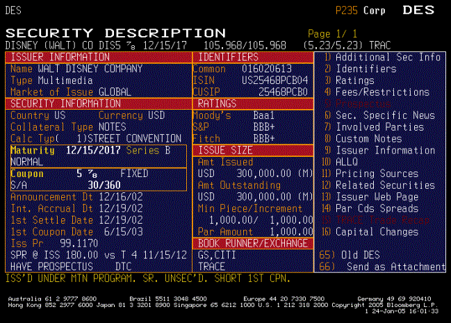
Can a poor user interface actually be a selling point for a product? For financial information services company Bloomberg, it can.

Can a poor user interface actually be a selling point for a product?
For financial information services company Bloomberg, it can. The company's iconic data-spewing terminals offer streams of info in yellow and orange text on a black background, among other design no-nos.
But when a global design firm attempted to revamp the terminal in 2007, they discovered that Bloomberg's users were very, very attached to its poor usability.
Want to know more? Read the rest on SmartPlanet's Smart Takes blog.