Google Plus gets a new look and feel (Review)

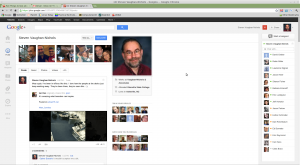
I've been a happy user of Google Plus since its early days.. Now, with its recently revised interface and functionality, Google+ is indeed a bit simpler and more beautiful, but... it still have some blemishes. Such as, what the heck is that large swatch of white space anyway? Bur more about that later. First, the good stuff.
Google Plus, which now has 170-million users according to Vic Gundotra, a Google senior vice president, has been redesigned to make it easier to use and more attractive. The first feature you'll notice is the left-hand Google Plus menu-bar, the “ribbon.” From it you can quickly go to your favorite Google Plus service.
And, I do mean your favorite service. Google makes it possible for you to edit the ribbon, So, for example, you can place your favorite service on the top. Or, if you don't care for one—I have no real use for social network games—drop them in the bottom-right “More” box. If you hover hover over some applications you'll also be presented with a set of quick actions for them. For example, if you hover over the photos app, you'll get options to add images from your phone or an online album.
Say hello to the new look of Google Plus (screenshots)
It's also a lot easier to start video hangouts. These are free video-conferences. You can have up to ten people in a hangout. It's always been a nice feature, but a trifle hidden. Now, it's right on the ribbon. Once in it, it's also easy to pick and choose who you want to join you in your impromptu video-conference.
Some of the changes seem to be purely cosmetic. For example, what Google calls an Activity drawer is just a slide-out box that displays +1s and any reshares of your post. That information used to be displayed below all posts. In the new Google Plus vocabulary, a Card is the box that contains posts and everything that goes with it such as comments, plus ones, shares, etc., etc. Gundotrra says, “stream of conversation 'cards' that make it easier to scan and join discussions.” I don't see any real difference between this and the old way.
One thing, which wasn't spelled out, is that when you now add pictures to your Google+ account, you can also give them a quick clean-up with the built-in photo editor. It's not going to replace Photoshop, but by integrating with Google's Web-based Picasa photo editor it does make it dead easy to neaten up photos you want to share with friends and family.
There's also a new Explore page. This is meant to keep you up to date with what's new and happening with Google+. So far, I don't find this very interesting. I withholding final judgment on it though until I see what Google has in mind for it.
There are also several small nice features. For example, shades of Twitter and it's trends display, a Trending on Google+ display on the home page.
Each of your circles also now has a slider that you use to determine how much of each circle's message feed makes it to your main all-circles feed. For example, I have my friends and family circles set to forward everything to my main stream. My Google Tech circle, which just has Google developers and engineers in it, is set to only display a few things on my main feed. If I want to know what's going on at the Google campus, I just head directly to that circle.
One last point, now that I've used the new G+ for almost a day, I've noticed a really annoying change: Comments to a post are now displayed in light gray on white. What the heck is that all about? I want to be able to read those comments, not squint at them! I want black fonts on a white background and I want it now.
This new look and feel, however, doesn't extend to Google+ on tablets and smartphones. They'll have to wait for another day. I suspect, we're going to wait for Google to finish up its plans for the white space, before we need a major overhaul of its mobile applications.
Last, but not least, there's the “Whitespace.” On big monitors, this is a honking huge whitespace between the main news feed and my online friends list. What's going to go there? We don't know. We do know that Google plans to put something there. What? Well, some of the best funny guesses I've seen include pictures of cats, porn, and that all time favorite: Bacon, yummy, yummy bacon.
On a more serous note, I suspect Google may be getting ready to let is put informative gadgets ala iGoogle in it. Then again they may put a YouTube TV video feed in it. Alas, I also strongly suspect that that at least some of that space will be given over to ads. I mean, it has to happen eventually right?
Related Stories:
Google+ Hangouts even more collaborative with Google Docs
Google’s new privacy rules: Get over it already
Google search: This time it’s personal
Microsoft: We're not involved in an antitrust complaint over Google+
