The Great Vista/Mac Showdown: Desktop convergence

The return to the Mac/Vista showdown has been languishing as I actually used the two systems for a while. During the past few weeks, I’ve found that I continually gravitate to the MacBook Pro because of its deep integration between the hardware and software. It has shortcomings, but the system is so much more responsive on startup, waking from sleep and maintaining connections as I move from one place to another than with a Vista PC.
Yet, based on the experience of using Vista, I am convinced that Windows is much improved. How, though, to explain the remaining differences? In previous installments, I’ve examined packaging, memory management, networking, Bluetooth and system migration. Now, it’s time to look at the day-to-day experience, starting with life on the desktop.
The Vista desktop and Mac OS X desktops are very similar, because they've both evolved from the same background, the various experiments in computing by Xerox PARC in the 1970s. PARC veteran Larry Tesler, in particular, along with Bill Atkinson, who while working on the Apple Lisa and Mac desktop user experiences came up with the implementations of most of the features we are familiar with today: Pull-down menus; mouse-based navigation and pop-up menus.
So, today, desktop navigation revolves around folders, files, pop-up menus and mouse-clicks. Consider the results of Right-clicking the Vista desktop (below right) compared to CTRL+clicking the Mac OS X desktop (below left):
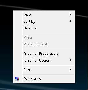
Pretty similar, both in design and content. Windows Vista, however, hews to the Microsoft focus on customization of the view while the Mac pop-up is aimed more at functionality the user may need just at that moment, such as creating a folder or folder for burning a writable optical disc. True, you can find the New Folder command, as well as handy shortcut, compressed folder and Briefcase folders, one layer below this top-level Vista pop-up (see below), but I just don't see the point in being able to create a wide range of application files from the desktop. It's an example of how Microsoft pours so many options into the UI that the simplicity of the system is lost in presented options.
Like most folks, including Larry Tesler, who initially advocated fervently for a one-button mouse, I've embraced the three-button mouse because it makes simple physical commands more convenient by reducing key combinations to a one-hand operation. Yet, the Vista desktop commands are accessible through only the right-click and are still oriented to the customization of the view of folders and files. The Graphics Properties and Options as much as the View and Sort By commands are about changing the display of data rather than accomplishing the tasks I associate with a desktop.
Windows relies more keyboard shortcuts, generally, and the Mac has gravitated in that direction over the years. But my memory isn’t tuned to things like three-key commands. I rely on the commands accessible through the mouse-click, regardless of the OS. On the Mac, I have to try different F keys to find the command that opens the Widgets panel. I do know the print keyboard command (z-P) on the Mac, but select Print from the File Menu in Windows applications and on the desktop.
Mac OS always presents its basic menu set at the top of the screen, providing far more flexibility from a static set of menus than the complicated combo-clicking available in Vista. The emphasis on customization in Windows, as I explained near the beginning of this series, stems from the wider range of hardware on which that OS runs, which demands more capability than may be needed for simple user experience.
Now, you may love keyboard shortcuts. More power to you. I'm more interested in keeping my mind on the content I am trying to get out of it onto a page than remembering how to indent or change the desktop background with a couple keystrokes. For me, then, the Mac remains a more undertstandable and pleasing desktop.
Next, we'll look at how the options multiply as one begins to explore using files from the desktop.