An Event Apart 2008: Day 2

The second day of An Event Apart will feature plenty of web standards jargon. I will be posting photos and notes from today's events.
Unfortunately, the slides are reserved for attendees only, but I will try to gather as much information as possible.
8:23 a.m. Jeremy Keith, Derek Featherstone, and Jeffrey Zeldman discussing today's presentations:
8:29 a.m. Keith is taking a souvenier photograph of the AEA crowd:
Patterns in the Process
Jeremy Keith, Clear Left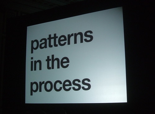
There are different phases of design patterns: discovery, content, information architecture, visual design, templates.
We have a client worksheet that people can download if they want to see how much it costs
Copy writing is interface design. Setting a tone of voice and sticking to it can really impact the user's experience.
It's okay to be silly sometimes too. Humor makes people feel comfortable.
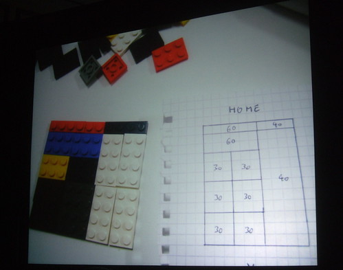
Post-it notes are a great tool. You can easily move them around or modify them. Using paper and pen is the most natural form of design. Clear Left makes wireframes in HTML and CSS because you can sit down with a client and interact with it.
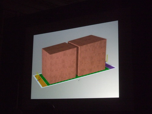
Visual designers take these wireframes and draw on top of it. It's more fun when you use LEGOs actually:

We see many patterns in forms, tables, and microformats. What is the best way to mark up a form? Everybody has a different way of doing it. Your way is right.
Web development is a mess; we are all making it up as we go along. But processes are good. But as you go through different projects, you will always be tweaking things. We're all flying byt the seat of our pants in this industry.
Cool links from the presentation:
- Edenbee
- Elf Cartel
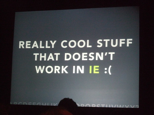
- Dean Edwards' IE7. This is like a browser tax for IE6 users because they have to download one extra file.
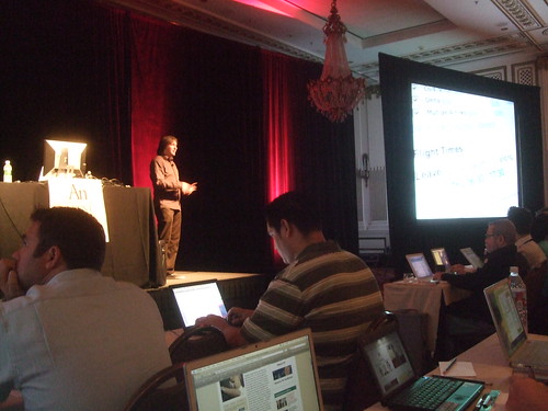
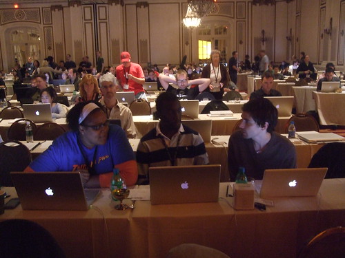
9:25 a.m. The room fills up as the morning progresses:
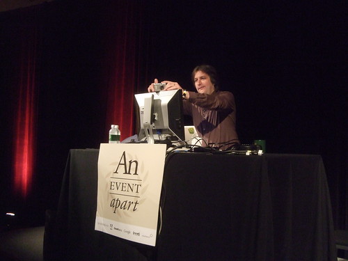
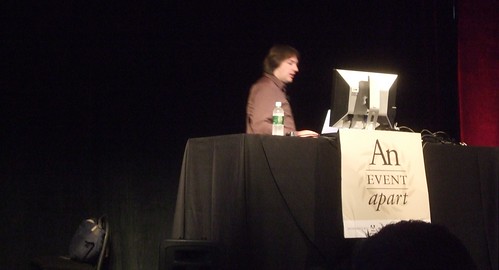
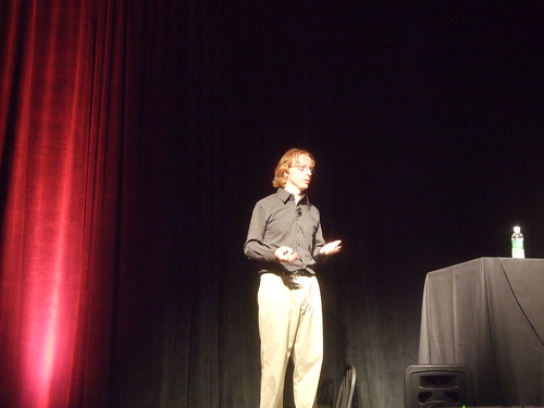
9:34 a.m. CSS king Eric Meyer prepares for his presentation on debugging:
Debug / Reboot
Eric Meyer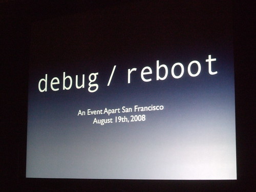
Great tools for debugging:
In the process of building debug stylesheets, I've uncovered some dusty old parts of CSS.
There is an :empty pseudo element that lets you see which elements are empty.
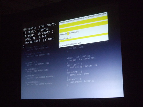
You can use img[alt==""] { border: 3px dotted red; } to see which images in your pages don't have alt atributes.
Use a[href="#"], a[href="#"] { border: 3px dotted lime } to identify bad links.
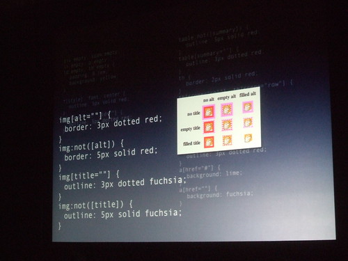
Eric Meyer finds all the little invalidities of HTML and calls them out with bright colors in his debugging styles.
His reset.css script continues to be the industry standard when resetting browsers.
Stay away from the universal selector (*). It applies to every element, including form elements. So even the default "submit" text in a form element would have no padding, thus making it really close to the borders.
10:59 a.m. The xylophone dings and it's time to get back to your seat:
11:15 a.m. Derek Featherstone is speaking about accessibility. I am taking some notes, but I also have to publish a new video on ZDNet. CIO Session with Dan Farber and CIO Brian Shield fromWeather Channel if you want.
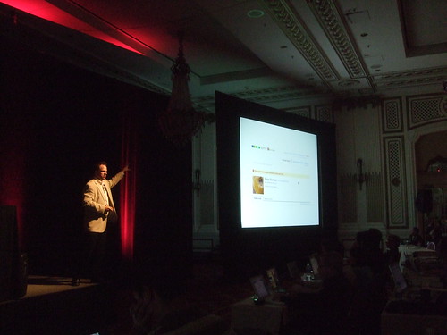
Accessibility Beyond Compliance
Derek Featherstone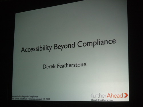
Accessibility is definitely part of the user experience today.
Raised lettering is now complementing braille. The cool thing about this is the angle of the sign. The disabled person can read the raised lettering with their fingers, and optionally read the braille with their thumb.
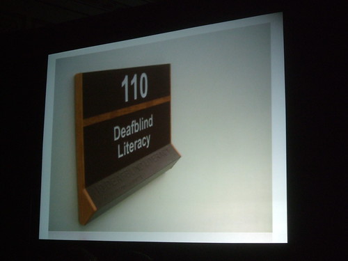
This is a useful alternative.
In web browsers, there are plenty of accessibility features built into languages now.
A small barrier can become a big one for a person with a disability. When using a tabbed keyboard interface, make sure that after an action is taken, you don't bring the user back to the top of the page.
To make it accessible, the keyboard or voice-recognition software needs to be functional.
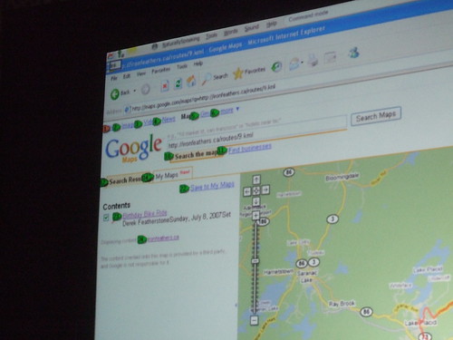
Google Maps has a custom set of tools for panning around the map and zooming in. They have a voice-activated mouse grid that lets the user zoom in on certain parts of the screen in a very detailed way. Since GMaps' tools aren't accessible with a keyboard, you can use this.
Flickr has an alternative interface for their "click-to-edit" titles and description fields. In their search bar, they use <label> correctly so a deaf person could easily tab around.
12:01 p.m. ZDNet's technical production team is attending An Event Apart:
12:11 p.m. Eric Meyer talking with an attendee:
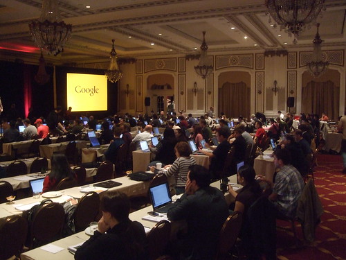
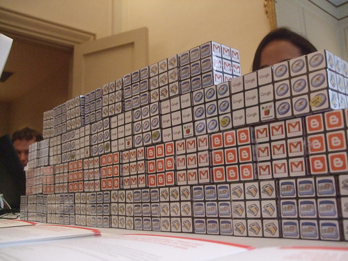
12:15 p.m. Google has a wall of cubes to give out:
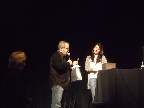
12:17 p.m. They are giving away prizes: an iPod Touch and some copies of Adobe Creative Suite CS3:
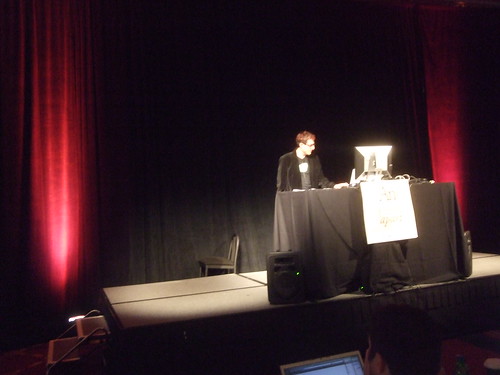
Better User Experience Through Microformats
Tantek Çelik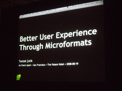
What is a better user experience? Less pain, faster surfing, more empowering ("Wow, I just performed magic."), and overall happiness.
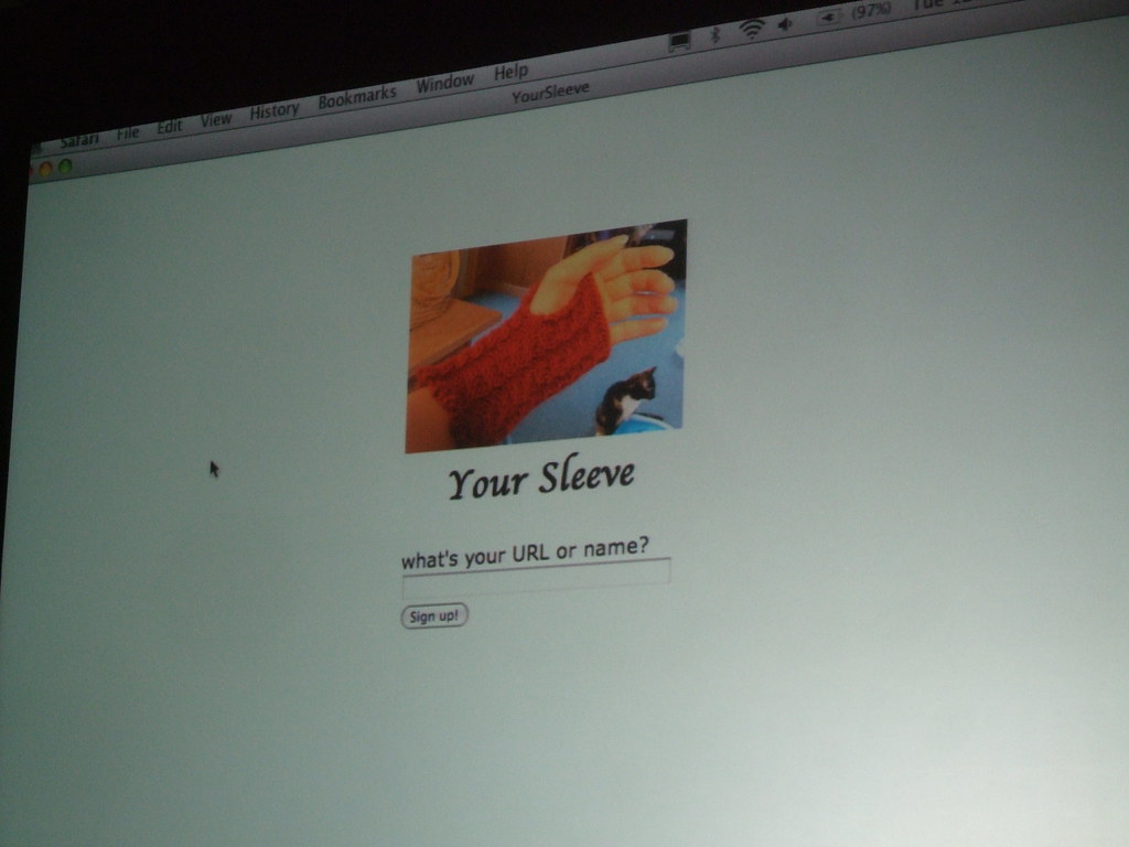
If you could install one piece of software today, it should be Operator for Firefox. When using Google Maps, it runs through all the hCards on the page and allows you to add them to your address book easily.
There is a magic search engine now that scans the social web for your hCards called Dosi.
The hListing microformat would be huge if Craigslist implemented it.
GetSatisfaction uses microformats to pull in your social data from your services right in the signup screen.
The ideal signup screen of the future would only have one line and one submit button.
Social networks are using your handle on one site to find friends on the other site. A social network dance is when you meet someone and add them on one site, and then try to add them on every site.
1:14 p.m. Lunch time! The dessert was great:

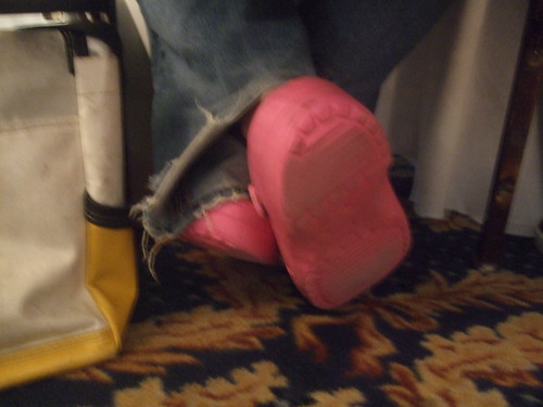
1:42 p.m. Jeffrey Zeldman is spotted wearing pink shoes:

2.0 Workflow: Merging Agile and UCD
Kelly Goto
The big ball of mud is a "haphazardly structured, sprawling, sloppy, spaghetti code jungle" was coined by Joseph Yoger in 1997.
- Quickly release your 1.0 junky code
- Deliver a 2.0 versino of the system, and you rjunky code slows you down a little bit
- As you attempt your future releases, your code gets so bad that you have to do a total rewrite.
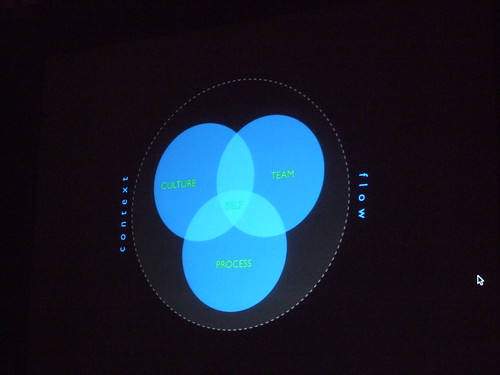
The cure is a flexible, adaptive, feedback-driven development process.
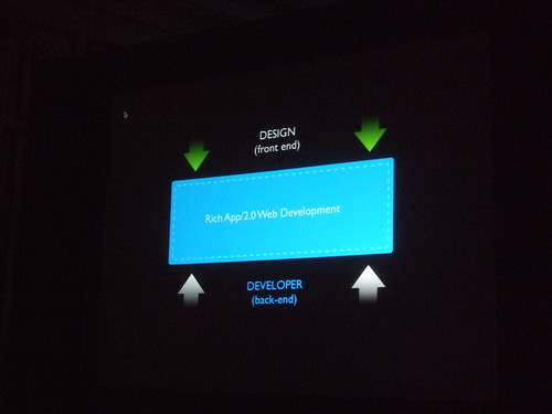
There is a rich application environment now that bridges the gap between design and developer.
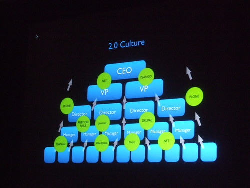
In the 2.0 world, this layer of the corporate structure is upside down too, so the lowly developers are teaching the CEO about new technologies.
Agile programming isn't just about getting software up there quickly; it's about planning and production.
We want to be more 'user-centric' but lack time, budget, and expertise. We have inconsistencies in processes. We don't have the right team or resources.
When you goto a restaurant, you do a bunch of things; sit down, order, eat, pay, etc. The overall difference than eating at home is the novelty of eating out. Try to sit in the user's seat at the dinner table.
An integrated design process goes from concept to build to testing to release. During this process, think about the user's needs all the time.
Many AEA attendees use the SCRUM software development process. Others just do cowboy coding (someone who does their own thing).
Focus less on documentation and more on communication.
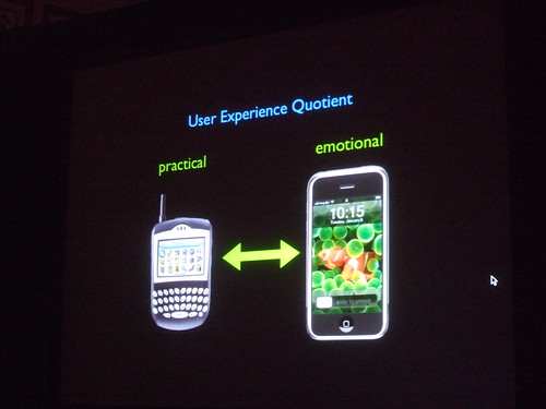
Think about the user experience quotient. Practical vs. emotional. What are people thinking about doing? How satisfied is the user?
Designing The Future Web
Jeffrey Veen, from Hotwired to Adaptive Path to Google
There is data everywhere.
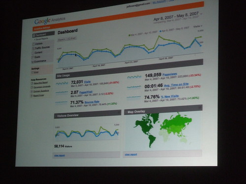
How do you make it engaging? Don't make me think, just tell me the story; give me access. I need to know what's actionable.
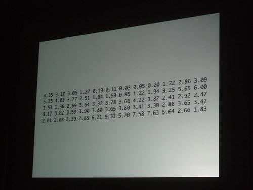
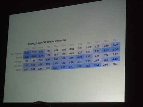
Start with the raw data:
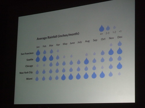
Dress it up with some color:
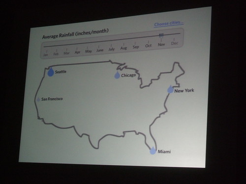
Add some better visualization:
Then use your imagination:
Think about the penny. There is $2,000,353,186.72 worth of pennies in the world. How would you visualize that?
“Our country uses 2 million bottles every five minutes. Statistics can feel abstract and anesthetizing, making it difficult to connect with and make meaning.” -Chris Jordan
Instead of designing the experience, give the user tools so they can define their own experience
Assign different visual cues to each dimension of the data. Remove everything that isn't telling the story.
The data itself becomes the navigation to change the data.
Cool sites from this presentation: