Web Form Design Best Practices, 2010

The most common element you see on any web page is a form. Some place to enter in some data; whether it be your username and password, or a wall post on your mom's Facebook wall.

Luke Wroblewski is a pro at web form design. He was an afternoon speaker at An Event Apart in San Francisco today.
In general, forms suck.
YouTube has updated their upload form a lot over the years. The numbers don't lie either, the design of the form matter. They went from 65k in July of 2006 to 234k in November of 2008.
Let's start from the beginning. The primary goal of every form is completion. How can you make the user experience as painless as possible and still get their information correct?
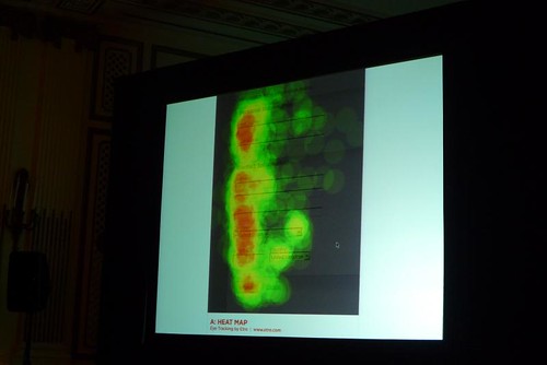
Most people's visual attention is focused on a vertical line at the beginning of each form element. They want to know what's needed to complete the job.
You should have everything line up nicely, even the submit button. Give people an indication on all of the steps that are involved. Use progress indicators to communicate the scope, status, and position.
People see input fields and jump right in. Put the label of the form field above or before the actual input field. If you are asking people questions about stuff they already know, they don't need to spend time looking for the label.
When you put labels inside of the form element, make sure there is a way for you to keep the label active when the user is typing.
Automatic inline help text exposure is good. That means give the user a small notice when the complete a form field successfully. The most important thing is consistency. Twitter and Gowalla do this really well.

You know those password indicators that let you know how strong your password is? Sometimes they are not a good idea because the user can never make their password too secure. They will always try to type the most hard-to-remember, cryptic password, and then they will forget it.
Not a bad idea to add some humor to the mix. Yahoo's form validation is really smart:

Don't fire off error messages too fast. And make sure the errors are actually errors:

Don't start validating the form until the user unfocuses their cursor from the form field.
Give people an opportunity to auto-complete a form. Think Google Suggest or Kayak:

Simple thing: make the submit button look different than the cancel button. No one clicks cancel or reset anyway. Avoid secondary actions all together if you can.
Use conversational dialog, but not too much help text. Forms are everywhere, we see enough help text.
More from Event Apart 2009: