Google+ gets a makeover

Google has revamped the layout on Google+, with the aim of making its social network better looking and easier to use.
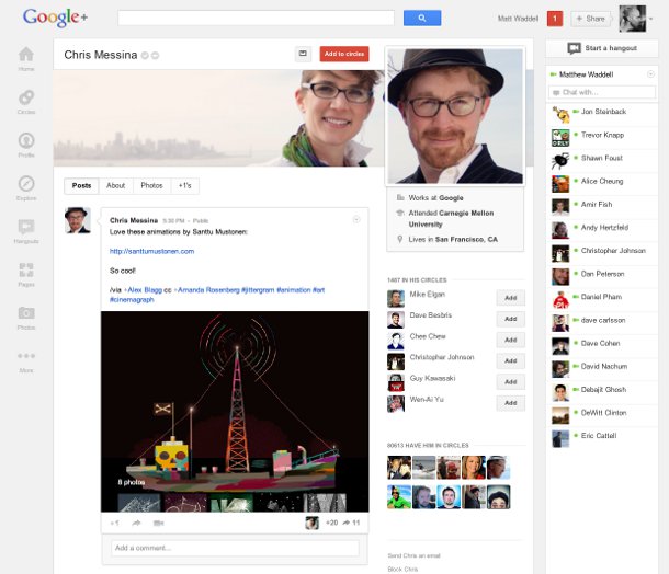
As part of the redesign, introduced on Wednesday, the icons at the top of the page have been replaced with a ribbon on the left of the page. People can now edit the icons to put their favourites in prime position or remove those they rarely use, and hovering over the icons produces a list of "quick actions", Google said.

Google+ profiles have been redesigned to put more stress on photos and to move icons to a left-hand ribbon. Image credit: Google
All photos and videos posted to Google+ will be full bleed, as part of the beauty enhancements. In addition, there is now a separate Hangouts page where people can see invitations to video conferences from contacts in their circles and get quick access to watch or join public live video Hangouts. Other changes include a new 'Explore' page that shows popular Google+ pages across the whole social network, a new profile page with larger photos, and a chat list that highlights people you know.
The new design has come in for ribbing from users. Some have begun posting wacky uses of the large amount of white space now found on the right side of a Google+ stream, with some suggesting it as a good place to put beer, or allow your cat to hang out.
However, Google notes that there are more features in the pipeline, and this space may end up put to that use.
"We've... built the ribbon with the future in mind, giving us an obvious (and clutter-free) space for The Next Big Feature, and The Feature After That. So stay tuned," it said.