Microsoft: Time to bury live tiles

Square colorful tiles that flash useless information alongside other tiles on the screen doing the same thing. Distracting bits of tiny text that are rarely looked at and totally unnecessary. These are live tiles that make up the lion’s share of the interfaces in Windows Phone and Windows 8. They are so useless they need to go away, and soon.
A lot was said about live tiles when they first appeared on Windows Phone a few years ago. The reaction to them ranged from those who found them innovative to those who absolutely hated them.
Then they appeared in Windows 8 and got much the same response. Colorful tiles that flash vital information, like the latest Twitter update, from someone in the user’s contact list.
Live tiles might be OK for some, but for many of us there is no warm, fuzzy feeling when we start our Windows device.
It’s time for live tiles to go away. They are the primary reason that I never liked Windows Phone. I always found that they waste space on the Windows Phone home screen, while distracting me with information displayed in an annoying rolling fashion. It doesn’t help that the information is never what I want. I blame live tiles directly for my inability to connect in an emotional way with the Windows Phone interface.
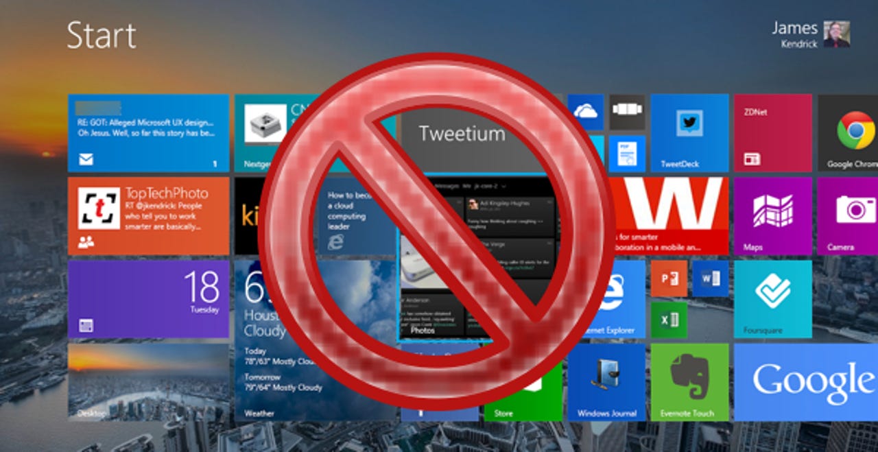
I’m beginning to feel the same way with live tiles on the Start screen in Windows 8. Large, blocky squares and rectangles that run into one another and keep flashing with rolling information that is rarely, if ever, of use to me. I constantly find myself reaching for a particular app, only to be bombarded by all these tiles with rolling tickers. It’s a constant distraction, and I often end up finding the app I want by the background color of the tile.
In this day and age that’s a travesty. It’s not a carefully thought out organizational scheme or helpful icon that lets me quickly find the app I want. It’s the color of the background on the tile that I usually end up spotting. That’s because the tile probably has flashing text in a tiny font rolling on the tile that makes the background color the only attribute to get my undivided attention.
Sure I could turn the live tile updates off, but then there would just be a sea of blocky color tiles staring at me all day. I’d still be looking for the color I want, and the problem is more than one app has the same color. It’s not automatic, even though I carefully arranged the live tiles in the order I want. I still have to stop, look all over the screen, and then finally tap the proper tile to run the app I need.
This doesn’t make it hard to use Windows 8, but it prevents me from forming any attachment to the interface. It never feels entirely natural, and that’s a big deal for a tablet interface in particular. I am confident I’m not in the minority with these feelings, or lack of them, given the constant negative comments online about Windows 8. It’s not so much the OS people are hating, it’s the UI. The live tiles in particular are widely criticized.
Featured
The interfaces of iOS and Android are far from perfect, but users are able to develop an attachment, a bond if you will, to their personal configuration. Home screens have all of the icons the user wants, right where they put them. In the case of Android there are widgets, too. The comfortable feeling users get when they turn on their iOS or Android phone and tablet signals that they are home.
That’s largely due to the use of icons for apps instead of cold tiles. If you don’t believe that just look at the outcry when an app or OS update changes the icon(s). It’s not an objection solely to the look of the icon(s), it’s the loss of the familiar, and that temporarily breaks the bond the user has with his or her familiar home screen.
The bond is totally absent for me with Windows Phone and Windows 8. Live tiles might be OK for some, but for many of us there is no warm, fuzzy feeling when we start our Windows device. That’s due to those blocky live tiles that add little value to the UX. There’s no up side to them, especially on tablets that are in your face.
Microsoft needs to lose the live tiles, or many Windows users will never form an attachment to the interfaces as they do with other platforms. There will continue to be those like my buddy Matt Miller, formerly the most devout Windows Phone enthusiast I know, who put Windows on the shelf. Live tiles are of limited value, don’t make the interface easy to use, and they are just cold blocks on the screen. To quote Matt, “I am tired of live tiles”.
Windows Phone and Windows 8 are very functional with live tiles, that's not the issue. The problem is that all the blinking and flashing is distracting, and that prevents me from getting comfortable when I fire up my device. I want my stuff to be where I put, quietly waiting for me to get busy. I can't do that with the live tiles in Windows, so please, Microsoft, get rid of them.
See related: