Image Gallery: Windows Mobile 6.5 disappoints with lack of customization and stylus requirement

I had high hopes for Windows Mobile 6.5 to at least provide a better touch experience, but it only does so on a basic level. We now see no customization support in the Start menu or Today screen and an overall lack of consistency across the platform. Windows Mobile needs major work and I am not sure people are willing to wait until the end of 2010 for Windows Mobile 7.
There are lots of new icons provided in the Start menu.
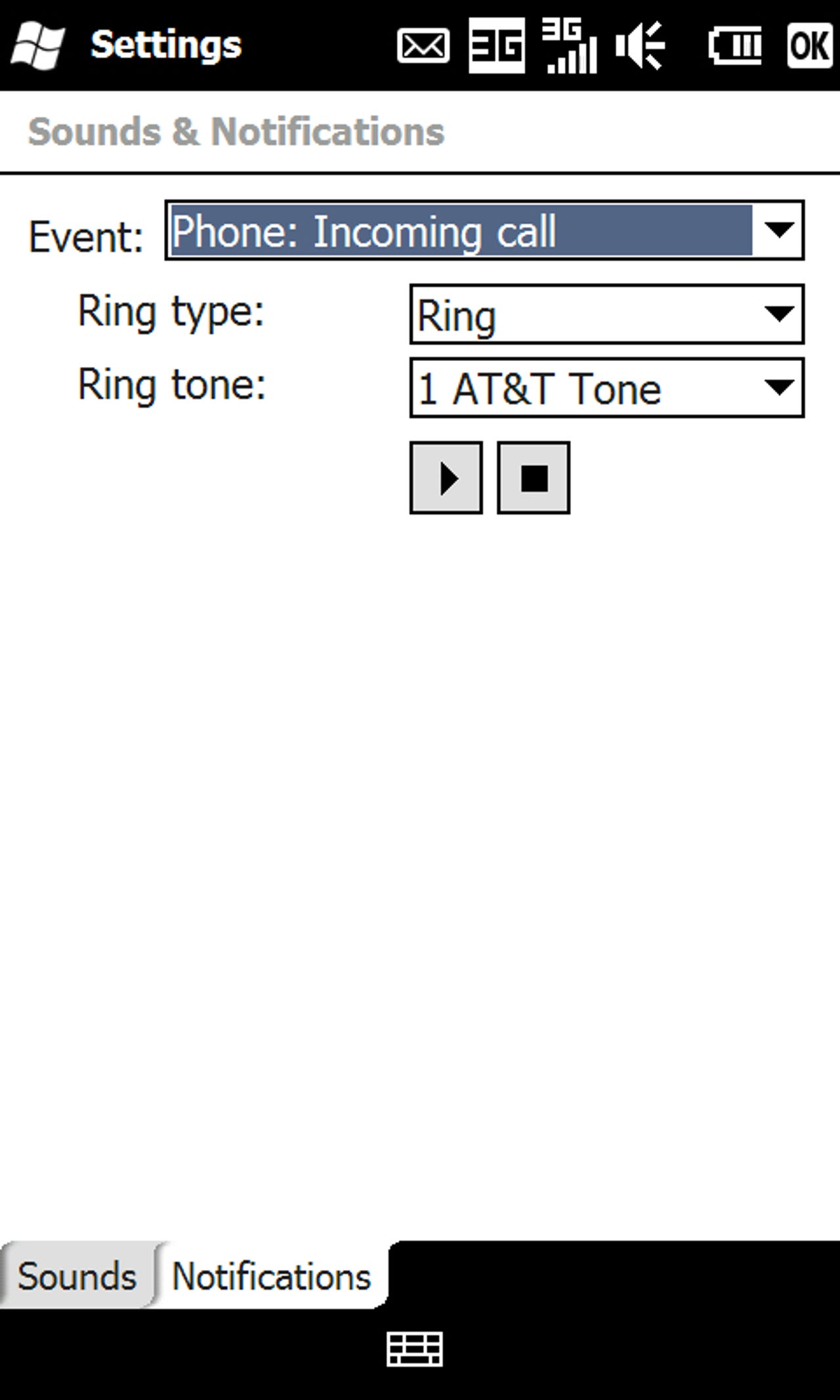
The Settings look different at one level, but further down go back to the same as always.
All you can do with the icons on the Start menu/page is move them to the top. You cannot add, remove, place them where you want, or organize by folders.
The updated Internet Explorer Mobile browser is pretty good and gives you access to full Internet pages.
The toolbar auto hides and gives you quick button access to the main functions.
As you can see beauty isn't even skin deep in Windows Mobile 6.5.
Pull out that stylus, Windows Mobile is alive.
The more traditional 3 wide grid is provided on the Traveler 137.
Flicking up and down is required in WM 6.5.
The Today screen brings the sliding panels from WM 6.1 Standard (non-touchscreen) devices to the touch screen.
The right soft key changes with the selected utility on the Today screen.
You can select an image for the wallpaper too.
I just can't believe that this media player comes out of the same company that made the Zune HD. This is embarrassing Microsoft.
Thumbnail 1
Thumbnail 2