Eight changes I'd like to see in Windows 8.1 (but probably won't)

Make it possible to pin the charms menu so it's always visible
One of the most common objections I hear to the charms menu is that it’s too hard to find.
You summon the five charms with a swipe of the mouse to the upper or lower right corner, or with the keyboard shortcut Windows key + C.
The trouble with that is that the hidden charms menu is hard to reach, requiring a gesture all the way to the upper right corner, followed by a swipe down to the Search charm.
But what if you could pin the charms menu so it were always present? That menu is a mere 86 pixels in width, which still allows plenty of room for your apps and even the desktop, as this mockup shows. And with the charms visible, it would be much easier to search or share, or do anything else that would otherwise require multiple gestures.
See also:
- Windows 8.1 unveiled: will it change your mind about Windows 8?
- A closer look at what's new in Windows 8.1
Add Power options to the Start screen
If you want to shut down or restart your Windows 8 device or force it into sleep mode, you have to make the charms menu visible, then click Settings, then click the Power button, and then, finally, choose one of the options on that menu.
Wouldn’t it be easier if those power options were on the Start screen menu? After years of using Windows 7, that’s where I’ve been trained to look. On the old Start menu, the options to sign out, switch user, and lock the screen are in the same place as Shut Down, Sleep and Restart. So why split those functions? Why not put Power at the bottom of that Start screen menu in Windows 8?
See also:
- Windows 8.1 unveiled: will it change your mind about Windows 8?
- A closer look at what's new in Windows 8.1
Make the date and time persistent on the Start screen
If your vision’s good enough, you can always tell what time it is in Windows 7. The current date and time are always visible at the right side of the taskbar.
But the same isn’t true of the Windows 8 Start screen. With its live tiles, it’s supposed to be a place where you can get crucial information at a glance. So why is the clock hidden?
In Windows 8, the only way to see the current time is to show the charms menu, which requires a separate gesture or keyboard shortcut.
I’d love to see the current date and time permanently displayed on Start, perhaps in a bar along the bottom of the screen, to the right of the new Start button. In that configuration, you could always check the time by tapping the Windows key to go to Start, and then tapping it again to return to your previous app.
See also:
- Windows 8.1 unveiled: will it change your mind about Windows 8?
- A closer look at what's new in Windows 8.1
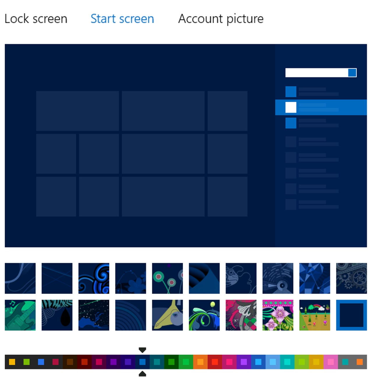
Provide a low-intensity color scheme for tiles
I understand why tiles use bright colors and also why they can’t be customized. The idea is to allow apps to control their own branding. I know the Store tile is green and the Messaging tile is purple, which makes it easier for me to spot them on the screen no matter where they’re pinned.
But do they have to be Day-Glo?
The Personalization options in PC Settings let you choose a color palette for the Start screen. In Windows 8.1, Microsoft plans to expand that color selection significantly, so you can have a much more subtle, nuanced combination of colors as your background for the Start screen and for other interface elements. But those tiles are going to remain bright.
How difficult do you think it would be to offer a low-intensity color scheme for app tiles, one that dials the Day-Glo back to Just Another Sunny Day? Maybe then I could stop reaching for my sunglasses every time the Start screen pops up.
See also:
- Windows 8.1 unveiled: will it change your mind about Windows 8?
- A closer look at what's new in Windows 8.1
Better notifications management, please
The good news: Windows 8 apps can pop up a notification to let you know about important things like appointment reminders, incoming Skype calls, and new messages in your email inbox or your Twitter DM column. The notifications (you control which apps are allowed to interrupt you) pop up over the Start screen, over Windows 8 apps, over the desktop, even over the lock screen.
The bad news: Those notifications go away after a few seconds. If you step away from your desk for a few minutes, you might not know you had several people urgently trying to reach you via Messaging or that you’re running late for an appointment.
Windows 8.1 really needs a way to tell you that you’ve missed some notifications along with a way to review them.
See also:
- Windows 8.1 unveiled: will it change your mind about Windows 8?
- A closer look at what's new in Windows 8.1
Make it easier to snap a backup image
Windows 8 includes two new options for restoring your system in the event that you want to get a fresh start. You can refresh your Windows installation, preserving your data files, or you can completely reset your PC, wiping out all user data.
Those are nice new features to have, but why was the option to create a complete backup image demoted and hidden as Windows 7 File Recovery? And why can’t you easily create a custom image of your system that reflects your changes instead of the original image as shipped by the system manufacturer?
See also:
- Windows 8.1 unveiled: will it change your mind about Windows 8?
- A closer look at what's new in Windows 8.1
Add a Quick Launch bar to the charms menu
In earlier versions of Windows, Microsoft has always included a way to designate some of your programs as favorites, with easy ways to get to them more quickly. You could pin those programs to the top of the Start menu or add them to the Quick Launch bar, for example. And for desktop programs you’ve pinned to the taskbar, you can use keyboard shortcuts (Windows key + 1, Windows key + 2, etc.) to launch them quickly.
Windows 8 doesn’t offer any quick and easy way to get to your favorite Windows apps. That seems like an oversight. Why not offer up some of the ample free space on the charms menu as a place to pin icons for favorite programs? With the new smaller tile size in Windows 8.1, it seems like a logical addition. Here’s a mockup that shows what it might look like.
See also:
- Windows 8.1 unveiled: will it change your mind about Windows 8?
- A closer look at what's new in Windows 8.1
Add a visual cue for the charms menu
With Windows 8.1, Microsoft is adding a Start tip on the taskbar. That change addresses a usability problem with the original Windows 8 design, which offered no visual indication that clicking in the lower left corner was the way to get to the Start screen.
But what about the charms menu? Doesn’t it deserve a visual cue as well? How is a new or casual Windows 8 user supposed to know that the corners on the right side of the screen also lead to important new elements?
One solution might be to add a visual cue on the right side of the screen that hints at the existence of the charms menu. In fact, why not borrow the same design already used to separate snapped panes? That’s what I’ve done in the mockup shown here. The slim bar only takes up 22 pixels, but those three dots in the center add an unmistakable visual hint that something else is available there.
See also:
- Windows 8.1 unveiled: will it change your mind about Windows 8?
- A closer look at what's new in Windows 8.1