Windows Phone 8.1: A bittersweet update that appeals to the mainstream

Windows Phone 8.1 is crammed with great new features. Not just the big name ones like the Cortana assistant and the swipe keyboard (which works using the same kind of word prediction as T9 so you only have to hit a three letter block as you draw, not exactly the right letter), but great little extras.
Along with the full IE11 browser complete with hardware-accelerated WebGL, you get remote tabs — on your PC, you can get a list of the tabs you have open on your phone if you'd rather see them on a bigger screen. If you're always hitting the comma instead of the spacebar on the keyboard you can hide it. On an unlocked AT&T Lumia 1020 with a T-Mobile SIM, data sense worked for the first time.
There are plenty of reasons to want Windows Phone 8.1. But there are also some changes you may find an infuriating step backwards from the Windows Phone philosophy of simplicity and integration and "getting it done".
If you liked the clean, simple approach of the People hub where you could see all the comments from all your friends on Facebook (not just the ones Facebook thinks are interesting) combined with updates from Twitter and LinkedIn so you could see all the comments in one place, you get about half the experience.
You can still see those updates together, but if you want to read comments on a Facebook post or add your own, you're plunged into the busy Facebook app, with a completely different interface. When the compatible Twitter app comes out, that will do the same, which means you have to tap in slightly different places on the tweet depending on whether you want to reply to it, retweet it or open a link in it.
Gone is the simple, unified experience, but you may not feel you're getting extra features to make up for it either. You can't see a post and the comments on the same page, because Facebook seems to think phone users don't know how to scroll.
But you do get the trademark white and blue interface so you can't forget you're on Facebook (I suspect that's the point of the change). You can no longer copy text from a Facebook post, even if it's your own.
And you might want to do that because you can no longer share to a group of social networks; you have to pick one at a time, because that launches each app for you to post — so yes, you have to install apps for Facebook and Twitter and LinkedIn even if you didn't need them before. You can try copying your words before you post them, but by the time you get back from the Facebook app to post to Twitter the clipboard has usually emptied itself.
Sharing photos now takes you through the sharing experience on each app. On the current version of Twitter, that means jumping past filters and effects I don't want every time I post an image; the reason I use a Lumia 1020 is that the photos are good enough to publish, so no, I don't want your cheesy 70s effects.
The Twitter beta changes that, but it's not officially released yet. And now that photo sharing is through the specific apps, you're no longer creating a caption that gets picked up in the photo gallery and when you share an image on another social network.
I was lamenting the loss of a persistent caption and a helpful Microsoft person popped up asking me to report it as feedback in the Facebook app. After we discussed why I liked it, they said they would try writing a multi-network photo posting app in their spare time, so I'm waiting eagerly for that.
Perhaps someone will also make an app that brings back the ability to post to multiple social networks that used to be built into the OS. Or perhaps no developer will do it, because who will pay for what used to be in the OS?
Oh, and until Twitter and LinkedIn update their apps, the only way I've found to post links to either network is to copy the URL by hand to each client because Twitter and LinkedIn don't show on the list of options when you choose Share Page from IE (if you were fast enough to grab the Twitter beta when it was briefly available it is on the share list but it's not generally available yet).
Being able to send a URL to three social networks with a single share link was extremely useful; not only is it so much work on Windows Phone 8.1 that I might not bother, at this point in the preview it doesn't actually work. Waiting for apps is one of the reasons why this is still a preview, but it's more than that.
By taking all this functionality out of the OS, Microsoft has made what used to be the social phone a hostage to third party apps.
It means that you can have integration with social networks that Microsoft hasn't built in, but only if those social networks do the work of making an app. It's an admission that Facebook and Instagram and the other networks have more power than Microsoft in mobile. But if they wouldn't open up APIs to Microsoft will they really build apps that work well on Windows Phone, keep them up to date and make them fit in?
The Facebook app is a good example; it looks more like an iOS app than a Windows Phone one, and most of all it looks like the Facebook web site. Which is a shame, because getting Facebook without putting up with the Facebook interface used to be one of the real benefits of Windows Phone.
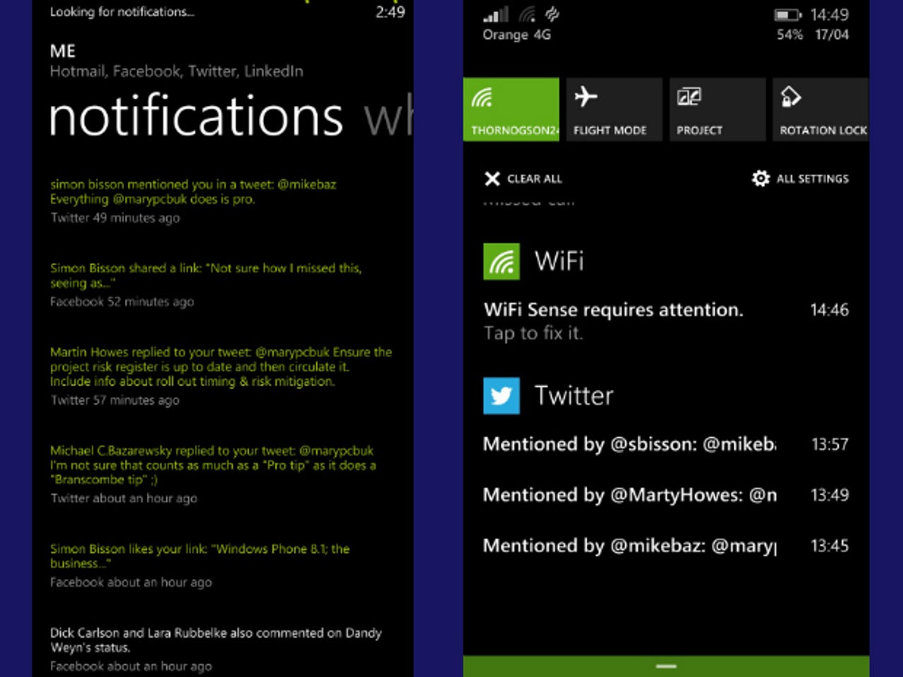
But what I miss the most is a feature all the people clamouring for a notification centre seem not to have noticed; the notification hub on the Me tile. It was one of the lively, humanizing tiles on the start screen; seeing it flip over to reveal a message from a friend felt like someone was waving to me.
Now it feels like a pointless act of narcissism to have it on screen at all. After all, I know what I look like and since posting updates from the Me tile actually means opening each app in turn and writing my pithy phrasing out by hand each time, it's no more work to open each app directly.
Yes, apps can integrate themselves with the check-in feature without Microsoft doing the work and maybe once more of them do the Me tile will feel useful again, but it's not much more direct than having a tile pinned to do that.
Tech Pro Research
I have to keep the Twitter and Facebook apps pinned to the Start screen anyway because the new Action Center doesn't always show new messages from them (see: it's still a preview). And when they do show up, I can't read enough of them to see if they're interesting without actually, yes, opening the app to read them.
And if I go back later to refer to them again they're gone; unlike the Notification pane, which was a handy way to look back at everything people had said to you in the last few days. The only thing on the Notification pane in 8.1 is an advert for Facebook and a button to hide the pane. The action center that replaces it is ideal for dismissing notifications; much less useful for actually reading them.
The Games hub is now an app Microsoft can update separately from the OS. Let's hope they do that to bring back the useful features, like the list of recently-played games at the top, the universal games settings that gave you a single place to block all games notifications and the ability to pin and uninstall games from the hub. Now that games are dropped in the All apps list with everything else, the Games hub feels like just a place to admire your avatar and achievements.
There are various places it's obvious this is a preview, especially the keyboard cursor. This used to be easy to place precisely inside a word you wanted to edit using press and hold, but it now behaves like one of those crane games in an arcade, never quite going where you want. In the OneNote app, even when you get the cursor in the right place you often find you're typing at the end of the line instead. Hopefully that will improve by final release.
Apps need to pick the right keyboard to get all the new features, such as using the Shift key to change the case of a selected word; the OneNote app doesn't yet have that, for instance. My battery life is definitely worse, which I hope will also improve (Battery Saver blames my mail accounts for most of that, but also Twitter).
But it's unlikely that Microsoft could reverse abandoning built-in social. The People hub still uses the system that drove the Notification pane, so it might be possible for Microsoft to bring it back (if you're a fan too, I put the suggestion on the User Voice site where people voted for a notification centre, so feel free to vote it up).
If you loved Windows Phone the way it was, you just have to get used to your cheese having moved and changed flavour. After all, Microsoft is hoping many more people will buy a new Windows Phone than ever got used to the old way of doing things. And every OS changes, in ways you may prefer or dislike.
But if what you fell for was less the details and more the philosophy, the way that the phone started with you and what you want to do rather than with apps, this update is bittersweet. You'll love a lot of new features, even without Cortana, but the apps have won the war and Windows Phone is losing some of its delightful whimsy in the interest of going mainstream.