A sneak peek at the Windows 7 Release Candidate

Last week, Windows 7 build 7048 escaped from Microsoft’s labs and quickly made its way to the Internet, where the x86 and x64 versions quickly became top downloads of the week.
This build is not the long-awaited Release Candidate, but it does include a slew of bug fixes, design changes, and interface tweaks checked in as part of the march toward an RC, much of it based on feedback from beta testers. What you see in this build is not experimental; given the development process for Windows 7, it is a near-certainty that the changes you see here will make it into the final product.
| Image Gallery: Don't miss the before-and-after screens for every feature. | 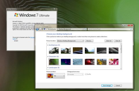 | |||||
Over the weekend, I installed the x64 and x86 builds of Windows 7 build 7048 on two desktop PCs and two notebooks. The process was remarkably smooth and fast in every case. For the most part, installation went smoothly, with most drivers installed automatically, from the source media or from Windows Update. An upgrade of a Dell Latitude XT was nearly problem-free. On a clean install of a Dell XPS M1330, I had to track down a missing wireless adapter and replace the default sound driver with a Dell-supplied Vista-compatible version before the system would produce sound.
Several people, including my ZDNet colleague Adrian Kingsley-Hughes, have offered first looks at this build of Windows 7. For the most part, they’ve focused on a handful of obvious details, especially the greatly expanded options to remove Windows features such as Internet Explorer and Media Player. For this post, I decided to dig deeper and see what sorts of changes you’re not likely to notice right away. I’ve winnowed my list down to 21 separate changes; most of the changes fall into one of the following four buckets:
- Fit and finish, especially tweaks to make the user interface more consistent
- Branding, such as icons and sounds (we’ll see more of this, I’m sure, when the product is finally released)
- Last-minute usability tweaks
- Some image-driven changes, such as a scrubbing of negative language from the Windows 7 Reliability Monitor
I’ve documented what I found in this post and in an accompanying image gallery. Here's a road map:
Page 2: Basic features, reworked
Page 6: Backup and recovery options
Next page: Basic features, reworked -->
The basics
1. A new way to switch Control Panel views.In the Windows 7 beta, the only way to switch to Control Panel’s all-icons is to click the All Control Panel Items icon at the bottom of the category view. That design apparently flopped in usability testing. In this build (and presumably in the RC) you can click a View menu at the top right of the Control Panel window to choose between Category view or large/small icons.
2. No more Aurora backgrounds.
In the beta release, sidebars on the left side of Control Panel windows followed the Windows Vista design, with white text on a dark background that resembles the old Aurora theme. For the RC, the design is changed to a light blue sidebar. Black type on this lighter background should be easier to read than the older white-on-dark-blue scheme, but some testers have complained that the new design is too faint and lacks contrast, especially for those with less than perfect vision.
3. Support for pen/touch devices.
The System Properties Control Panel includes a new line that indicates whether you have any touch or pen-enabled devices. The current crop of drivers for touchscreens is weak, however. The Dell Latitude XT shown here is capable of recognizing multi-touch gestures, but the only way to enable that support is by installing a very ragged beta driver from N-Trig.
It is, of course, completely unrealistic to think that Windows will ever be problem-free. But in this build, the word problem has been scrubbed from the Reliability Monitor front page. In the beta release, the heading referred to “your computer’s reliability and problem history.” In this build, there’s no mention of problems in the heading. The explanations of the 1-to-10 scale in the caption and along the right side of the graph are also changed to remove negative references to “least stable” and “poor reliability.”
5. Windows LiveID integration.
Now that a beta client is available for Windows LiveID, you can link your Windows logon to a Windows Live account. One advantage is quick access to Windows Live services, including Hotmail and Messenger. This is still a roughly drawn feature, though, and its full outline won’t become apparent until some additional pieces of the puzzle are unveiled.
Next page: Shell and UI tweaks -->
Shell and UI tweaks
6. Tweaks to Windows Explorer.A couple of months ago, I wrote, “If you love Windows XP, you’ll hate Windows 7.” Nowhere is that more apparent than in the new design of Windows Explorer. There a slew of tweaks in the post-beta builds designed to mollify old-school Explorer fans. For example, pressing Windows key+E now goes to the Computer pane by default, instead of to the Libraries pane. In the beta, right-clicking Libraries in the Navigation pane revealed a Delete menu that didn’t work; that menu is gone in RC builds. In the screen shot I’ve taken here, you can see the alternative Navigation pane, which resembles the XP-style Folders list.
7. Changes to library windows.
Speaking of libraries… This new addition to Windows 7’s file management arsenal is likely to be the most controversial. A slight change in the interface design is designed to make library windows more consistent with folder windows and and increase discoverability of this feature, We’ll see if it works.
8. Usability tweaks for the Homegroup feature.
The other Windows 7 innovation that’s likely to cause headaches for upgraders is the Homegroup feature. For post-beta releases, you can skip the Network and Sharing Center and right-click the Homegroup entry in the Navigation pane to see this group of options.
In the Vista era, onbe of the most vocal UI complaints was over the ancient (Windows 3.1 era) Add Fonts dialog box. It’s gone in Windows 7, and in fact the Fonts folder has received a pretty impressive makeover. Favorite feature is the ability to hide fonts (such as those used for alternate languages) from application menus. In this release, the info pane at the bottom of the Fonts folder is reworked to hide mostly confusing file and designer information.
The differences in design are profound if you go from XP to Windows 7; you have to look much more closely to see the subtle changes in this post-beta version.
Next page: Eye (and ear) candy -->
Eye (and ear) candy
10. Aero Peek is now the official name.Everyone knows that Microsoft can’t come up with a sexy/clever/compelling name to save its life, right? Imagine my surprise, then, when I saw this change in the Taskbar Properties dialog box. The boring Desktop Preview feature is now officially called Aero Peek, a colorful name that was previously used only in demos,
I wasn’t surprised to see a slew of new Windows wallpapers in the Desktop Backgrounds folder. I was, however, startled when I counted a total of 13 new sound schemes in Windows 7 Build 7048. I especially like the Raga scheme, which add sitar-drenched Indian sounds at unexpected moments.
Icons are nearly pure eye candy, but for product designers they’re also an essential part of the branding process. The samples I’ve selected for the gallery include Calculator, WordPad, Paint, Homegroup, and Control Panel. They’re clearly a different approach from the current icon set, with a straight on approach instead of a tilt, and a simpler, bolder design.
13. Easier adjustments for ClearType settings.
The ClearType wizard in Windows 7 does an excellent job at helping you tune settings so that type is readable, especially on LCD screens. This subtle tweak in build 7048 adds a ClearType settings option in the Display Control Panel, where it’s much more likely to be discovered by someone tinkering with a system’s visual settings.
14. New ribbons for WordPad and Paint.
You have to look pretty closely to see these mostly cosmetic changes in WordPad (new icons on the Home ribbon, new checkboxes on the View ribbon). I’m more interested in the fact that WordPad allows you to open and edit documents saved in the Word 2007 native format with the .docx extension. On a default installation of Windows 7, without Microsoft Office, this file type is identified in the file properties as Office Open XML Document type.
Digital media
15. Windows Media Player 12 now streams to Internet.ZDNet’s Zack Whittaker deserves props for noticing this new feature and writing it up with more details about the user interface. It’s clear that Microsoft plans to create a channel you can use (in conjunction with a Windows LiveID) to stream music over the Internet, giving you access to your full music collection on a notebook, work PC or, presumably, a mobile device. Exactly how this feature will work, thogh, is still a mystery.
16. A smaller, slicker Mini Media Player.
Windows Media Player has had a mini player for as a long as I can remember. The version in the public beta of Windows 7 is clunky, to put it kindly. The revamped mini-player in build 7048 is much smaller and more elegant. Its playback controls are transparent, and slide out of the way until you move the mouse pointer back into the player window. If you prefer the clunky look, you can still resize the window and customize it (showing the playlist, for example). This image shows the default mini-player at actual size.
17. Radio station presets in Windows Media Player.
Through the years, radio stations have popped up and disappeared in different releases of Media Player. In Windows 7, the Radio Stations link has made a triumphant return to the main navigation pane, where it sits at the same level as Music, Pictures, and Recorded TV. In this build, however, the interface for saving radio stations is still missing, so it’s hard to see how the feature will work when it’s finished.
18. A simpler Now Playing background in Media Center.
When you play an album or music playlist in Media Center, Windows 7 replaces the boring blue Vista-style background with a wall of album covers, drawn from your collection. In beta builds, the wall slides down the screen, refreshing itself constantly. In build 7048, you have the option to make the album wall static or remove it completely; the latter option might be boring but provide a better experience on extender devices with low-powered graphics hardware.
Next page: Backup and recovery options -->
Backup and recovery options
19. Simpler explanation for Advanced Recovery Methods.The backup and recovery tools in Windows 7 are more usable than in previous editions, but they’re still daunting for non-technical users. As I went through the backup feature, I was struck by the sheer number of changes to headings, descriptions, links, and buttons. Clearly, this is an area where Microsoft has been doing extensive usability tests. Will the shorter, less technical headings and descriptions here make it easier for mere mortals to restore a backup? Only time will tell.
20. Simplified terminology for Backup options.
In this post-beta build, Microsoft appears to have settled on “system image” as the term it prefers over “image backup.” This is the sort of esoterica that usability experts argue over, and presumably the changes shown here are lab-tested and user approved.
21. More user data included in default backup sets.
If you use the Backup program’s default settings to create a system image and back up all data files, the Backup program makes some selections of folders it will back up for you. Noteworthy additions in this build include the Downloads folder and the hidden AppData folder, which often includes important data such as e-mail messages, address books, and program preferences.
These locations were inexplicably excluded in earlier builds; it’s good to see this sort of change made even at this late date.
And that's my report. Have you downloaded this build (or a later one)? Any additional discoveries to report? If so, leave them in the comments.