Google Docs redesign looks great

The new intervace is very usable, and addresses many of the issues people were asking about. Let's talk about each of the improvements individually.
First, you will notice the interface. There isn't just one thing about it that I particularly like -- it's all pretty good. It's speedy, AJAXy and makes me want to use it. You can even drag and drop things into folders -- I'm sure some Gmail users are hoping the same thing comes to their inbox soon too.
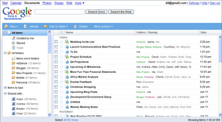
Next, the whole folder structure is brand new. Strangely enough, Google abandoned the "tag" and completely replaced them with folders. Earlier today a friend of mine called me up to ask how to make folders in Google Docs -- I'm betting there were a lot of people in that same boat and that's why it was changed.
And last, but not least, the search box now tells you what you are searching for before you finish typing. It has a similar behavior to Google Suggest and the Google Toolbar.
Overall, a great job by the Google Docs team on this one -- the only thing missing now is offline functionality and maybe a new look for Writely and Google Spreadsheets to match the new docs list.