Google Docs & Spreadsheets has been the center of attention recently -- yesterday they announced plans to give us a presentation tool, and today they launched charts in Google Spreadsheets.Source code for this new feature has been around for a while now behind the scenes, but now we're finally able to use the feature that we knew was coming.
Google Docs & Spreadsheets has been the center of attention recently -- yesterday they announced plans to give us a presentation tool, and today they launched charts in Google Spreadsheets. Source code for this new feature has been around for a while now behind the scenes, but now we're finally able to use the feature that we knew was coming. It has a very slick interface that makes it easy to create, delete and save charts. To make one of these for yourself, follow these steps:
Create a new spreadsheet in Google Docs
Enter some data you would like to visualize
Highlight the data
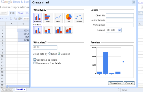
Click the "chart" icon
Choose your chart type
In addition to the new chart functionality, they have added several other new features too:
Named ranges: you can define a name for a range of cells, and use this name in formulas to refer to cells, for example write =sum(expenses) instead of =sum(c12:e17). This helps make calculation logic clearer to write and understand. Check it out under the "Formulas" tab.
Cell comments: Attach comments to individual cells, great for additional information or for collaboration on a single cell.
Bi-directional text: The ability to properly view and edit text in right-to-left languages like Hebrew. This is very important for our local community here in Israel.
A quick way to duplicate a sheet.
A new right-click option to search the web for the text in a cell.