Microsoft outlines vision of the future ... and it disturbs me

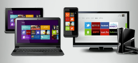
Here is an image that Microsoft has been showing to delegates at this year's Worldwide Partner Conference ... and it disturbs me.
Here's the graphic:
Here we see a notebook (or possibly a netbook), and tablet system, the Xbox games console and a Windows Phone device all featuring the tiled "Metro UI" look that people using Windows Phone handsets will recognize. What Microsoft is showing here is plans to unify the entire ecosystem.
Ugh ...
See, i don't have anything against the Metro UI personally. It's an interesting take on an old problem of how to present information to the user. I happen to think that it's fresh and interesting and is ideally suited to small screen devices like smartphones ...
... yes, ideally suited to small screen devices like smartphones. But smartphones aren't tablets and netbooks/notebooks and games consoles and such. Why is Microsoft once again going for this 'one size fits all' approach to UI design. Why push a design paradigm designed for the small screen onto systems that aren't limited by screen size? It makes no sense. But we've got to remember that Microsoft is the company that for years has been desperately trying to shoehorn the the desktop UI paradigm onto devices that have small screens.
I'm surprised that there isn't a Dell desktop in the background featuring a 30-inch UltraSharp display also featuring the Metro UI. What better way to feature a UI designed for the small screen than to shove it onto a 30-inch screen.
Note: Rumors circulate about how Microsoft might actually unify the entire OS, and even go as far as to drop the 'Windows' name, but I'm not even going to bother linking to anything discussing this as it's nothing more than pure speculation.
Now, Windows 8 will come with the classic UI, and it'll be there for people to use, but I'm concerned by the way that Microsoft seems to be plastering this Metro UI onto every screen it can. The Metro UI seems to be the new Aero UI which we saw everywhere before Vista hit PCs (albeit only on largish screens). Just because the Metro UI is new and shiny, it shouldn't be something that's shoved onto the bigger screen. But that's what we're seeing. And from what I can tell, the only reason Microsoft wants to see a tile-based UI like Metro on notebooks, netbooks, tablets and desktops is BECAUSE IT'S NEW AND SHINY.
So Microsoft, learn something from Apple. There's a reason why Mac OS X has a different UI to iOS on the iPhone and iOS on the iPad. They're different devices, and different devices have different usage scenarios. That's the point of having different devices in the first place. Shoving the same UI on devices that are used in different ways is either lazy or hubristic ... and it disturbs me.
(Image via WinRumors)
