Quickly format subtotaling rows to increase your productivity

Microsoft Excel
Quickly format subtotaling rows to increase your productivity
Excel's subtotaling feature is a great tool for inserting subtotaling formulas in into your data. The down side is that the subtotal rows are often difficult to discern from the rest of the data. Formatting just the subtotaling rows, one by one, could be a tedious task. Fortunately, you won't have to do that - the tool you need for quick formatting is already in place. I'm talking about the outline symbols Excel displays when you add subtotals. Using the outline symbols, you can quickly format all the subtotaling cells with just a few clicks.
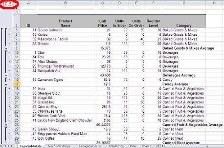
Before I can show you how to put those outline symbols to quick formatting use, you need some subtotaling rows. The example sheet shown above uses data from the Products table in the Northwind database. You can use any data range you like, but in this example, I'll display the average of each category as follows:
- First, sort the data range appropriately. In this case, I sorted by the Category column because I want to average the price of the products in specific categories.
- Once the data's sorted, select any cell in the data range.
- Click the Data tab and then click Subtotal in the Outline group. In Excel 2003, Subtotal is on the Data menu.
- In the resulting dialog box, choose Category from the At Each Change In dropdown.
- Select Average from the Use Function dropdown.
- Check the Unit Price field in Add SubTotal To.
- Click OK, and Excel will display the average unit price for each category (see the first sheet above).
At this point, you have subtotaling rows, but the information gets lost. Formatting is the answer. In this case, I added a background color and border to the subtotal in the Unit Price column (see above), as follows:
- Select the column that contains the values or cells you want to format. In this case, that's C5:C66 - select the whole range, including the detail values.
- Collapse the outline by clicking the 2 symbol in the outline pane. Doing so will hide the detail records and display only the subtotaling rows. Don't change the selection.
- Press [F5] to display the Go To dialog.
- Click Special (at the bottom of the dialog).
- Click the Visible Cells Only option, and click OK.
At this point, you can apply the appropriate formatting. In the case of this example, I chose a color from the Fill Color dropdown and a border from the Outside Borders dropdown; both are in the Font group on the Home tab. To see the results, click the "3″ symbol to expand the records. The subtotaling cells in column C are easy to spot!
I showed you a similar trick earlier in the summer, but I used it to copy subtotals. This trick isn't a copying technique, it's a selection technique. Anytime you want to do anything to subtotal cells or rows, use this selection method first. That way you can act on all of the subtotaling cells at the same time.
Microsoft Powerpoint
Create a preview or remembrance slide in PowerPoint
Before and after a presentation doesn't have to be wasted time. You can add a single slide to preview or review your presentation. One way to do that is to splash representative graphics or pictures on a single slide, and doing so is easier than you might think.
Creating this effect has just a few steps:
- Gather the pictures or art you want to use; I recommend that you save them to the same folder with your presentation for easy access.
- Divide the slide into equal (or not) sections.
- Insert an AutoShape, most like a rectangle, into each section.
- Fill each AutoShape with a different graphic file or picture.
- Assign an entrance effect to each AutoShape using the After Previous Start setting so each picture is showcased individually.
Let's work through a simple example with just two pictures, side by side (I got all the pictures from Microsoft's Online Gallery). First, let's insert a couple of AutoShapes:
- Insert a blank slide.
- Click the Insert tab and choose Rectangle from the Shapes dropdown in the Illustrations group.
- Insert it, consuming the left side of the slide.
- Copy the rectangle and position it to the right.
Now, you're ready to fill the shapes with pictures, as follows:
- Right-click the rectangle you want PowerPoint to display first. In this case, that's the AutoShape on the left.
- Choose Format Shape from the resulting context menu.
- Choose Fill in the left pane (if necessary).
- Click the Picture Or Texture Fill option.
- Click File.
- Locate and select the picture you want to display.
- Click Insert.
- Click Close.
Repeat the instructions above to fill the shape on the right. Then, you're ready to apply an animation to each shape:
- Select the picture on the left (or the picture you want to appear first).
- Click the Animations tab.
- From the Animations dropdown in the Advanced Animation group, choose Wipe from the Entrance section.
- In the Animation task pane, find the selected rectangle and choose Start After Previous from the dropdown.
- From the same dropdown, choose Effect Options.
- From the Direction dropdown choose From Left.
- Click OK.
At this point, the slide will display the picture on the left immediately, using the left wipe effect. You can click Play in the task pane to preview it. Repeat the process with the picture on the right, but this time, choose From Right in step 6.
I've used just two pictures to keep the example simple. You can divide the slide into numerous pictures - the larger your viewing screen, the more pictures you can reasonably display on one slide. But that's not the end of it; you can stack AutoShapes for a layered effect.
After creating the first layer, add a second layer by positioning more shapes right on top of the first set of pictures. The shapes that comprise the second layer don't have to match the first. In fact, a mismatch creates an interesting effect, where pictures in the first layer are partially obscured as the second layer exposes each picture, as shown below. The two squares on the bottom are actually the bottom halves of the two pictures in the first layer, which contains only two pictures. The two squares on top are the first two pictures in the second layer, which contains four pictures.
When adding a new layer, you can work on the same slide. However, you might find it easier to create each layer on a temporary slide. When the layer is complete, press [Ctrl]+A to select all the elements in the temporary slide and paste the selected elements to the permanent slide.
You can use this effect to display tons of pictures or graphics at the beginning of the end of your presentation. You can even use it in the middle of the presentation, if you do so for the right reasons - this type of slide could easily distract your audience. If you use this slide at the beginning or the ending of your presentation, make sure it repeats.
Microsoft Word
Add customized shaded bands to a Word table
Shading a table's rows or columns is a good way to improve readability. Fortunately, using Word's AutoFormats, you can quickly add shading, called bands (stripes in Word 2003). There are a number of AutoFormats and fortunately, they're not garish, so you're sure to find a reasonable look. Interestingly, all of the AutoFormats have one-row or one-column bands (there are a few in Word 2003). You can create a band that's larger than one row by creating a custom table style.
Today, I'll show you how easy it is to apply an AutoFormat to a table. Then, I'll show you how to create a custom table style that has two or three rows of columns in each band. (We'll work with rows, but everything applies to columns, as well.)
AutoFormat - the quick way
Applying an AutoFormat is just a quick click. In fact, you'll have more trouble choosing the format than applying it.
First, you select the table to display the contextual Design tab. Then, click the Design tab and choose a banded style from the Table Styles group. Or, click the dropdown to see the entire gallery. As you mouse over the different options, you can watch the table update, accordingly. I used Light Shading -- Accent 1 to format the table below with just a few clicks. It's a smart format too; it will automatically update as you add or delete rows.
In Word 2003, choose Table AutoFormat from the Table menu. Then, choose an option from the Tables Styles list and click Apply.
Creating a custom table style
There won't always be an existing AutoFormat to meet your needs. For example, if you want a band to have more than one row, you can create a custom table style. Word anticipates this need and so the process is simple, but it isn't a well-known option. First, you select the table and to continue, do the following:
- Click the contextual Design tab.
- Then, click the Table Styles dropdown and choose New Table Style (the last option). In Word 2003, choose Table AutoFormat from the Table menu.
- Provide a meaningful name for the new style.
- From the Style Based On dropdown, choose Light Shading -- Accent 1. (You can use any style you like.) In Word 2003, choose a style from the Tables Styles list and click Modify.
- Click the Format dropdown.
- From the resulting options, select Banding. In Word 2003, choose Stripes.
- In the resulting dialog, choose 3 from the Number Of Rows In A Row Band dropdown.
- Click OK twice. (In Word 2003, click OK and then Apply.)
The table style is also smart. Below, you can see the three-row bands. When shading columns, you can use this same process to increase the number of columns in a band. In addition, you can create more complex table styles by choosing other Format options.
Susan Sales Harkins is an IT consultant, specializing in desktop solutions. Previously, she was editor in chief for The Cobb Group, the world's largest publisher of technical journals.