Why is Microsoft obsessed with live tiles, and why doesn't Apple care?

Can you spot the similarities between these two Windows 8 machines from Lenovo and HP?
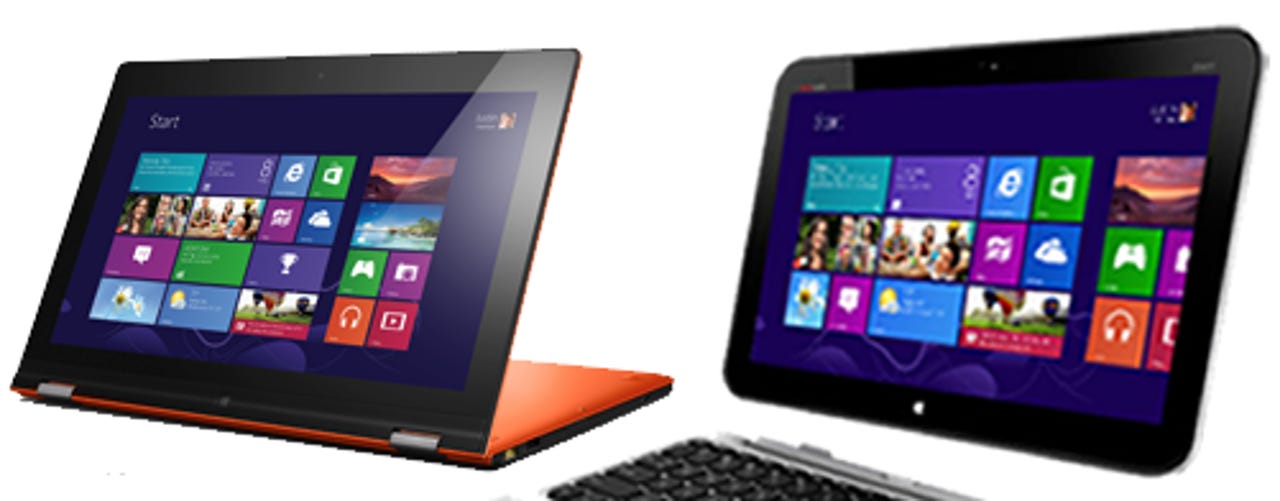
That's right. The screenshots are the same. In fact, the screenshots from all of the OEMs are always the same. It's always Friday 8, you've always just got an email from Wendy Teo, and it's always 77 degrees Fahrenheit.
And it doesn't matter whether it's a desktop, a tablet, a hybrid, an all-in-one, or anything. It's always the same image.
Wherever you go, whatever you look at, Microsoft's position on Windows 8 is that you will look at the Start screen and you will look at live tiles.
This theme continues over on Windows Phone. Official product shots from HTC, Nokia, and others always put the Start screen with live tiles front and centre — although these guys seem to have more leeway about what image they show.
The fact is that the Start screen and live tiles has become the "totem" in a reimagined and reinvented Windows.
But this week much has been made about how with Apple's iOS 7, despite apparently borrowing inspiration from various quarters, Ive and Co have steadfastly refused to rip-off live tiles or even their closest analogue on the market leader by sales: widgets on Android.
Widgets
Just to be clear, I think live tiles are over-thought, unhelpful, and offer little value to the owners of post-PC devices. Similarly, I don't think that widgets on Android are particularly helpful either. I wasn't surprised that iOS 7 doesn't have anything like it and continues to stick to the simple, baseline usability of what some people call "a sea of icons."
But regardless of what I think, don't you think it's interesting that we have the following situation:
Apple is the market leader in producing consumer-focused compute devices. Their products are celebrated and enjoyed around the world by consumers and have been for many, many years. However, when rebooting iOS, they avoided doing live tiles or widgets.
Microsoft does not have similarly demonstrable capabilities around producing consumer-focused compute devices. (Windows Phone does not sell as well as iOS or Android, and Windows tablets do not sell as well as iPads. Xbox does better.) Yet Microsoft's marketeers have aligned their entire representation of their consumer products in the market around this one, single, unifying image of Start screen and live tiles.
Or to put it more simply: "Company A, which is the best in the world at consumer usability, sees Company B's offerings and utterly ignores it."
Why would Apple ignore the Start screen and live tiles if they were such a good idea?
We know that it won't be an (entirely) emotional decision. Apple isn't a collective of hippies, it's a corporate behemoth full of some of the smartest technicians in the world. Apple's engineers are not going to avoid replicating the Start screen and live tiles because of pride.
An advantage of working in a more mature market is that competitors are out there trying ideas that you can steal. Apple hasn't stolen Microsoft's approach, despite the fact that Microsoft is a) hungry for it to work, b) must have thought about it as a great idea, and c) must have been able to quantify it as being a great idea.
Dashboarding
What got me thinking about this was this fantastic piece by Wes Miller: "Content, not chrome. Apps, not the phone." In this piece, Wes talks about how pro and amateur industry-watchers seem obsessed about the iOS 7 "shell" (i.e. the bit that launches apps), whereas the story with iOS is and always has been about the apps.
Or, more to the point, it's about the data behind the apps. When someone is using their phone, they're actually trying to get at data. On post-PC devices which are relationship-centric, they're always actively working to get through to the people and things that are important to them.
In the context of driving relationships, the shell becomes something that you simply want to fade into the background. You don't take your phone out of your pocket to "launch the Facebook app." You take your phone out of your pocket to "connect with people on Facebook."
Part of Microsoft's challenge as they face a post-PC world is that they're undoubtedly, stonkingly good at doing enterprise stuff, but consumer stuff is much more of a challenge.
If you look at the Start screen/live tiles from a certain angle, you can see something...
It's an enterprise dashboard, much like you might see on a corporate intranet.
Except for rather than showing you what the last week's sales in the western region were, or what the average waiting time for an operator to handle customer calls is, it's showing you your next appointment, or the current weather, or your last email, or a news headline, or whatever.
Now that I've written that, it seems quite a helpful approach. "OK," you may think, "I can glance at my phone and see that headline dashboard information."
But is it? Is anything shown on a live tile actually helpful within the context of why you've accessed the device in the first place?
If you're using it on a PC, frankly who cares about live tiles? A PC is about focused work. The reason why you're sitting in front of it is to do something, and unless what you're doing is a watching-paint-dry-like activity such as actually waiting for live tiles to update, you're going to blast through Metroland to get to the actual, useful, usable part of your PC.
And if it's on Windows Phone, as per my previous point, your objective is to get to a deeper and more meaningful collection of data.
Take the email tile. That's utterly useless. What's the point of showing one email? If I'm checking my email I need to know the totality of what's outstanding. The only useful information the email live tile can show me is that "I have zero emails."
The problem with the dashboard approach on post-PC devices is they rail against the "monochronicity" which is central to what makes those devices usable. Monochronicity means "one thing at a time," and puts front and centre this fact: the reason why you access your smartphone or tablet is to drive down into an app. The shell should, in monochronistic operating systems, which all post-PC operating systems are, fade into the background.
This is the central thrust of Wes's article that I called out earlier and why, I believe, Apple ignored live tiles and widgets in their iOS 7 reboot.
Conclusion
I don't really care whether the Start screen-slash-live tiles-slash-dashboard approach is a good one or not, what I care about is that this approach has become the whole story in terms of what Microsoft talks to the market about when it comes to Windows 8.x and Windows Phone.
If you look at what Apple does, it doesn't do this. Apple's marketing on iOS devices is always about the relationships. The latest TV spot they're doing around music on the iPhone is about the user's relationship with themselves and their relationship with music they love.
This is what Apple gets, and Microsoft doesn't, and moreover what Microsoft needs to get if it's going to appeal to consumers. These devices are about relationships, about deep connections with people and things that you love.
They are not boxes designed to tell you, at a glance, what the weather is outside.
People have a thing for doing that already. It's called a window.
Apple's "Music Every Day" ad — the focus here being the user's relationships with their music.
What do you think? Post a comment, or talk to me on Twitter: @mbrit.
Image credit: Lenovo, HP