Competing visions of the future of personal computing

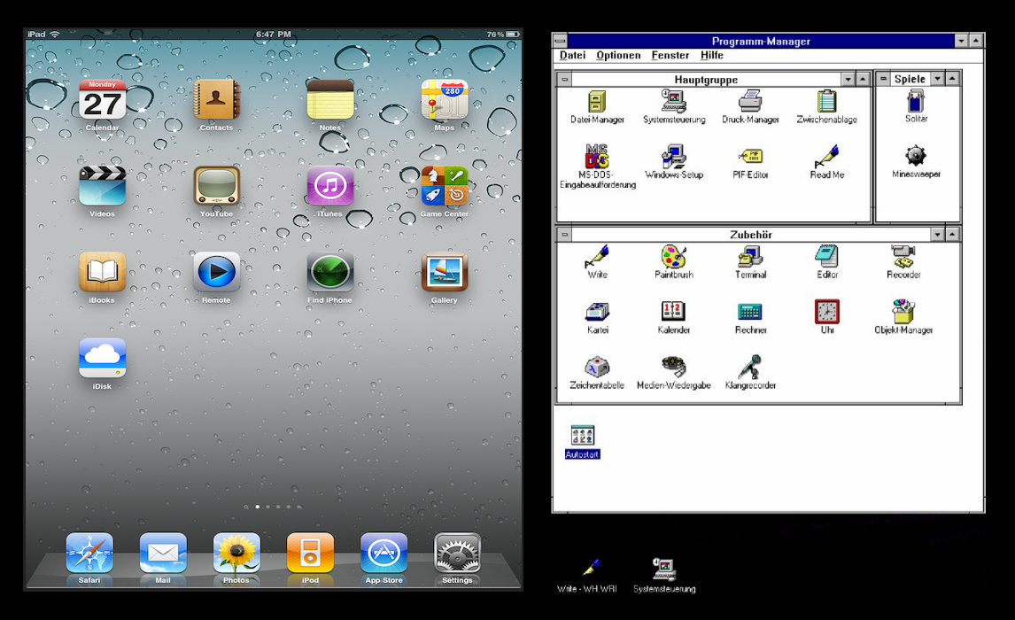
A picture is making the rounds on the Internet today. You’ve probably seen it: a side-by-side view of two screenshots, with the iPad home page on the left and the new Windows Explorer interface (the one Microsoft plans to release with Windows 8) on the right.
I’m sorry it’s taken me so long to respond, but I’m sure you understand. That image was posted at a site I never visit (except by accident) and accompanied by text from a person I never read (except by accident).*
Anyway, anyone who sees that graphic and tries to debate it on its merits is falling into a trap. It's a ludicrous comparison. Here, allow me to demonstrate with some similar, equally valid, equally ludicrous comparisons.
Apple’s vision of personal computing in 2011 versus Microsoft’s vision in 1992.
Rows of identically sized, equally spaced icons with text labels below them. I admit, the water drops make the one on the left prettier, but I still think of Windows 3.1 everytime I look at the home page of an iOS device. Even more so after Apple added folders.
Apple’s vision of personal computing in 2011 versus Apple’s vision of personal computing in 2011.
Note that the operating system on the right is newer than the one on the left. I defy you to tell me with a straight face that the UI of Finder is in any way "modern."
Microsoft’s vision of a consistent UI in 2011 versus Apple’s vision of a consistent UI in 2011.
Did you know that in Apple's Finder, thumbnail images of a photo file are called icons? And using the international symbol for "radiation warning" as an icon in the Disk Utility toolbar is a nice touch...
Gosh, this kind of comparison is fun, isn’t it?
Also pointless. All it proves is that snark is cheap.
* Oh, OK, if you insist, here’s the link.
