Finance
Keep tabs on your portfolio with StockTouch
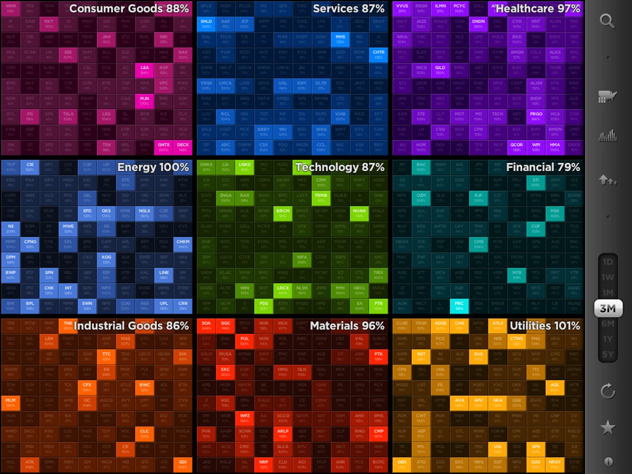
This financial app for iOS features a silky smooth interface that's the synthesis of financial information and data visualization -- and it's a thing of beauty to use.

It's hard not be a fan of tech stock these days, especially with the meteoric rise of Apple shares (NASDAQ:AAPL) -- which are up 48 percent in a year (despite taking a 12.02 or 2.2% haircut in trading Monday.) I've experimented with a number of iOS stock apps over the years and StockTouch($4.99, App Store) is the most beautiful that I've ever seen. By a long shot.
The screen shot above shows the winners (by percentage gain) based on volume (relative trading activity) over a three month period. Below is a screenshot of one-week Apple chart:
The silky smooth interface is the synthesis of financial information and data visualization and it's a thing of beauty to use. It was built specifically for a touch interface (hence the name) and you zoom from viewing the market as a whole to sectors to individual stocks by pinching and zooming. It was built on a video game engine which makes the UI approachable and easy to master.
It uses real-time market data to create 9,800 dynamic charts which you can customize to view by price or volume, and spontaneously rearrange the layout to sort by market cap, winners, activity and alphabetical. StockTouch uses the familiar red and green color coding scheme market watchers are familiar with to identify winners and losers and numerous views provide more than enough information to keep tabs on the market on a daily basis.
It's not perfect though. For example when comparing a stock to the S&P I'd like to see the two overlaid on the same chart. Chart colors can be a little extreme, the bright green (on a really big up day) can be a little intense. You can't pinch, drag and touch on an individual chart to see a stock's price at a specific point in time (like you can on Google Finance) and quotes in the market indices option (displayed at the bottom of the screen) frequently overlap.
I'd also like to see expanded fundamentals that are clickable to reveal more information. It would also be nice to be able to view income statements, balance sheets and cash flow statements -- like you can on Yahoo Finance.
Despite my minor nit picks and feature requests it's an amazing app. Plus it's universal so it works on the iPhone and iPad, although it really shines on the iPad's 10-inch screen.
This video shows StockTouch in action:
StockTouch Navigation from stevied on Vimeo.
