Google Image Swirl: Looks neat, but useless

I have a problem with things like Google Image Swirl. Not the offering itself, just the strange notion that somehow cool design equals usefulness. There are tons of examples floating around that have the exact same problem -- things like Bing's "Visual Search".
I'm the lead software designer at the company I work for -- our flagship product is an end-to-end retail solution for the wireless industry. If you go to a store in the mall that sells wireless devices, there's a good chance they use our software.
What does that have to do with anything? Well, building business software, with a large amount of users, using powerful technologies like WPF (that make it extremely easy to create anything you can dream up) forces you to think about usability rather than simply cosmetics -- that said, cosmetics can, and should, still play a big part in usability.
Based on my design experience, I have to say that Google Image Swirl is absolutely useless. Don't believe me? I challenge you to find a really good reason to use image swirl over a typical Google Images search. I guess you can find "images that look the same" like they propose -- but why have a completely new and gratuitously "sexy" front-end to something that's easier to accomplish in existing ways (by clicking "find similar images" under an actual Google Images search result)?
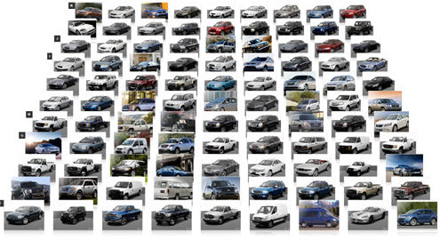
Now let me talk about Bing's "Visual Search". Looks great! Useless. If I click on "cars", a giant grid of tiny thumbnail images in no immediately apparent order, which all happen to be silver and look similar is shown. Thank you Microsoft. I'm never going to use this tool for any real searches.
Remember "Cuil"? It was that new search engine that was supposed to give Google a run for its money. It's innovative grid view was one of it's big features. The grid view put results into three columns rather than a simple vertical list of results. Useless. Scanning horizontally and vertically with your eyes is not natural, and actually made it more of an effort to find your desired result. They have since taken more of a one/two column approach -- hopefully because they realized that looking cool and different isn't always useful.
I could go on for a really long time about examples of gratuitous flare -- which often equals terrible usability, but I'll spare you the details. I think I made my point. Now make your point in the Talk Back!