How to hack a cloud app to change its look (using Todoist as an example)

My favorite to-do manager, Todoist, recently changed its look - and I hate it.
This is one of the problems with cloud services: things change all the time, often completely out of your control. At least with desktop applications, if you don't want to apply a change, you don't have to (although that's changing with Windows 10). You could stick with an older version. Sometimes, the vendor would wise up and fix the "upgrade" and other times, you might just live with an old version.
But not with the cloud. If a cloud vendor wants to make a change, the next time you load the page in your browser, you're stuck. It's all different.
In Todoist's case, they changed the look and color of their prioritization icons. Rather than red being urgent, two shades of blue, and a white, they went with a graduated scale where some kind of purple is urgent, a somewhat similar shade of orange indicates less urgent, a yellow, and then a white. It's terrible.
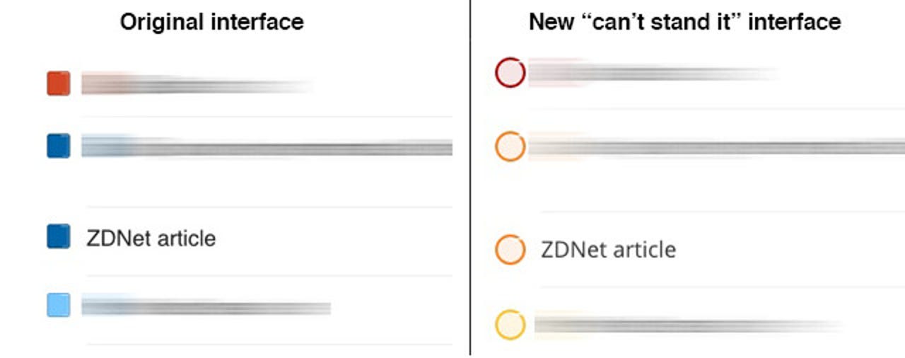
On some screens, it's hard to tell between top priority and medium priority. Back when the color difference was red vs. blue, there was no such problem. It was immediately clear that the urgent, priority items were red, and everything else ... wasn't.
My original thought upon waking up to this change was to simply yell about it. I thought about posting to Twitter, Facebook, and even trying to write harsh screed here about how unfair it is for vendors to change colors. I worked up a full head of righteously indignant steam.
Then I thought about it. First, a complainfest about cloud vendor changing the colors of an interface - whether I like it or not - is not exactly a ZDNet-quality article. Second, I really wanted to do something about it, not just cry about it. I wanted to change the colors back.
Fortunately, given that Todoist is presented on the Web as an HTML+CSS Web page, that change is within my power. So rather than writing an article that's simply a childish rant, I'm going to show you how I dynamically change some sites at the browser level. I've done this in the past for XDebug, where error message is a black-on-orange that's difficult to read.
How to hack a Web page so it survives refreshes
Before I start, I should point out that I'm doing this in Chrome, which is my browser of choice. You can follow nearly the same set of steps in Firefox, but you might find yourself somewhat more limited on IE, Edge, or Safari.
You should start by installing an extension called Stylebot. Stylebot works by dynamically changing the styles on a Web page based on CSS selectors. When a given page loads, if it's got a configuration in Stylebot, certain CSS styles in the style sheet of the host provider (in this case Todoist) are overwritten by the styles in Stylebot.
It should be noted that there is another extension I've often used called Stylish. There's a version of Stylish for both Chrome and Firefox. However, Stylish didn't successfully work with Todoist, so I'm using Stylebot instead. If you're on Firefox, you can try this approach using either Stylish or some other similar add-on or extension.
You'll need some basic knowledge of how to find styles using the Inspector, specify CSS selectors, and write basic CSS. I'm including three YouTube videos at the end of this article that provide a good tutorial on those skills, so follow along for now, and watch the videos if you need more help.
Finding your selectors
There are four priority circles now in Todoist, and I'm going to want to change three of them. I'll demonstrate how to do the change with the top priority item, and then you can go ahead and do the two others.
We'll start with Todoist open. To open an Inspector pane for a given element, simply right click somewhere near what you're looking for and select Inspect Element from the Chrome pop-up menu. As it turns out, Todoist also has a right click menu, so I had to right click a bit farther to the left of the priority circle, but I was still able to open the Inspector.
It's a little difficult to tell from the following image, but you can see that the priority circle is selected on the left, along with the HTML and CSS styles on the right:
Here's a better screenshot showing the Inspector code only:
There are two classes we're going to want to play with: amicheckbox and priority_4. As it turns out, items with the class priority_4 are top priority, priority_3 less so, priority_2 near the bottom, and priority_1 is lowest priority. So we'll use these classes to help determine which color is applied for each circle.
At first, I thought the checker class was the class we wanted, but as you can see, when selecting amicheckbox in the Inspector, I got editable CSS items with the colors that I want to change:
In fact, you can see that the Inspector even points out the proper selector, which is .priority_4, followed by a space, and .amicheckbox. The dot indicates that the text following is a class name, and the space is used to tell CSS to select any amicheckboxes that are located inside priority_4 blocks.
Modifying the page with Stylebot
Now that we know the selectors, we can go into Stylebot and make some style changes. From within Todoist, right click on Stylebot. Be sure to select Options as the arrow indicates, not Open Stylebot.
Then I went into Stylebot and selected the Styles tab, and then clicked the "Add a new style..." button:
Once inside the Stylebot editor, it was a simple matter of telling it I wanted this style to operate on todoist.com and then I inserted my replacement CSS. As you can see, I simply used the selectors and properties I found earlier, and changed the color specification:
I just typed in my CSS code and hit Save. I could have used hex color specifications, but I was a bit lazy and just used the text equivalents for colors.
The final results
Here are the final results. As you can see, I have all four priorities represented, and they're now exactly what I want: red, blue, and light blue.
There is one disadvantage to Stylebot: styles don't sync across machines. I found simply dumping the styles in Google Keep and making changes on my main four machines was easy enough.
Also, remember, you can use this for pretty much any Web page you want to change to your liking. I find it's a bit of a temporary solution, because vendors do change their page code regularly. Even so, I usually get a few months or more out of a ten minute hack - and it reduces my level of annoyance with the vendor choices considerably.
It's a hack, so it won't work with everything. But it's a nice tool to have in your kit bag.
Tutorial videos
Here are the three tutorial videos I mentioned. They're well done and will take you about a half hour to watch all three. If you're not sure about CSS or the Inspector, watch these videos. Don't worry that one video is part 3 and another part 5 -- they're the parts of an excellent tutorial series that explain more about what you need to know for this project.
So that's it. I hope you enjoyed tweaking a Web app. If you tweak any Web apps, please tell us about it in the comments below.
By the way, I'm doing more updates on Twitter and Facebook than ever before. Be sure to follow me on Twitter at @DavidGewirtz and on Facebook at Facebook.com/DavidGewirtz.