Twitter's latest design: cleaner, richer, better

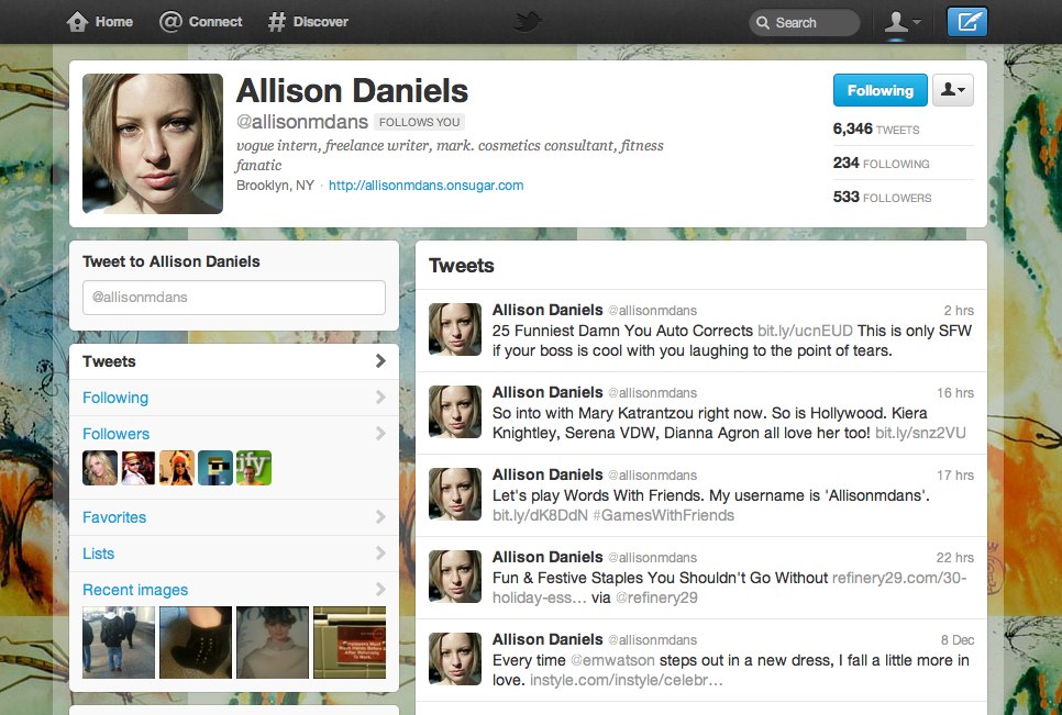
I'm a huge fan of Doug Bowman's design brain. Since he's started working at Twitter over two and a half years ago, the site's design, look, and feel has gotten better and better. Yesterday, they announced Fly, their latest design. Below are some screenshots from the new design, and why I love it.
At a glance, I can see everything I need to see about a person. My eyes start at the top, then go down the left column, then go down the right column. The flow is intuitive.
The "Connect" tab, especially the "Interactions" section, is great because it tells me everything that anyone is saying about me, who has added me to a list, or who has favorited my tweets.
The "Discover" tab tells what is being tweeted about most, and gives me a rich preview of that content.
When you click a user's name, the newly designed lightbox emerges. It's a mini view of that person's profile page, and in a snap, it tells me whether or not I should follow them.
I'm really glad they moved "Messages" out of the main nav, and into this little dropdown, along with keyboard shortcuts (which, if you don't use them, you should).
Finally, the "Tweet" page, as I call it, got a great makeover. I love that the "Follow" button was added to this page, and utility dropdown.
I'm not sure how they can improve much further, I am really impressed with this redesign.
Here are a few other things they've added:
- New buttons, notably a hashtag button: https://twitter.com/about/resources/buttons
- Embedded tweets: https://dev.twitter.com/docs/embedded-tweets
- New iOS, Android and TweetDeck: https://web.tweetdeck.com/
- User tip in iOS app: if you swipe vertically on "Me" button nav, you go straight to DMs
What do you love or hate about the new Twitter design?
