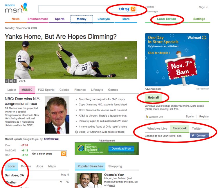
MSN's new home page; Nice, but it won't lure new users

Microsoft rolled up the curtain on a new look for the MSN Home Page, the first redesign in about a decade. (Techmeme)
Strictly from a visual standpoint, it's a much cleaner and simpler interface than the previous version, which was cluttered with way more links and darker in color. It's also integrated with local and social elements, too. And, there are areas now where users can preview their Hotmail accounts or get updates from their Windows Live, Facebook and Twitter accounts.
It reminded me a bit of the new home page that Yahoo rolled out a few months back, notably the attempt to be the one-stop shop for all of your personal accounts. Here's the difference: Yahoo allows you to bring any feed into the page - even services from competing companies such as Google's GMail. With the MSN page, you're limited by what Microsoft allows you to bring in. In the image, I've noted a few areas to watch.
If you were a MSN Home Page user before, I think you'll like the new look and the simplicity of it. The designers have clearly put some effort into making it easier to navigate. But if you weren't a MSN Home Page user in the past, I don't know that there's any added value by making MSN your new home page.
In a blog post, the company said this release is a limited one, giving Microsoft the chance to gauge the reaction of users. The company writes:
That behavior has changed immensely as people get more and more adept at using search engines to find what they're looking for on the Web. The reduced home-page links will be augmented by the deeper integration of Bing search technology.
The company will flip the switch on a full rollout early next year.