Windows Mobile 6.5 disappoints; no Start customizations and stylus still required

Microsoft officially launched Windows Mobile 6.5 this morning and with all the leaks and AT&T releases the information has been out for over a day already. I've had the chance to use both an AT&T HTC Pure and Pharos Traveler 137 running Windows Mobile 6.5 and I have to say Microsoft disappoints me greatly with this release. We have seen more leaked than what was released today so maybe there will be some upcoming updates, but I am disappointed by the lipstick Microsoft gives to us with WM 6.5. The thing is, the beauty isn't even skin deep on this release and I think using Spb Mobile Shell 3.5 gives me a better experience on the Touch Pro2 than Windows Mobile 6.5 ever could. Check out my image gallery and video below and judge the new OS update for yourself.
| Image Gallery:Some key screenshots from the Windows Mobile 6.5 update on a couple Windows Mobile devices. | 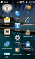 | |||||
Start menu
In the past when you press the Start button or left upper Start icon you were taken to a left upper drop down, similar to a Start menu on a PC. Now when you press the Start button/icon you will be taken to a grid of icons (similar to an iPhone) in different configurations. The default Windows Mobile 6.5 has a 3 wide grid while other customizations may be provided. For example, AT&T has a 4 wide grid on the HTC Pure. At first you may be pleased to see a full screen of icons rather than the desktop Start menu, but that is all that is good about the new Start menu. The icons are randomly placed on the display and the only thing you can do with them is tap and hold to select to move them to the top. That is it! You CANNOT place icons where you want to, you CANNOT add or remove icons, and you CANNOT create folders and manage the icons to create an efficient device. IMHO, this is so ridiculous that I see little value in this new Start menu scheme and find it to be worse than what we have on previous Windows Mobile operating systems.I recommend you load up something like Spb Mobile Shell 3.5 if you want to truly customize the user interface on your Windows Mobile device, at least until Microsoft pulls it together and provides some actual functionality with the Start menu.
Lock screen
The new lock screen is useful in that it provides you with a quick, glanceable way to view any notifications without actually starting up and diving into the device. You can tap the lock designator on the Start screen or press and hold the End button to lock the device. Notifications will appear, along with the number of each, in a center row and then tapping that icon will take you to the notification. Calendar appointments also appear in the bottom portion of the display.Today screen
The Today screen is the sliding panels we saw on the non-touchscreen Windows Mobile Standard 6.1 devices that finally appears on touch screen devices. IMHO, Microsoft should have rolled this out at the same time as the non-touchscreen version over a year ago. I think this is a pretty functional display, but if you are using a device like the HTC Pure you won't even see it at first because HTC has their TouchFLO 3D selected by default instead. TouchFLO 3D is actually quite fast and functional so you may not want to deselect it on your Pure.If you have the Windows Default Today screen selected then there is again no customization available for you to optimize the list of apps and utilities on your Today screen. You cannot move, hide, add, or remove the different pieces and are stuck with what is provided. Many of these sliding panels are useful and I can see people using them regularly, but one thing I have always loved about Windows Mobile was the available customization and that is no longer there in these Today and Start screens.
Menus, apps, and more
You will find several menus that are now much larger and more finger friendly, but these also require that you now tap arrows to continue scrolling through long lists. The worst though is that diving down to this level and lower takes you back to drop downs that require you to have a fingernail or stylus to make selections. This is particularly evident when you try to create a new appointment, manage your regional settings, enter a new contact, or perform many other tasks throughout the device.You would think by now that a company with a good search product like Bing would figure out how to implement a good search utility on their mobile platform. Wrong, the same lame, limited Search utility is on the device even though it has a new icon that had me getting my hopes up.
The Windows Media Player and Pictures & Videos applications are still the same pathetic ones we have had since the good old Pocket PC many years ago (do you really need me to manually update my library all the time and browse to the most likely photo storage location every single time I run the application?). Hey Microsoft, you have a great media player in the Zune product so why don't you send the Windows Mobile team over there to learn how to do it right?
The new Internet Explorer Mobile browser actually is a nice improvement over the previous anemic version and now you can actually view the full Internet in the program. The automatic hidden buttons are even newer than the version of IE Mobile seen on my T-Mobile Touch Pro2 and for now the browser is just fine for most of my browser needs.
A couple other apps were included, MSN Money (stock ticker), Microsoft My Phone (backup solution), Windows Marketplace for Mobile (follow up detailed post coming soon), and MSN Weather (weather utility).
Closing thoughts
I wasn't expecting a whole lot from this point release, but I was expecting more than what Microsoft delivered. I expected to be able to place icons where I wanted them on the Start displays, I expected to have finger friendly menus throughout the OS, and I expected some attention to the media player, device search, and more.I am a fan of Windows Mobile, but find very little added value in this Windows Mobile 6.5 release and would never recommend anyone actually purchase a new device just to get this update on their smartphone. We are going to have to wait and see if Microsoft can pull anything out of the hat in Windows Mobile 7, but with the current schedule of late 2010, most likely slipping into 2011 like this release, I think the T-Mobile Touch Pro2 may be my last Windows Mobile device for quite some time.