Photos: OLPC, Classmate and Eee

Small and inexpensive notebooks designed primarily for schoolchildren — particularly in developing countries — have been a hot topic ever since Nicholas Negroponte's One Laptop Per Child (OLPC) project began in 2005. Production XO laptops (above, left) became available in November 2007.
OLPC is a not-for-profit organisation, whereas Intel, which notoriously joined and then exited the OLPC project, most definitely is not. Nevertheless, Intel's World Ahead program has the laudable aim of 'connecting the next billion people to uncompromised technology around the world', and part of that program is a low-cost notebook platform called Classmate (above, centre).
ASUS's Eee (above, right) has proven extremely popular since its mid-2007 launch. Designed in conjunction with Intel, the Eee has a broader remit than the OLPC and the Classmate in that it's less specifically targeted at developing countries and therefore less rugged. In the UK, the Eee is distributed by RM as the RM Asus miniBook.
In the following pages we take a comparative pictorial look at the OLPC XO, Intel Classmate and ASUS Eee.
Photo credit: Charles McLellan
The Intel Classmate (centre) is the bulkiest of the three notebooks, measuring 24.5cm wide by 19.6cm deep by 4.4cm high. The OLPC XO has the biggest footprint (24.2cm x 22.8cm), while the ASUS Eee is the baby of the bunch at 22.5cm by 16.5cm by 3.5cm. The Eee is also the lightest of the trio by some distance, weighing 920g, compared to 1.45kg for both the XO and the Classmate. In terms of overall stylishness the Eee is the winner, but the XO and the Classmate are both more rounded and rugged, and come with carrying handles.
The OLPC XO has the biggest screen, an innovative 7.5in. dual-mode transmissive/reflective LCD that can swivel from traditional clamshell mode to 'e-book' mode with the screen facing outwards, tablet-style (although it's not a touch-screen). The Classmate and Eee both have similar, rather cramped, 7in. TFT displays.
There are three different operating systems on view here: the XO runs a Red Hat Fedora 6-based version of Linux and the Sugar graphical user interface (GUI); the Classmate runs Windows XP (although some Linux distributions are also supported); and the Eee runs a Xandros-based Linux distribution (with Windows XP also now available).
The XO's keyboard is a waterproof membrane-style unit, while the Classmate and Eee have more traditional, if small, keyboards.
The left-hand sides of the three notebooks all carry a pair of audio jacks (mic/headphone) and a USB port; the Classmate and Eee add an RJ-45 Ethernet connector and a fan intake — features missing from the wireless-only, passive-cooled OLPC XO. The latter's ear-like antennas cater for 802.11s mesh networking as well as standard 802.11b/g Wi-Fi connectivity (also supported in the Classmate and Eee).
The connector for the XO's 12V AC adapter is also on the left-hand side: the notebook is designed to work with off-grid power sources such as solar panels and car batteries; a human-powered 'yo-yo' pull-cord generator has also been designed, although this is not yet widely available.
Another unusual feature of the XO is its microphone input, which can also be used to measure voltage and resistance, allowing sensors to be plugged in and their output recorded by the included Measure application (or 'activity' in OLPC's terminology).
The ASUS Eee is the only notebook of this trio with a VGA connector for an external monitor. The right-hand side of the Eee also carries two USB 2.0 ports (making a total of three), an SD/MMC card slot and a Kensington lock slot. The Intel Classmate's right side has the power connector, a second USB port and a fan vent, while the OLPC XO has a pair of USB ports (again making three in all), one mounted horizontally, the other vertically.
Viewed from the front, the bulkiness of the 4.4cm-thick Intel Classmate (centre) is clear, as is the relative slimness of the ASUS Eee, which tapers from 3.5cm at the back to 2.15cm at the front
In this picture, we have removed the protective cover of the Intel Classmate (centre) to reveal the SD card slot at the back. The rear of the ASUS Eee is mostly taken up by the battery, the only other feature being the power connector. Meanwhile, the back of the OLPC XO is simply a carrying handle.
Although it's the smallest of the three notebooks, the ASUS Eee has the largest keyboard. The main keys measure 15mm by 13mm and have a positive action; adults with large fingers may struggle to touch-type on the Eee, but children should have no problems. The Eee's touchpad is also relatively small.
Like the Eee, the Classmate has a traditional-looking keyboard, although it feels more solid than the Eee's. However, the key-tops are slightly smaller and the position of one or two keys (notably the '+/=' key) may confuse at first. The Classmate's circular touchpad seems slightly gimmicky, but is reasonably usable.
The Eee's keyboard is not ruggedised in any way, while the Classmate's is described as 'water resistant'. The OLPC XO's keyboard is properly rugged, being a sealed membrane-type unit (see next page). The XO has a conventional two-button touchpad flanked by two areas that will accept stylus input, although there's no stylus provided as yet.
The keys on the OLPC keyboard are relatively small and the action takes some getting used to — for adults at any rate. However, children who tested our review sample had no complaints (in fact one commented that it was 'addictive, like popping bubble-wrap').
The OLPC XO (left) has the biggest screen, measuring 7.5in. across the diagonal; the Intel Classmate and ASUS Eee both have 7in. TFT screens with native resolutions of 800 by 480 pixels.
The XO's screen is an innovative dual-mode TFT that can operate in greyscale/reflective mode to save power, or in LED-backlit colour/transmissive mode (shown here) for maximum image quality. In greyscale/reflective mode, the resolution is 1,200 by 900 pixels and power consumption is 0.1-0.2W; in colour/transmissive mode, resolution is approximately 800 by 600 pixels and power consumption 0.2-1W, according to OLPC.
The XO has a 0.3 megapixel digital camera to the right of the display; the Classmate has no camera, although there are plans to include one in the next version of the system; the entry-level 'Surf' version of the Eee (pictured here) has no camera, but slightly more expensive models have a 0.3 megapixel unit.
Here is the OLPC XO in e-book (greyscale) mode, with the screen rotated and folded flat, facing outwards. Flanking the screen are the speaker grilles, with the camera (right) and microphone (left) above them. Below the speakers are a quartet of game buttons on the right and a four-way directional pad on the left. Beneath these are the power button (right) and a screen rotation control (left). There are also LEDs for power and battery status on the right, and wireless acquisition and activity on the left.
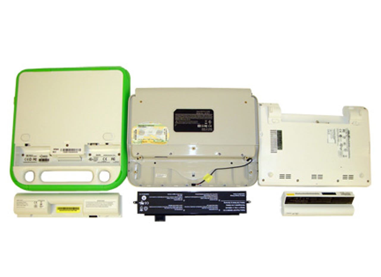
The battery in our OLPC XO review sample was a 4-cell 3,100mAh LiFePO4 (lithium iron phosphate) unit, although 5-cell nickel metal hydride batteries (NiMH) are also used. Among the advantages of lithium iron phosphate are the absence of heavy metals and the ability to support more charge/discharge cycles than conventional Li-ion cells (OLPC quotes 2,000 in this case). Battery life figures vary, but in our simple rundown tests we got around 3.5 hours with the screen backlight on (colour/transmissive mode) and 4.5 hours with the backlight off (greyscale/reflective mode).
The Intel Classmate's battery is not designed to be easily removed — you need to undo four screws to get the protective cover off and two more to release the battery itself. Having done this, you discover a bulky and relatively weighty 6-cell 4,000mAh Li-ion unit. Intel claims around four hours' usage for the Classmate on battery power: this seems optimistic in our experience, although we have yet to formally test this.
The Eee has the most compact battery pack, a 4-cell 4,400mAh Li-ion unit for which ASUS claims 2.8 hours' life, which seems reasonable in our (so far anecdotal) experience.
OLPC XO
The OLPC XO's motherboard, which is built into the back of the screen lid, uses an AMD Geode LX700 processor running at 433MHz. The PCI and memory interfaces (North Bridge) are built into the CPU, as is the graphics controller. The South Bridge chip, which includes controllers for audio, hard disk, USB and power management, is the AMD Geode CS5536. There is 256MB of RAM and 1GB of solid-state storage. Extra storage can be added via the SD card slot.
Intel Classmate
Intel's Classmate is built around the 90nm Celeron M Ultra Low Voltage 353 processor running at 900MHz. It has a 400MHz frontside bus linking it to the Mobile Intel 915GMS Express chipset, which includes the Intel Graphics Media Accelerator 900 graphics module. Like the OLPC, the Classmate has a moderate 256MB of RAM, but Intel's system has double the solid-state storage capacity of the OLPC XO at 2GB. Again, there's an SD card slot for storage expansion.
In passing, it's worth noting that Intel clearly does not expect the average user to modify or otherwise tinker with the Classmate's innards: to expose the motherboard for the above picture, we had to remove more than 20 screws and detach the screen — a process that took the best part of an hour.
ASUS Eee
Like the Classmate, the ASUS Eee is built around the 900MHz Intel Celeron M ULV 353 and the 915GMS chipset, although it comes with a more generous 512MB of RAM. The 2G Surf model shown here has 2GB of solid-state storage, although more expensive 4GB and 8GB models are available. As with the other two notebooks, storage expansion via an SD card slot is available.