Twitter for Windows Phone updated: Looks like iOS, Android, and BlackBerry 10

Twitter for Windows Phone is updated
One of my most used applications on my smartphones is Twitter, but I have always used third-party clients on Windows Phone, since I was never a fan of the official Twitter client. Twitter released an updated version today that aligns the design with Android, iOS, and BlackBerry 10.
The new Twitter app definitely looks like Twitter and gets away from the Metro UI styling, although you can still swipe right and left to get to other columns. I am still getting used to it, but personally I don't like how much room is taken up by the top icons. I use third-party apps — Tweetings on Android and BB10, TweetBot on iOS, and Rowi on Windows Phone — because I want to see more tweets on the screen, and not the icons for the application.
The update is better than the old version and does add some Live tile and lock screen functions. I would probably use this application if they shrank the upper icons and gave me the options for a dark theme.
Do you like the new Twitter client for Windows Phone? You can check out several screenshots in this gallery.
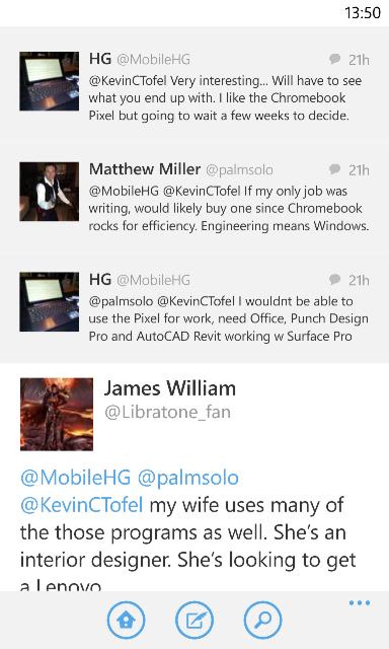
Twitter for Windows Phone main feed.
Viewing my profile.
What's trending?
Menu options.
Editing my profile.
There are just a couple of settings available.
Lock screen options.
Notification settings.
Pull down to refresh works, too.
Composing a tweet with a mention.
Content can be attached.
Conversation view.
Searching Twitter.
Related stories
MWC 2013: Windows Phone Store has more than 130,000 WP8 apps
MWC 2013: Nokia aims to broaden Windows Phone appeal with new Lumias
- Nokia Lumia 920 or HTC Windows Phone 8X; a purchase made with the head instead of the heart
AT&T and Nokia release Lumia 920 update with WiFi and camera fixes
Microsoft Windows Phone 8 guide: Are these improvements to a great OS enough?
Another ZDNet Great Debate lost, still not giving up on Windows Phone