Surface Pro and Surface RT should have been different colors

Back in the day I used to own a Dell Inspiron laptop. When I took it out of the bag and put it on the desk, the logo was the right way for me to read it but when I flipped up the lid it was upside down to everyone else.
At some point this changed. Cue the story of how in Sex in the City the Apple logo is the wrong way up. Like carrier bags from shops that also advertise the story as well as being useful for transporting goods, a right-way-up logo on your laptop builds the brand. That logo on the lid isn't for your personal delight -- it's to tell your peers that you approve of the deivce you're using.
So why are the Surface RT and Surface Pro the same colour?
Distinction
I'm always interested in what devices people use, and I usually "device watch" whenever I'm out in public. As I walked through and variously sat in Amsterdam Schiphol airport last week, I saw a whole load of iPhones, a good number of old school BlackBerry devices, Dell laptops, ThinkPads, handful of iPads, one iPad mini, and a few other generic devices.
It's the "generic devices" that worries me though. As someone who watches the industry quite keenly, you'd think I'd be able to make a definitive list of whatever I've seen. I can spot the difference between a Dell and a ThinkPad over a decent distance whilst sitting at the gate, but if someone holds up a black rectangle that's not an iPhone and starts prodding at it, I usually don't know what it is.
You'll notice that I didn't spot any Surfaces, RT or "early release for Microsoft super-friends" Pro. That's not surprising, but imagine I had seen someone using a Surface across the departure lounge. How would I have known whether it was an RT or Pro? They're both black, and the difference in thickness you can't tell without close inspection.
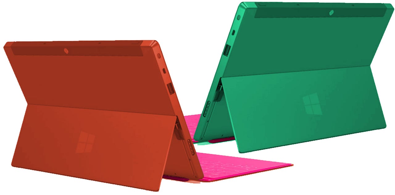
The answer, different colours. Glance across -- "I spy a lovely red Surface, must be an RT", or "Mmm, a beautiful green Surface, add one to Pro!"
I am not a graphic designer, but for your delectation I made these mockups of a red and green Surface. I'll let you into a secret -- I'm quite proud of how this came out. You should have seen the first attempt. Also, the ports on the red one are not on the wrong side and, no, I didn't just flip the image horizontally. Well, OK, they are and I did. However, the point is, if you knew colourisation told you that one was RT and the other Pro, looking at that picture you know you have one instance of each type.
Validation
This approach would help to two things. Firstly, I'm no expert in industrial design but most new-wave Windows kit is coming out in black or silver boxes. Only Lenovo has been brave enough to come up with a gorgeous burnt orange colour on the Yoga 11. Microsoft added zing with the Touch Cover covers -- additional colour on the chassis would have been good too.
Secondly, one of the problems in the consumer space is that people tend to be influenced by what their peers buy. And those peers can either be people know, or people not known to them. There are modes of direct influence, which I'm not talking about here. A good example is a group of young friends who all encourage each other to buy BlackBerrys so that they all have access to BBM. Another is simply asking a friend for recommendations.
Some marketing strategies are designed to interrupt what you're doing in order to get your attention and lodge a message. Spam, direct postal mail, telemarketing, TV ads all do this. The other form is non-interruptive such as billboards. (On the web we're now seeing more interruptive marketing through interstitial ads, as opposed to non-interruptive ads like Google AdWords.) Non-interruptive marketing is designed to accumulate over time such that when you hit the right point in the buying cycle, your unconscious mind has already formed most of the judgement.
However, actually seeing products in use by peers has the same effect as non-interruptive marketing, but none of the cost. One of the things that we tend to do as humans is converge on commonality. Part of the psychology to do that involves tracking what our peers do and keeping mental tallies of various facets. Back on the plains this was probably all about what our peers were doing to get the best breeding partners. Today, that psychology remains active, but is brought to bear on a larger set of problems. Anyway, the point is this -- if you're in the market for a tablet, chances are that unconsciously you're already keeping track of how many iPads, Kindle Fires, Nexus 7s that you see when you're out and about as well as making more conscious enquiries from friends and family.
Seeing people using Surfaces in public would no doubt help sales pick up because of this basic "tallying" that we do, but I'm wondering about using colour to address one of the biggest problems with Microsoft's tablet strategy, namely that it's created two very different products with the same basic name.
Visibility
I remain keen on this idea that Windows RT has the potential to be a good post-PC operating system in a way that Windows 8 cannot. But there's now a problem. If people do start buying Surfaces in any number, and it doesn't matter which variant, that will start to get noticed. Let's imagine it's a year out and both RT and Pro products have had a chance to get embedded into the market. Someone thinking about buying an iPad might reflect on the fact that for the past few months they've seen more Surfaces being used. Perhaps they might have asked the owners about them.
But what they don't have is any clear idea which, because all that individual is seeing are discrete black boxes. It could be 50:50 RT to Pro, it could be 20:80 RT to Pro, there's no way of knowing. So when that person goes into the store, they don't know what to buy. If they have a sense that they've seen far more red ones than green ones, and they then have the opportunity to apply a conscious and considered understanding of the pros and cons of each, that are more likely to make a good choice. It could be that the market is wholeheartedly rejecting Surface RT over Surface Pro, and then he or she walks right into a store and buys the one the market has rejected. That story doesn't end well. Another possibility is that the customer's confusion is enough to cause them to abort the Surface plan any buy a competing tablet.
There's another argument that influencers would be helped with this as well. If an IT manager is being sold heavily on buying green Surfaces, but is aware that every time he or she is out and about she only ever sees red Surfaces, that's either intrinsicly useful information or it signals that more information is needed. Similarly it would help people who write or comment on the state of the industry. If I start seeing more Surfaces out in the wild, if they're all black, I don't actually know whether people are buying Surface RT or Surface Pro.
This entire process, by the way, also happens with phones. The old style squarish BlackBerry handsets with the buttons was a fantastic industrial design because it looked nothing like a phone and it was easy for people to build up this mental picture that everyone had BlackBerrys. This accelerated them to a tipping point. I'm grateful to my ZDNet colleague Mary Branscombe for pointing out that on the new BlackBerry Z10 smartphones the logo of covered by your hand when you're holding it. Put it closer to the top, and people would know you were rocking a Z10.
Similarly, Samsung has a very distinctive white shell, nicely curved, and with a clear "Galaxy" logo at the top where your hand won't cover it. The iPhone has always been instantly recognisable. It's no accident that the most successful phones have an identity that can be tallied without conscious thought. You might also want to consider HTC who started out building handsets for other people, now build their own, but don't have such a clear identity in terms of their industrial design. Now look at their market performance -- it's not good.
But I digress -- this is about the Surface.
The Surface looks good -- RT or Pro, it's the one thing that everything agrees on -- but having two products that look identical but are in reality couldn't be more different in terms of their capabilities does nothing but add to market confusion. A clearer signal of which one was which, and one that would allow the market to organically percolate up which was the more popular by virtue of it being more obvious that there were more of them, could be a huge help in framing Microsoft's tablet proposition.
What do you think? Post a comment, or talk to me on Twitter: @mbrit.