The Metro hater's guide to customizing Windows 8 Consumer Preview
Summary: Why has there been such a negative initial reaction to the Windows 8 Start screen? Maybe it's because the default presentation is so ugly and impersonal. If you hate Metro and want to use the Windows 8 Consumer Preview mostly with desktop apps, try my five-minute makeover and see if it helps.
I’ve been following the ongoing debate over the Windows 8 Start screen with amusement and genuine sympathy. The common complaint goes something like this: “Touch-optimized Metro apps are great. The improvements to the Windows desktop are solid. But the Start screen, which serves as the hub between the old and new Windows, is too much new and not enough old. The transition is jarring, and ultimately doesn’t make me more productive.”
OK, I understand that point of view. In fact, I had a similar complaint when I first looked at Windows 8. Personally, after using the new interface for a while, I have come to like its overall design, but I also get how someone can look at the Windows 8 Consumer Preview with a much more jaundiced eye. I also see its long-term potential and expect it to improve and be refined over time.
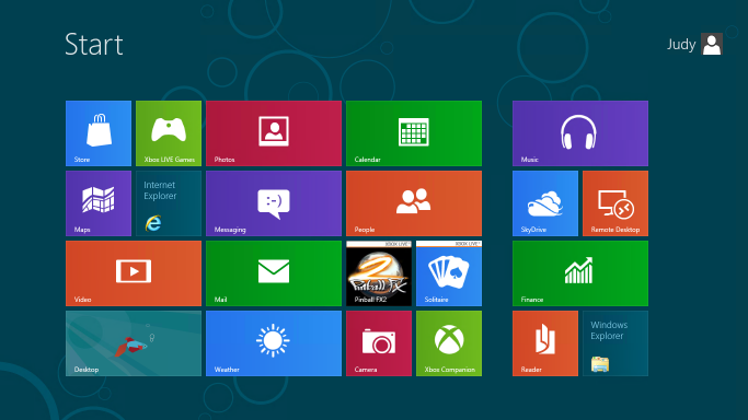
Frankly, I think a lot of the reason people have a negative reaction to the Metro style Start today is because the default presentation is so ugly and impersonal. Here, see for yourself:
By default, all 18 Metro style apps in the Windows 8 Consumer Preview are literally in your face, pinned to the Start screen along with tiles for the Store, Internet Explorer, and the Desktop.
If you install a Windows desktop app like Microsoft Office, all the icons that would have been dumped into the All Programs menu in Windows 7 are splattered across the right side of the Start screen
Taken as a whole, the result is messy. It’s a great way to encourage beta testers to try out the preview apps and thus get an idea of the potential of a future with lots of slick, well-coded Metro style apps. It is distracting and disorganized if you are trying to be productive today, in an environment where you mostly use Windows desktop programs.
The solution? Clear away the clutter and reorganize the Start screen into something more personal and more appropriate to your workflow. Once I did that, I found it was a lot easier to understand how to use the new Start. Here’s what the customized Start screen on my test machine looked like after getting my five-minute makeover:
No, your eyes are not deceiving you. I’ve also included custom Shut Down and Restart shortcuts.
The whole point of this Start screen is to make it easy to get to the desktop, where almost every technique you know by heart from earlier Windows versions still works. (Unless, of course, it involves the Start menu.) If you can get to the desktop, you can pin shortcuts to the taskbar, pick recent documents from jump lists, and use a variety of shortcuts to do stuff directly without returning to Start.
For me, being productive with the Windows 8 Consumer Preview means accepting a few realities:
- You need to learn new ways to accomplish some tasks. In most cases, I think your productivity will increase. Some specific tasks take more steps but are easier once you learn them. I really can’t think of a single common task that is significantly more difficult than using the Start menu in Windows 7.
- Keyboard shortcuts really make things simpler. That’s been true of Windows for as long as I can remember, but Windows 8 really takes it to another level.
- It’s OK to ruthlessly clear unwanted tiles from Start. If you expect your primary usage to be Windows desktop apps, you can safely remove just about all of those.
- The search box is your friend. Seriously.
In the gallery that accompanies this post, I explain in detail, with specific steps, how to give your Start screen a complete makeover so it becomes a useful gateway to the Windows desktop. I also introduce a handful of keyboard shortcuts that will make switching between the Start screen and the desktop much easier.
For the step-by-step instructions, see The Metro hater's guide to customizing Windows 8 Consumer Preview.
Here's what you'll find in that gallery:
- Introduction with before/after screens
- How to quickly remove tiles from Start
- How to change the Start screen background
- How to pin desktop apps to Start
- How to pin files and folders to Start
- Creating custom groups of tiles
- The hidden Zoom shortcut
- Renaming and rearranging groups of tiles
- Replacing the "betta" desktop background
- How to create a desktop background that perfectly matches the Start screen
- Uninstalling Metro style apps you don't plan to use
- Creating custom shutdown/restart shortcuts
It also includes the five Windows 8 keyboard shortcuts you must know:
- Opening the Charms menu
- Opening the Settings pane
- Searching for Windows settings
- Using the new program switcher
- Using the classic app switcher that recognizes desktop programs and Metro style apps
Related posts:
- Windows 8 Consumer Preview: a fresh start for Microsoft
- Windows 8 in detail (gallery)
- A closer look at the 18 built in Metro style apps (gallery)
- Getting started with the Windows 8 Consumer Preview
- Shortcuts and surprises in the Windows 8 Consumer Preview
- Windows 8 unveiled (Developer Preview)
- Windows 8: what you need to know to be productive now
- Windows 8 wish list: 10 Metro-style apps I want to see
- A deeper dive into Windows 8: can Microsoft’s big bet pay off?
- This new version of Windows? "I love it." "Oh yeah? I hate it."
Kick off your day with ZDNet's daily email newsletter. It's the freshest tech news and opinion, served hot. Get it.


Talkback
microsoft has no taste.
The customization you did is a huge improvement, but still...
I think it's a good concept with great functionality, but...
There needs to be more customization options. I hate the fact that we cannot choose the background or a full size image for the static tiles. I don't care if it's a desktop only item, I want it to have a full size image of my choosing.
The biggest problem I have with Windows 8 is the jarring separation between the two different worlds. Either merge them, or completely separate them. This seems like more of a transitional OS at the moment, but then again, that's true with every preview release of an O.S.. Time will tell what becomes of this. My hopes is that they choose one direction or the other and adapt it so it no longer looks less like two different, but stacked, operating systems.
Prediction: Metro apps may be placed like sidebar gadgets
It's Not Jarring As It's Been Claimed Except Internet Explorer.
Everything is 10x faster, and more informative without being in the way when it comes to uploading files, editing files, navigating windows explorer and etc. Mail notifications and etc. are done elegantly like they should have long ago on the OS that makes you realize how much they needed to update.
Also I really think the way Microsoft have advertised or focused on is like what they have done to Xbox with Kinect. They focus too much on the new stuff for 'casuals' and the much better additions for most of us who know what the hell we're doing.
While it was feared this new OS makes more power user functions harder to get to, that's not true; It's actually 10x faster by just right clicking the bottom left corner or the revamped Windows+x keyboard shortcut.
The Task manager is actually useful know with all the information us Power Users cared about. Also, the operating system actually accomodates SSDs completely understanding to optimize things (TRIM) in long-recommended intervals and you not having to worry to remove defrag and etc.
The start-up is a lot better and is literally as fast as it was advertised.
The ONLY grip as far as jarring with the new Metro UI is the Two Versions of IE. It sort of makes no sense as far as switching back from them and then having multiple tabs opening on both; it's sort of dumb and it has annoyed me.
Also there is a bug with one of the keyboard shortcuts that they're fixing when it comes to going back and forth between Win+q, Win+w, and Win+f: You can switch back to apps (Win+q) from searching settings and files (Win+w and Win+f) for some reason that doesn't apply to the other search short-cuts.
Overall, I think Windows still need to realize they need to at LEAST provide advertising/useful information for power users better than they have then just the casual market basically that don't really need a desktop to use a computer what it advertises to them and instead use a tablet or phone.
One thing
I honestly think Microsoft should take a look at re-designing the start screen for the final release that has all the "classic" desktop icons (Computer, User Folder, Windows Explorer, etc...) pinned front and center for RTM, and have the metro tiles next to them, better organized. I feel that would ease users into the new start screen as well, better than it is in the CP.
My start screen is similarly laid out, and I've all but uninstalled a handful of Metro apps (I'm REALLY loving the weather app!). All it needs is a Facebook and Twitter app, and I'd be set! Otherwise, Windows 8 is fun to use, and I've been using quite regularly since it's release, and have yet to find myself hindered by the new start screen in the least.
Vista was better
THis is worse then what the did to Access 2010 and that was pretty bad.
What did they do to Access 2010 that was different?
I haven't used Access 2010 that much, but I have done a lot in 2003 and 2007, so I would be interested to know any basic gotchas before I need to get into it too deep again.
One thing
I agree with Ed
Make things like the user folder, etc into live tiles. I've been running Windows 8 for over a year on several non-touch screen computers. Put the things you use regularly in the first set of tiles. Click in the lower left for most system maintenance tasks and hit the Win button on your keyboard and type away to find things.
A pig with lipstick
Hardly a "pig"
Yes a "pig"
Hardly, yes it is a pig
If i just use sleep mode, windows 8 'boots' in 12 seconds or less.
But if i actually shut down and reboot, it takes quite a few minutes. Even after it boots, when i get to my desktop, i have to wait another few minutes before internet explorer will open up.
Of course, i upgraded (not clean install) from previous version of windows, though not intentionally (I wanted to leave my existing installation untouched and install to 2nd partition, it never prompted me).
Your problem on a computer with similar specs doesn't have that problem....
I think you may have to play around with your Bios about what to start.
@robwilkens
agree with you
Right...
Get back on track, Ricky
It's funny...
My typical workflow sees me using 4 or 5 windows, with most visible with reference material, whilst I work in another - mainly technical documentation, presentations, product concepts etc.
Metro feels like Microsoft are dropping off the "s" in the name, are we getting Windows 8 or Window 8? For me, the multi-windowing environment is what I need and love, and one of the reasons I just cannot take a tablet seriously as a general purpose work tool. I can see it being useful in vertical markets and for consumption, but for the type of work I do, a single window interface is a non-starter.
If the apps I use "go Metro" in the future, that leaves me being a lot less productive, switching between screens, as opposed to glancing at windows (little w).
I like the look of Windows 8 on a tablet, but the Contact, Calendar and Solitare Metro apps look quite frankly ridiculous on a 1920x1080 or 2560x1400 24" or 27" display - blowing up the fonts and images by 210% over a 10" tablet doesn't make a good experience!
I can see where, for example, a OneNote Metro app would be great when out and about, for collecting information and making notes, for when I get back in the office. But once there, I need OneNote in a window in the corner of the screen, along with other windows, so that I can transpose my notes into a finished document.
IF that is the way forward, I am happy with Windows 8. If the Windows desktop is slowy getting killed off for a less productive Microsoft Window screen product, I am either going to be left in Windows 7, with aging software, or I am going to have to look for a new platform that lets me work effectively.
Unfortunately, both Apple and Ubuntu seem to be going in the same direction. Let's hope that not all GUI environments shun the major advantage they had over old DOS single screen apps...
exactly