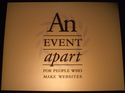
An Event Apart 2008: Day 1

The antique Palace Hotel in San Francisco houses An Event Apart, a collaboration of interactive presentations about web standards, user experience design, and best practices. The two-day conference features well-known speakers from around the world, including AEA's hosts Jeffrey Zeldman and Eric Meyer.
In this post, I will be showing you pictures from the event, and summarizing each presentation. If you are in to HTML, CSS, and overall web usability: pay attention.
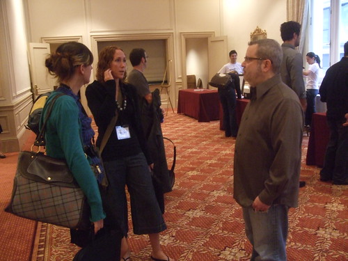
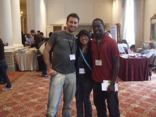
8:01 a.m. Zeldman mixin' it up with the attendees. Breakfast is being served until 8:30.
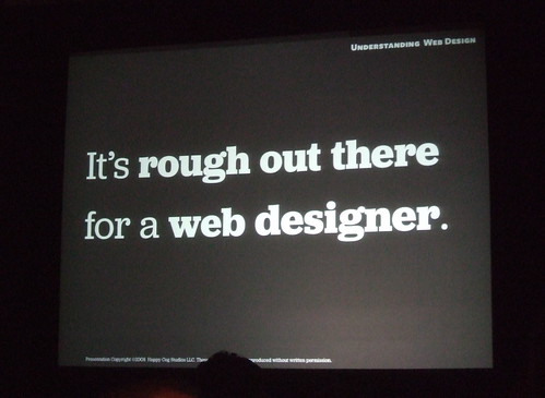
Understanding Web Design
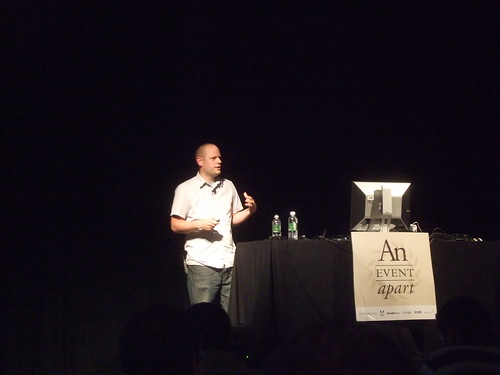
Jeffrey ZeldmanWhat do designers need? Empathy. It's rough out there for a web designer.
If you are in this field, the technology is always changing, and you always need to keep yourself educated. There are some really good resources out there for you.
Just because you know how to use Photoshop and Illustrator doesn't mean you are a designer. Good information is hard to find.
Never stop learning.
“At a university, you might be a webmaster. In Silicon Valley, you might be a user experience director. You might be doing the same job in both places though.” -Jeffrey Zeldman
If you website's structure in any way resembles your organization's structure, you fail.
Who speaks for web design? Who talks about web design easily enough that the public understands? The groups who do speak for web design may have some biases.
Great web design is a template that can be shaped into anything and look natural. We need to get away from the idea that design is something heroic. It's not something you should be really impressed by. It should be a design that you can live with for 20 years, and something that represents your brand. Designers do have an urge to make someone's jaw drop though.
Ajax is cool, but maybe your grandmother just wants to pay her parking ticket and be done with it.
Good web design is about the character of the content, not the character of the designer. The old Facebook was a very comfortable place to do those silly Facebook things. Now everything has changed about the layout; new and unfamiliar navigation, too much whitespace, "boxes" are now apps.
12 tips for good design:
- Start with the user. It's about your taste.
- Know yourself, know your own weaknesses.
- Find the right clients. Find an environment where you can thrive.
- Sell ideas, not pixels. Don't show them all the colors and mockups that you have.
- “I don't know” is okay.
- Build trust. Meet with your clients even if you have nothing to say.
- Bring out the big guns.
- Create a paper trail. Remind people what they already agreed to.
- Never underprice your work.
- Say no to SPEC.
- Say no to rush jobs.
- End with the user. When in doubt, go back to the user.
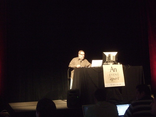
9:23 a.m. Setting up for the next presentation. This year, AEA is in the big conference room.
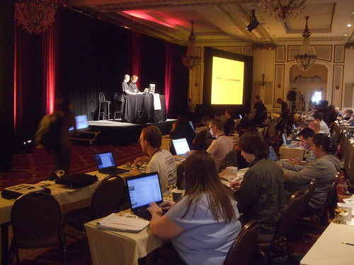
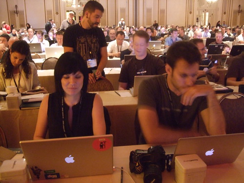
9:34 a.m. Every person in the room has a laptop.
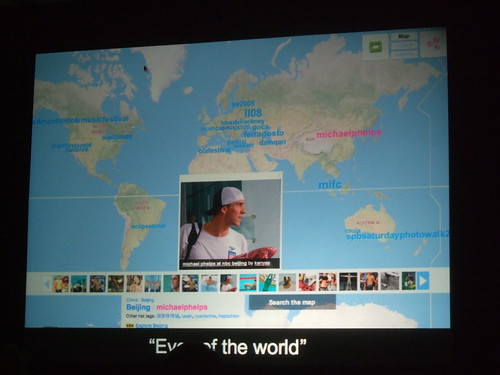
9:35 a.m. Metaphotography with Meyer and Zeldman:
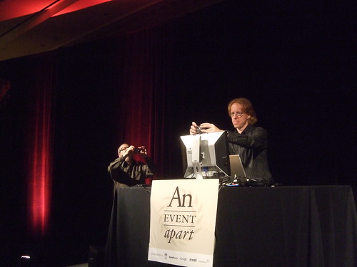
The Lessons of CSS Frameworks
Eric Meyer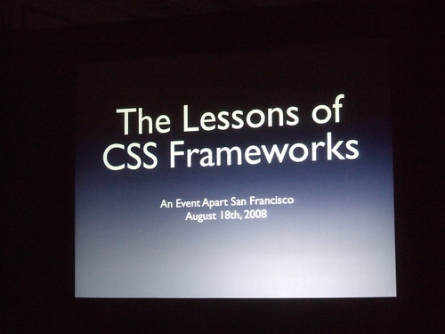
There is nothing wrong with templates, but you don't create your company's home page based on a cookie cutter template. It's okay to take ideas from them though. Create a foundation for your projects.
What can we learn about the frameworks already in place? Need to focus on support for reset styles, colors, fonts, forms, layout, print, and hacks. The only framework out there that has solid support for all of these is Blueprint.
When choosing a body size, about half of the frameworks use percentages on body sizes and the other half use pixels. Oddly, most use 13px as a default body size. Heading sizes vary greatly among frameworks too. HTML 4's default heading sizes are the following from <h1> to <h6> respectivelly: 2em, 1.5em, 1.17em, 1.12em, 0.83em, 0.75em.
Class and ID naming conventions are spread out across the board. Some people use "content", others use "container". The most consistent element names are #header, #main, #footer.
There are really two ways to include styles: Pointing to a single stylesheet that imports other stylesheets, or use <link> tags to just include them all in your <head>. Internet Explorer will cache the first file you point to, but not any of the files that stylesheet links to. That means they have to be reloaded every time.
Frameworks do a good job with clear-fixing, pseudo-padding, and IE hacks. Some frameworks automatically add external linking icons for you (If a link begins with mailto:, the framework adds an email icon).
A framework called 960 comes with sketch files; PDF printouts that you can use to prototype your designs.
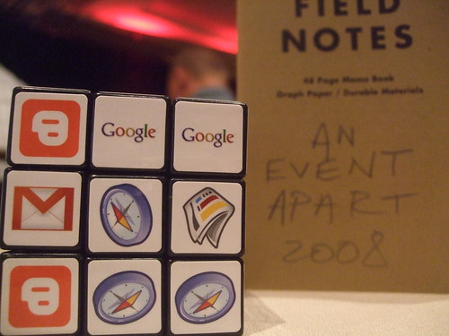
11:03 a.m. Google handing out cubes:
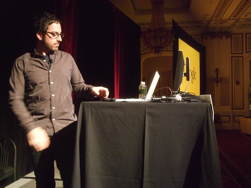
Storytelling By Design
Jason Santa Maria, Happy Cog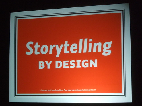
When you think about design, think about the message behind it. When we talk about just how we build something, we miss the message sometimes.
From an early age, we look at picture books and make stories in our head. This is called graphic resonance. Translated to web speak — the designer is the narrator.
More and more "web 2.0" icons and layouts look the same. Why are we plagued by this sameness? We're all capable of telling a story, but we are having trouble communicating that with our designs.
Get a handle on your viewport. When we look at a book, we can easily identify the length and height of it. But what about a web page? It can go on forever. We have a license to talk as much as we want. Books have a defined cover, an about page, and a table of contents. On a web page, we have to squeeze that into one place.
"Golden" ratios rely on predictable dimensions. So much graphic design has been based upon these ideals. Most of the web runs on a fixed dimension: width. If we can't depend on these things, what are we left with?
Tell a story with your design.
Awesome links from this presentation:
- Fray Magazine
- noonebelongsheremorethanyou.com
- A Brief Message
- Principles of Beautiful Web Design
- ESPN E-Ticket
Web Application Heiracrhy
Luke Wroblewski, Yahoo!
How are people using the web? Are we actually reading every word on every webpage, or are we quickly scanning around the page in a zigzaggy way?
Things to consider when designing:
- Presentation: How does you application appear to the audience?
- Interaction: How does your app behave in response to user actions?
- Organization: How is your app structured?
The presentation layer can estabilish relationships between content and provide situational awareness.
Visual organization and personality make a great presentation. It's important to communicate the brand essence of the product.
If you understand proximity, continuance, and closure you can understand perception. You have about 1.6 seconds to grab a user's attention.
Contrast is important. Use visual relationships to add more or less visual weight to objects. Text is parsed quickly, so it has a very low visual weight.
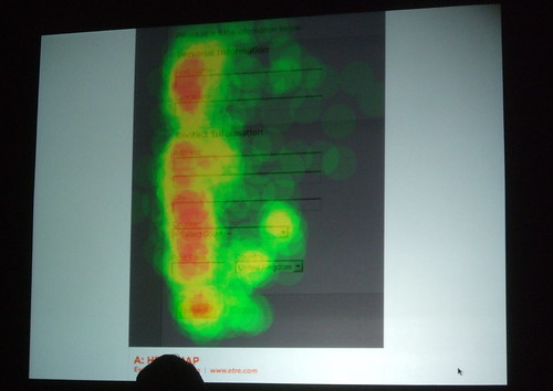
Symbols have a little bit more, and detailed photos and graphics have the highest visual weight.
How do people access content these days? Think of it as a web ecosystem rather than a site heirarchy. There are a bunch of sites like Digg, Twitter, and Delicious that aggregate content through a popularity filter. More and more, people are seeing your content in a way that you didn't intend them to. Make sure you balance content, non-content, and navigation.
When something is blocking your progress, it should have the most visual weight on the page. We have to design for speed too. Don't make people's eyes travel all over the place. Keep their eyes going in a straight line.
Cool links from this presentation:
1:03 p.m. No one is asking questions because it's almost lunch time. If you know my style of blogging, you know I will have some pictures of the food. BRB!
1:10 p.m. Short line at lunch. They had similar food last year:


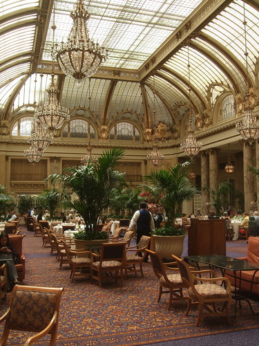
2:02 p.m. The Palace Hotel in San Francisco is a beautiful venue for a conference on design:
Shepherding Passionate Communities
Heather Champ, Flickr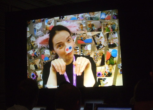
Flickr is a small photo sharing site that launched in 2004. It's grown up a little bit since then:
- 3 billion page views a month
- 2.7 billion photos
- 52 million monthly visitors
- 28 million members
- 5,000 new uploads a minute
It's easier to see world news through Flickr more than ever. People all over the world are uploading, and with geo-tagging, we can keep up with it in real time.
What is a community manager?
“Being a community manager is like being in a pinata. People beat you with sticks and you still have to give them candy.”
A community manager is a bridge between the community and the team. Being active in a forum, post on the community blog, and plan events. Basically talk in a soft, pleasing tone of voice.

At Flickr, we try to blog as much as possible. We have a strong forum and a solid community guidelines. The best thing you can do is build tools and put them in the hands of your members.
When things go wrong, don't try to whitewash what happened. Be honest with your community.
Don't create super-villians. Sometimes you have to make tough decisions, but you will always have people who won't stop harrassing you. If you keep respecting your community, then everything should even out.
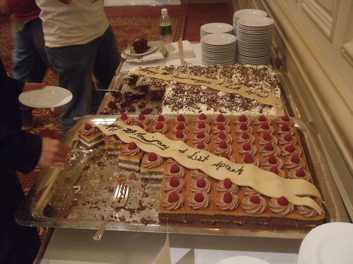
3:19 p.m. This is the sixth year of An Event Apart. They made cake for us
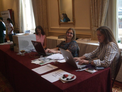
3:23 p.m This collaboration wouldn't be possible without the amazing dedication of the event producers:
3:25 p.m. Attendees from Apple, Automattic, and CBS Interactive are in attendance:
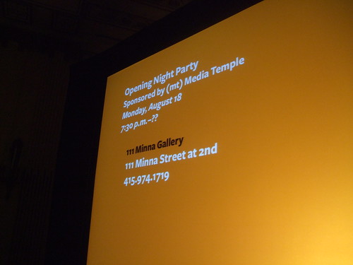
3:30 p.m. Details about the afterparty are announced:
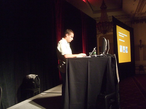
3:32 p.m. Coach Zeldman is prepping Happy Cog's Liz Danzico before her presentation:
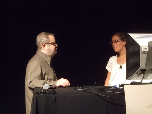
3:52 p.m. Liz Danzico from Happy Cog is speaking. Taking notes now.
The Age of Frameworks
Liz Danzico, Happy Cog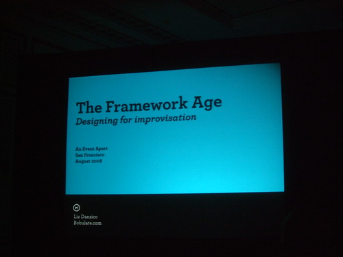
Uninscribed and detectable cues that loosely govern a set of actions or interactions. These types of frameworks that shape our behavior are much more important today because we have to improvise new web systems all the time.
The web from classical to jazz. As designers, using things like Twitter, we don't understand the rules of social ettiquitte. Interfaces are no longer dictating user's behavior. There are new rules.
In the book Glut: Mastering Information Through the Ages, content on the web looks like publishing, but it's just the same oral patterns that have been passed down through the years.
If you say "yes, and..." instead of saying "no, but...", you never shut down an idea.
Leave your own needs behind and be exquisite in your simplicity. Involve the audience.
Sometimes the designers have one idea, but the users overrule it.
Actively involving users in your design is important.
Bulletproof Design A-Z
Dan Cederhold, Simplebits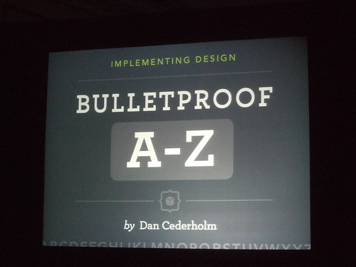
A product labeled "Made in Vermont" is worth 10% more than products made elsewhere.
When something is well-crafted, it reflects that a human is behind it. Craftsmanship is implementation.
The A-Z of bulletproof web design:
Anchor links with meta information. Make sure the whole row is clickable, not just the text. If you have a meta number, put it after the most important information.
Border-radius (progressive enrichment), a.k.a. rounded corners. In CSS3, we will have the ability to set the border radius of an element. There are vendor specific rules that already work today (-webkit-border-radius, -moz-border-radius). Note: vendor-specific properties should be placed in a separate style sheet (enriched.css). This is great for prototyping before carving out images.
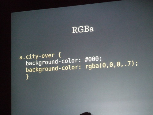
Color transparency with RGBA (progressie enrichment). You can use opacity: 0.7, but it will also set that value for all the children. To fix it, use background-color: rgba(0,0,0,0.7).
Do websites need to look exactly the same in every browser? No! D is for decision makers who get that.
Easy clearing of floats. This is not a fun topic, but it's very important.
Frameworks. You might already be using one, especially if you have your own little CSS template setup.
Gridlasticness (from Latin gridius lasticus nessinus = grid layout using ems). Em/pixel values make more send when using the 62.5% method. Adjusting text size may throw off the grid. Think modularly from the outside in.
Horizontal grid? Sure. Vertical grid? Sorta.
“Do you ever get a comp where EVERYTHING is lined up perfectly? It reminds me of those people who put the pillows perfectly on their bed.” -Dan Cederholm
Use classes for main columns.
IE8 Beta still refuses to resize text in pixels. A pixel is a pixel and it shouldn't be resized. This means we still have to use relative units to resize text.
jQuery. I hate Javascript, but I love what it does.
Kitty. Don't ask.
.last class. Use this for elements that are the last element in a section. Using jQuery, you can even do this programatically.
Must skip a few letters...
Shiftin backgrounds, or parallax scrolling for the lazy. An awesome usability project called SilverBack allows you to resize a screen and have it look perfect during the process.
A testimonial for reset.css. When redesigning MTV.com, I found over 150 references to margin:0; padding: 0;
UR stats. If your main userbase is IE, you might be in trouble.
5:57 p.m. Packing up for the day. Will be back tomorrow.