Can Ubuntu 'out-sexy' Apple?
After spending a few years concentrating on stability, performance and compatibility, Ubuntu is now set for an image makeover.
Jono Bacon, Ubuntu community manager, spills the beans:
The new style in Ubuntu is inspired by the idea of “Light”.
We’re drawn to Light because it denotes both warmth and clarity, and intrigued by the idea that “light” is a good value in software. Good software is “light” in the sense that it uses your resources efficiently, runs quickly, and can easily be reshaped as needed. Ubuntu represents a break with the bloatware of proprietary operating systems and an opportunity to delight to those who use computers for work and play. More and more of our communications are powered by light, and in future, our processing power will depend on our ability to work with light, too.
Here are a few snapshots of the changes:
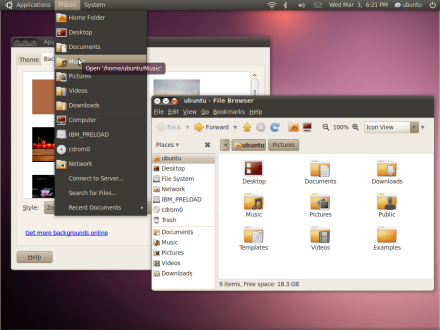
The color scheme is one thing, but a the shift in the position of window buttons is another thing, and already several commentators on Bacon's blog have expressed their dislike of the new scheme:
"The window control button placement is a horrible idea. Other than breaking Fitts law, what happens if someone overshoots the edit menu by a touch? Click, close. Oops. Please change this."
"The right top corner is for the window icon, it’s crowded with the window controls as well. I’d much prefer it to be on the standard top left."
"Also please don’t get rid of a standard taskbar. Ubuntu isn’t mac, and there is no reason to hide away opened windows."
Note: If you want to familiarize yourself with Fitts's Law, here's more than you've ever want to, or need to, know.
Others see a similarity to Mac OS X:
"I agree, the bar and some of the icons looks like they are ripping off Mac OS X. Though that is not necessarily a bad thing and I tend to say the Apple has good visual design."
To me, the UI does indeed look ... well ... a bit Mac-like. But that might not be a bad thing. One of Mac's major selling points is simplicity, and while Linux has a long way to go before it's ready for the computing masses, giving the OS a more refined look might help people feel at home with the OS.
And for those people that don't like it ... well, there are tons of themes out there to choose from.