Comparing Netbook Desktops - Part 1, Ubuntu Unity

There has been a lot of discussion lately about Ubuntu's decision to make their Unity desktop the standard for their next release, not only in the Netbook Edition but also in the base release. As a good friend used to say, most of that discussion has produced more heat than light, so I am going to try to shed some light on the situation by comparing several of the latest Netbook desktops. It is not my intention to extend this comparison to general desktops at this time, although that might change.
First up is the Ubuntu Netbook Edition with the latest Unity desktop. I have posted screen shots of this desktop before, but I will include another here for reference and discussion purposes.
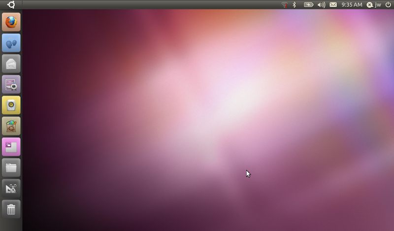
The first thing to notice about this desktop is that there are two "reserved" areas. One appears to be a more or less normal Panel across the top of the screen (but it's not, see below), and the other is the new column of buttons down the left side of the screen. Now, I might be wrong about this but it seems to me that one purpose of a netbook desktop is to make the best use of screen space or to make the most screen space possible available to applications. I don't see where this objective is being fulfilled by taking the menus out of the top Panel and expanding them to individual buttons, and then still leaving the top Panel in place anyway? Well, perhaps the goal was to make as many things as possible accessible with a single click of a mouse or tap on a touchscreen. That might be ok, if I could just auto-hide both the top Panel and the new Button column, so that I would still be able to use the entire screen... but unfortunately that is not the case, as far as I can tell. The top Panel doesn't seem to be a Panel at all, at least it doesn't have any of the normal controls or Preferences associated with a Panel, and I haven't been able to figure out how to do much of anything useful in cusomizing or configuring it. Likewise, I haven't been able to configure the left Column, either by hiding it, or for that matter even adding new icons to it.
At this point I will mention that I tried to find Unity documentation on the web, and I couldn't come up with much of anything that was useful. There are a couple of things posted by Unity developers describing the general concepts behind it, and what their design objectives were, but I couldn't find any sort of user documentation at all. I also looked for the "Help" button that used to always be included on previous Ubuntu releases (and which I personally had never used), and it doesn't seem to be there either. So there might be simple answers or solutions to a lot of the things I am saying here, but if so I haven't been able to find them.
I also wanted to change the clock in the Panel to 24-hour time, but couldn't find any sort of Preferences control for that... I would have liked to rearrange the icons on the top Panel somewhat, but couldn't find any "Move" or "Lock" controls... I suppose the bottom line is that the Panel and Column are pretty much what they are, and you might as well learn to like them because I don't think you're going to be able to change them.
Getting back to those icons, they are nice, and mostly colorful, with pretty pictures, but is it really obvious what each of them is for? Some of them are not to me. If you hover the mouse over them, a text box comes up with the name, but I thought Unity was supposed to be designed for touch-screen use without a mouse? Is it possible to "hover" your finger on something? Even if it is, and then a text box comes up, can you read that box or is your finger/hand/arm in the way? Also, although you can't see it here, if you get more icons than there is room for in the Column, it will start to "accordion" them at the top and/or bottom of the column. To spread them out again, you move the mouse up or down... but how do you do that on a touch screen without selecting something? It seems a bit clumsy to me. One more thing about the icons. Most of them are color, but the last three are monochrome. Is that supposed to indicate something special about them? Yes, it turns out that it does. Those are menu-like selection items rather than starting an application or utility. A few others like that might appear as you work, for example when you plug in a USB flash drive an icon to access and control it will be added, and that is monochrome.
Ok, one more thing about this desktop. At the top left corner there is an "Ubuntu" icon, for lack of a better term, with what I think is called the "Circle of Friends" symbol (is that right?). Click that and you get the following display:
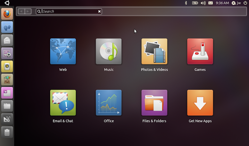
What the heck is that, and where did it come from? Although I have been trying UNE off and on for quite some time, and trying the Unity desktop for several months during the Alpha/Beta/RC cycle of UNE 10.10, I have never seen it before, and I honestly didn't know it existed or that the Ubuntu symbol in the corner was actually a button that would do anything, until I read about it in one of the technical descriptions that I mentioned above. This looks like a sort of replacement for the normal menu system, pretty much along the lines of the menus that were in the previous Ubuntu Netbook Edition releases. However, some of the buttons here start programs directly ("Web" started Firefox), while others drop into the menu system that you will otherwise get by clicking the "Applications" button. Whatever it is, you can get out of it by clicking the Ubuntu button again, or by pressing the Esc key.
Speaking of the "Applications" button, if you click that you will get the this screen display:
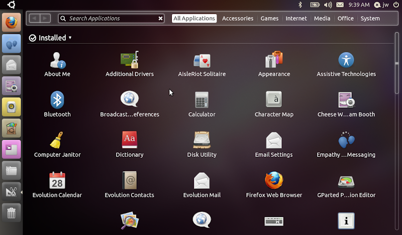
I suppose this is a list of "all" the installed applications. It reminds me of the Linux Mint menu when you choosed the "All Programs" function. You can scroll through it to find what you are looking for, or you can click the categories at the top to reduce the number of applications listed. Once again, the categories more or less correspond to the menu column which was in previous UNE releases, and to the Gnome Menu buttons in standard desktop releases. The thing that bothers me about this screen is that there are no Window Controls on it. How do I make it go away again? There is no "Close" button. Clicking the Applications button again doesn't work. Right-clicking on the title bar doesn't produce anything useful. In fact, I had stumbled across the fact that pressing Esc closes it, before I discovered the Ubuntu button. Clicking that will close this screen, but clicking it again doesn't bring it back... I find the inconsistency here quite maddening. Oh, one more thing about that title bar. I thought one of the original goals of UNE was to get window title bars merged into the top Panel area, to save screen space? That obviously hasn't happened here, so now we not only have the top Panel and left Column, but we also have a title bar for this window. Pretty soon there will be no space left on the screen for the actual window contents, if this keeps up!
Ok, get rid of the Applications window (by either pressing Esc or clicking the Ubuntu button at the top left), and then start Firefox by clicking its icon at the top of the stack. Firefox starts, and you get the following display:
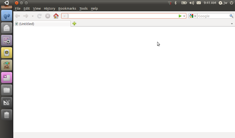
That looks a bit better. The Firefox window is "full screen" (well, as "full" as it can get with the top Panel and left Column), and its window controls have been merged into the top Panel. But that's all, just the window controls. There's a lot of empty space across that top Panel. You might think that space would be used for icons or tabs for other running applications, but you would be wrong, unfortunately. As far as I can tell, that space is not used for anything, ever. Maybe that is where the rumored "windicators" will appear in a future release? If you are looking for the "active program icons/buttons", they are supposed to be reincarnated as special symbols on the left Column icons, but you can't see that in this screen shot because the icons have inexplicably shifted up, and the Firefox icon is mostly hidden under the Ubuntu button. I suspect that is a bug, so I won't dwell on it. I will, however, say that adding a very small triangle adjacent to an existing icon is a very subtle way of indicating something is running, and I don't find it particularly appealing or intuitive. At least, though, in this case the normal window controls are visible on the title bar, so I can un-maximize the window if I want to.
What about other programs? Well, I clicked the "Cheese" icon, and I got this:
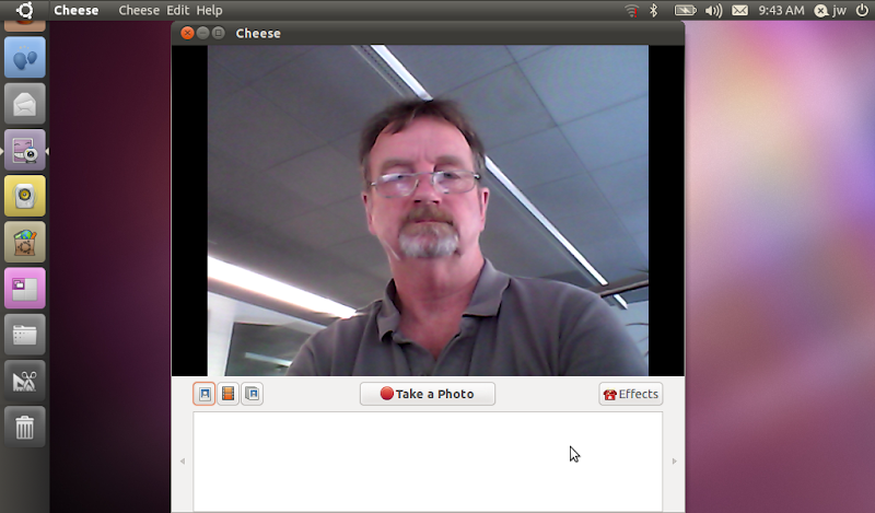
First question: why did this program not start in full-screen mode? Second question: why are the program menu buttons integrated in the top Panel this time, when they were not for Firefox previously? If I click the "Maximize" window control, it expands to full screen, so why didn't it start that way? When I do that, the window controls are then integrated into the top Panel along with the program menus, so why doesn't Firefox do that, and save some screen space? As I said, the inconsistency in Unity is maddening, but the potential seems to be very large. Oh, and in the icon Column a the left side of the screen you can now see the little triangles that have been added to the Cheese icon. If you iconify this window, it will disapper entirely, leaving only one of those triangles on the icon. You reopen the window by clicking that.
Close (or iconify) Cheese, and click on the "Files & Folders" icon, to get this display:
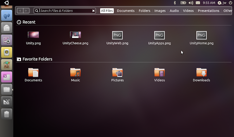
This appears to be the same thing we got previously on the Applications button, but with the title bar changed. The first line is a simple recently used files list, although I can't explain why some of them show a preview of the file and others don't. The "Favorite Folders" section seems obvious... but how do I customize that, add/remove folders, or whatever - perhaps it's dynamic? The menu buttons across the top correspond to some of the folders in your home directory, but even this turned out to be a problem for me. The screen shot application I was using for this saves its files by default in the Desktop folder. That is a BIG problem on UNE, because unlike Gnome, the contents of the Desktop folder do not automatically show on the desktop. Sigh. Even worse, I don't see the Desktop folder listed anywhere on this screen, so how the heck am I supposed to get there? In more general terms, how am I supposed to get to any arbitrary file or folder on the disk that is not in one of these pre-listed folders?
Then I found an even bigger problem with this utility. There are no window controls on it??? How am I supposed to un-maximize it, so that I can drag-and-drop to/from it? Hmmm. It just keeps getting worse... I don't think I can drag-and-drop anything in this window anyway?!?! I tried to move the pictures from the "Recent" section into one of the "Favorite Folders", but they didn't budge. I inserted a USB flash drive, which brought up an icon in the Column, so I tried to drag-and-drop them directly to it... they didn't budge. So what is this screen supposed to be good for, how am I supposed to use it? I think I must be missing the whole concept here, but honestly I can't puzzle it out. A little bit of documentation would go a long way at this point. I actually ended up opening a terminal window and using the command line to copy the pictures from the Desktop folder to the USB drive. Ugh.
Two more things to mention as I wind down... First, when I plugged in the USB flash drive, a new icon came up for it in the Column. When I wanted to remove it, I had to try to figure out how to unmount it. I found that right-clicking the icon gave me an unmount choice, but once I did that the icon just stayed there, rather than disappearing as it does on other desktops. I guess you just have to "trust" that it is safe to remove after a few seconds. Second, a couple of times while I was writing this I left the Samsung idle for a few minutes, then went back to it to check something... the screen was still on, I opened or closed a window or whatever, and then suddenly it locked the screen and switched to screen-save mode! This might not have anything to do with Unity, but then again it might... and either way, it was plenty irritating.
At this point I was just about ready to send my beloved Samsung netbook out the window, so I decided to stop. I would summarize my investigation of the Ubuntu Netbook Edition 10.10 Unity desktop by saying it is maddeningly inconsistent to use, amazingly inflexible and un-configurable, it does not make the best use of the limited screen space on a netbook, and in fact seems to specifically waste quite a bit of space, and it still seems to have quite a lot of bugs in it. I honestly could not use it as a notebook desktop at this time, and I would not recommend it or install it for anyone else. I hope that they are able to make a lot more progress with it over the next six months, not only in fixing the bugs that I came across but more importantly in making it more consistent, more intuitive and a lot easier to use.
jw 4/11/2010