Flurry report on iOS vs. Android allegiance called into question

Last week Flurry Analytics released a report on iOS vs. Android titled "App Developers Signal Apple Allegiance Ahead of WWDC and Google I/O". The report has been widely circulated around the internet, and generally accepted as factual with little or no critical review. A ZDNet investigation shows that the report's math is flawed and its charts are misleading, thus throwing doubt onto all of its conclusions.
Flurry's report is broken up into four sections, and we found problems with all four. Two sections in particular, though, show the most glaring issues: one on new project starts, and one on platform fragmentation.
Section 1: "Oh Captain, My Captain"
The Flurry report starts with a section on new project starts. Here's a chart from Flurry's report that shows the number of new projects started on both platforms:
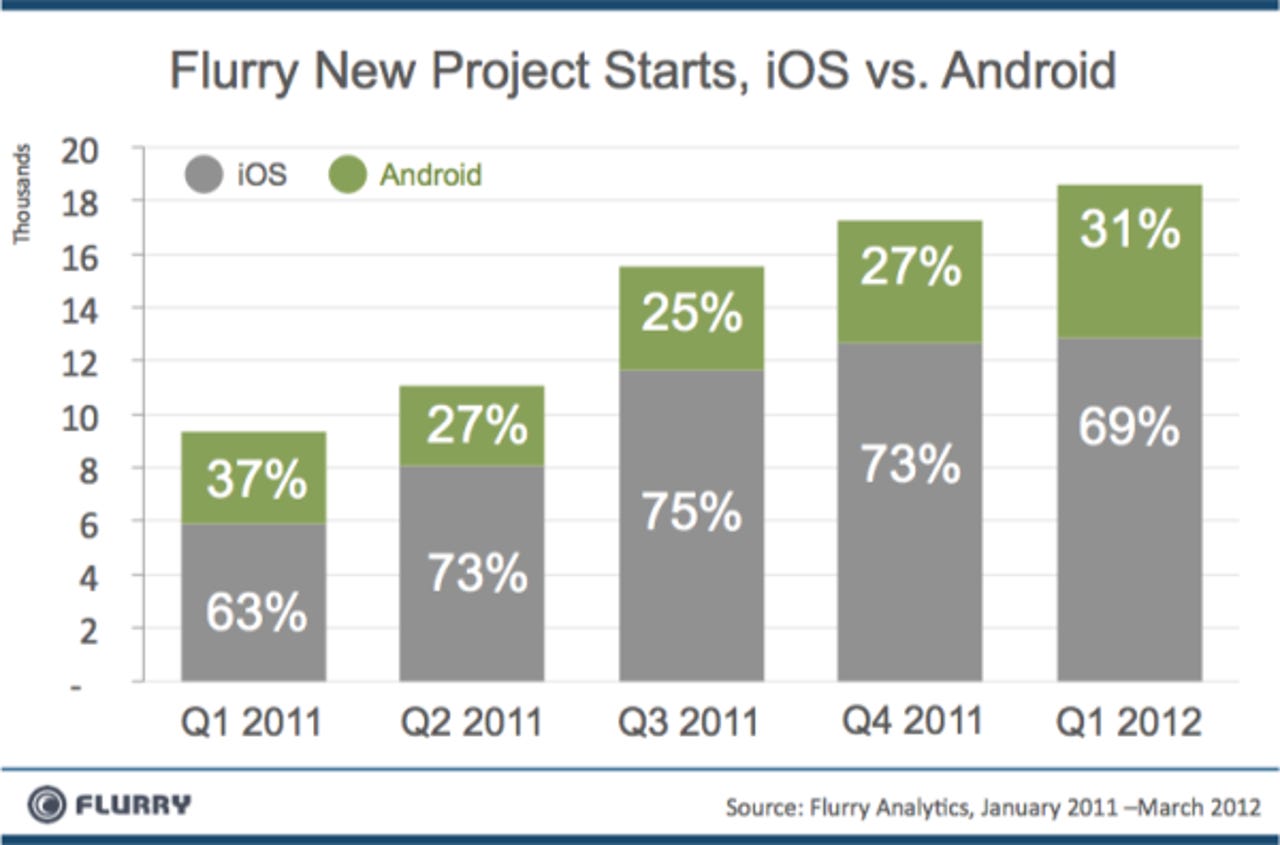
Using this data, the report draws the conclusion that "Apple continues to garner more support from developers. For every 10 apps that developers build, roughly 7 are for iOS".
The problem is that the data only tracks projects that use Flurry's SDK.
The Flurry SDK is a library that is linked into your application that sends data back to Flurry about how many people start your app, how often they use it, and for how long. Suppose that on Android, many developers use an alternative library such as Google Analytics. This would make a big difference in how the numbers are interpreted, wouldn't it?
You can see this is the case according to analysis by AppBrain which shows Flurry is used by only 6.58% of app apps in the Android Market:
If you'll excuse some quick, back-of-the-envelope calculations, Google claims 500,000 apps in their market, which works out to about 35,000 apps using Flurry. According to Flurry, their SDK is used by 185,000 apps, which comes to 150,000 for iOS and 35,000 for Android. Apple claims about 600,000 apps in the Apple app store, which means roughly 25% of iOS apps use Flurry.
Now, in Q1 2012, the Flurry chart shows approximately 13,000 Flurry new project starts on iOS, and 6,000 new starts on Android. That's how they got their '7 out of 10 are iOS' figure, because 13,000/(13,000 + 6,000)=0.72. But if you take into account the percentage of apps on each platform that use Flurry, you get 52,000 new projects on iOS total (13,000/0.25), vs. 91,000 new projects on Android total (6,000/0.0658).
This leads to quite a different conclusion: namely that there are nearly twice as many projects being started each quarter on Android than on iOS.
Next we'll consider Android's "F" word: Fragmentation.
Section 3: "Android Fragmentation Pain"
Another attention grabbing chart in the Flurry report is one that deals with how many different kinds of Android devices there are. Here it is:
Looks bad, doesn't it? Well, take a closer look. The chart lists each device individually, so for example it has 12 different slices for Samsung. Many of these are the same device running the same OS version. Here's how the chart would look if you combined all the Samsung pieces:
While compiling this, something odd stood out. Look at the black arrows. Flurry split one model, the Samsung Galaxy S II, into three slices which further magnifies the appearance of fragmentation. Doesn't anybody read these things?
The report argues that "each additional device a developer supports will deliver only a small increase in distribution coverage". In fact, Android developers do not support each device individually. Even the biggest developers have found that they only need about 10 to 15 devices in their test labs to cover nearly all the market.
Given this, we don’t see how the data supports Flurry's conclusion that "Android fragmentation appears to be increasing, driving up complexity and cost for developers". There are some costs, surely, but it seems that Flurry is using misleading charts to greatly exaggerate the issue.
The Flurry report has other sections and conclusions, but given the flaws in the two we have examined here, the findings of the entire report should be called into question. Flurry was contacted twice and given an opportunity to disagree with the findings in this story, but their only comment was "We don't have any comment".