LG G Watch vs Pebble: The simple genius of a not-so-smartwatch

What the Pebble sets out to do, it does really well. Admittedly, it doesn't do very much -- but the important thing is that when I forget to put it on, I miss it.
When Google showed the Android Wear watches at the recent Google I/O, I was pretty excited. Watching the video, it seemed to me that they'd nailed it. It looked like they'd taken the best of Pebble and added extra secret sauce. So I excitedly bought an LG G Watch with an expectation of it replacing my Pebble.
Turns out the LG G Watch — and by extension Android Wear — is pretty rubbish. Here's why...
Genius
The genius of the Pebble smartwatch comes from the fact that it is so brain-dead simple. The basic principle is that when something happens in your digital life, a notification appears on your wrist. This keeps you very up-to-date with your digital life. You don't have to fish out and unlock your smartphone to keep up with what's happening.
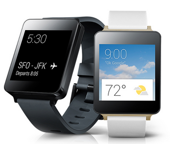
The first problem that occurs with the LG G Watch is that you can't always make out the screen. The Pebble has an e-ink display, and short of trying to read it in the full glare of a supernova at a distance of a few light-seconds, you can always, always read the thing. Any angle, any conditions, you can read the time.
Read this
The LG G Watch, because it has an LCD IPS display, often gets washed out by ambient light. It also dims the display when it thinks you're not looking at it, and uses onboard sensors to guestimate when you've moved your arm around to look at the display, at which point the display brightens. That's very hit and miss. So hit and miss you have to think about it.
It's also a lot heavier than the Pebble, and bigger. But, hey, it does more than a Pebble, and right now no one is buying these things for aesthetic considerations.
The problem
When you look at video of the LG G Watch/Android Wear at Google I/O -- and they are the same thing as Google's no longer into the idea of their to-market partners modifying the Android experience -- it appears it works in the same way as the Pebble. Something happens in your digital life, and a notification appears on your wrist.
The Google I/O presentation showed many different notifications all coming through to the smartwatch. You also use gestures on a screen to flick around the notifications, as opposed to Pebble's thick and chunky hardware buttons.
Looking at it cold, you would assume that adding a little bit more sophistication in moving through notifications would create a net improvement over the Pebble. It totally does not do that.
The idea of a smartwatch is not that it runs apps. That's crazy -- no one is going to do that. Why fiddle with a tiny display and a hopeless UI when you have a smartphone that is likely to be less than a few feet away? The smartwatch's whole raison d’être is to show you notifications.
With Android Wear, Google has taken the principle of cards popularised with Google Now and pushed them into a smaller form factor. What happens is that notifications appear as cards on the smartwatch. Flick up and down to scroll, flick right to dismiss, and flick left to see more information.
That's a simple design, and it should make sense, but it doesn't work in practice.
Imagine a continuum where you have different capabilities of devices. Way on the left, you have a screen that shows a notification when you get an email, and buzzes when you do so. Way on the right, you have a PC with a big monitor, a mouse, and a keyboard, running an email client. In the middle you have a smartphone.
Special Feature
We can then plot any device on that continuum from "all it does is show you the last email you got" to "I can sit here comfortably all day reading and writing emails." A smartphone fits in the middle because of its supreme portability and high usability. It's great for reading and writing short emails wherever you are. You give up some utility in the PC setup for its portability.
A Pebble smartwatch is way on the left-hand side of that continuum. The designers wanted a little bit more than "it just shows you email", but actually not very much more than that. You can always read the display, it always buzzes when something happens, and when you look at it you see the last thing that happened. It gives you information without fuss.
An Android Wear watch is more towards the smartwatch side. It buzzes (sometimes), and you look at it, and it might show you something, but most of the time you'll have to make gestures on the screen to get information out. At that point, you might as well just be using your smartphone because whereas a Pebble is just exactly the correct distance further away from being the basic device on the left, an Android Wear watch is just exactly the wrong distance away from being a smartphone.
Conclusion
A simpler way to put this is that a Pebble does something that augments the always-connected, always-available digital lifestyle afforded by a smartphone, and — through that augmentation — value to the user is delivered.
Conversely, an Android Wear smartwatch doesn't augment what a smartphone does, for the simple reason that it would be easier and more convenient just to take out your smartphone, and use that than fiddle around with something much too small on your wrist. (That by-the-by has no practical input method so you might as well just grab the smartphone. Pebble has no practical input mechanism at all.)
I was worried about the future of Pebble as a business when I saw the demo at Google I/O. I'm not anymore. If you want to buy a smartwatch, buy a Pebble.
What do you think? Post a comment, or talk to me on Twitter: @mbrit.