Stunning Data Visualizations -- From 1870
Visualizing information isn't new! Thanks to RadicalCartography.net and the Library of Congress, here are some pioneering data visualizations from the US census in 1870.
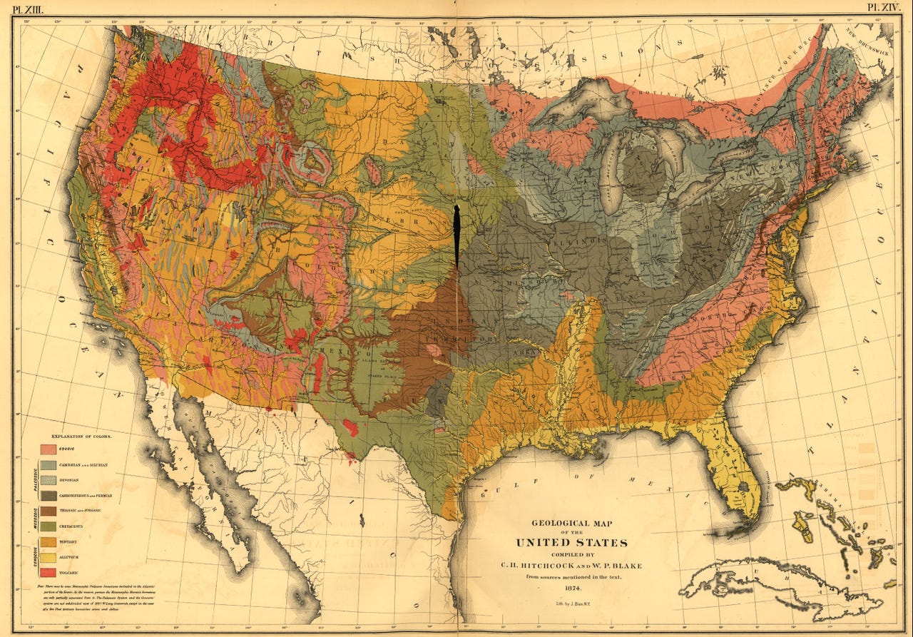
The geology of the US, with sumptuous hand-shading that puts most computer-generated maps to shame:
Here's a map of different national origins:
In the fiscal chart below, a lot of history is illustrated using data:
- The light blue spike in the lower right is the US Civil War (1861-1865), which prompted the introduction of a "temporary" progressive income tax (the light pink blob in the lower left) that was originally supposed to expire in 1866!
- The pink blobs on the right are a record of expenditures on the US Indian wars
- The dark blue spike in the middle of the left-hand chart shows land sales in the West - which may have caused the collapse of the banking system in 1837
Below is a beautiful rendering of church-going in the US. Interestingly, rather than show non-churchgoers as a separate bar, they are relegated to a grey box around the outside.
Here's a nice example of showing data through proportions.
Here are some population charts showing that the "cowboy states" (e.g. Wyoming, Nevada, Montana) were populated by young male foreigners, while Utah had lots of children.
Finally, the chart below is a good example of something that hasn't changed much in the last couple of centuries - the notion that you should show data just because you have it. It shows deaths per month per state. Is this data actionable in any way?
To compare these beautiful hand-drawn charts with the modern equivalent, check out the 2010 Census web site