Tableau Desktop 6.0

Traditional business intelligence (BI) tools have become a bottleneck, demanding too much IT involvement. With businesses increasingly resource strapped, devolving BI to information workers is becoming a priority. You could throw all your data in an OLAP cube and let business analysts at it with Excel, but building pivot tables and slices takes time, even with the improved BI tools in Excel 2010.
One alternative is Tableau Desktop. Designed to help users see and understand structured data, Tableau's tools let users author what it calls 'fun, interactive views of data sets' using drag-and-drop tools and avoiding wizards and dialogue boxes as much as possible. Where Tableau's tools differ from other BI suites is in its approach to visualisation. Taking a leaf out of the user experience design handbook, its visualisations build in rules that implement key principles of the psychology of colours and shapes — what CEO Christian Chabot describes as "making software to help us think".
Tableau Desktop — which is a Windows-only application (Windows 7, Vista, XP, Server 2008, Server 2003) — uses the same workbook metaphor as Excel, simplifying the learning curve for most desktop BI users. There's support for many different data sources, from most common business databases and data warehouses as well as Microsoft's analysis tools. You don't need to connect to a database because, depending on the version you're using, there are also tools for working with Excel files and for cloud data sources using the OData protocol (letting you analyse small data sets as well as the largest). There are two versions of Desktop, Personal and Professional. Personal ($999/£624) limits connections to Excel, Access, text files and Tableau's own data formats, while Professional ($1,999/£1,248) connects to database and BI servers, as well as online data sources using OData. A free 14-day trial is available.
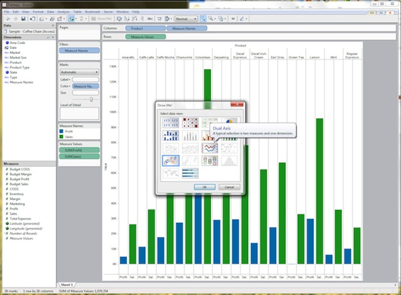
Click the ShowMe button to pick an appropriate chart or map type for your data (make sure you've chosen the right axes to explore your source data)
All you need to do to start analysing data is drag and drop the dimensions and measures you want to use into Tableau's workspace. When you import data into Tableau it automatically extracts the dimensions and measures, ready for analysis. One useful feature is its support for generated elements, giving you extra information about your data that can be used to extract additional insights. It'll immediately generate an initial chart or map (if you're using geographic information), which you can then work with to explore your information. You can use Tableau to produce a wide selection of different chart types, from familiar bar charts to complex linear geographic plots. It's almost like having an interactive copy of one of Edward Tufte's books on information design plugged into your data.
Tableau comes with a library of colours that can be used to enhance your data: choose a measure to define gradients, and you can quickly use both size and colour to show critical information
We were able to connect Tableau Desktop to an OData data source from the Azure DataMarket (a useful place to find large free data sets from national and international bodies). As soon as the data was imported, Tableau created a set of elements we could then add to the graph. It was then easy to choose the type of graph we wanted, along with the appropriate colours and shapes. Tableau Desktop provides a choice of palettes where colours have been chosen to help understand, rather than obfuscate, the information — something that's hard to do using tools like Excel, where design is not so important. Things can be even quicker, as you can just import the data choose a couple of fields, then press 'Show Me' to automatically generate visualisations. You can use the Show Me option to quickly shift between different types of graph, with inappropriate charts greyed out.
Visualisation is a powerful tool: here we're using Tableau to plot paths, wind speeds and energy of tropical storms in the Atlantic, focusing on Hurricane Katrina
One area where Tableau works well is bringing different data sets together on the same chart. This simplifies the process of creating joins, with no need to write complex SQL queries. Everything is handled in the Tableau workbook, using what Chabot calls "a visual query language, a SQL for visualisation".
Tableau Desktop is only part of a suite of tools. If you want to share your results with a larger community of people in a way that lets them interact with your data you can use Tableau Server. This lets you upload reports and data, either manually or automatically, and then deliver them via a web browser. The automatic option makes a lot of sense if you want to use Tableau to deliver regular reports. You can design in Desktop, upload to Server and then connect it to your data sources. As data is updated, users always get access to the most recent information, and can view the raw data and carry out their own analyses. Tableau Server reports can be embedded in SharePoint or any other portal or dashboard, as they can be exported as iframes. Reports can be shared over business social networks like Yammer or Salesforce Chatter, and users can use the Server-hosted analytic tools to check numbers and assumptions. For more detailed analysis, can you download models and data into Tableau Desktop.
There's a third member of the Tableau family, Tableau Digital. Intended for bloggers and journalists, and described as 'a Flip camera for data', it's a free online service that allows users to create reports and publish them to the web. Results can be embedded in websites, with the intention of bringing data and analysis to wherever a conversation is happening, providing a source of evidence and documentation for conclusions.
Tableau Desktop is easier to use than many other desktop analysis tools, but it's still not a tool for the complete neophyte. You can't just throw data at Tableau and expect to get insights — you really do need to have an idea of what information you're looking for in the data. Even so, you get those answers quickly and they're easy to understand. Support for geographic information is extremely useful, as Tableau aggregates information that would normally be scattered across different tools.