Home & Office
Mapping where the solar action is
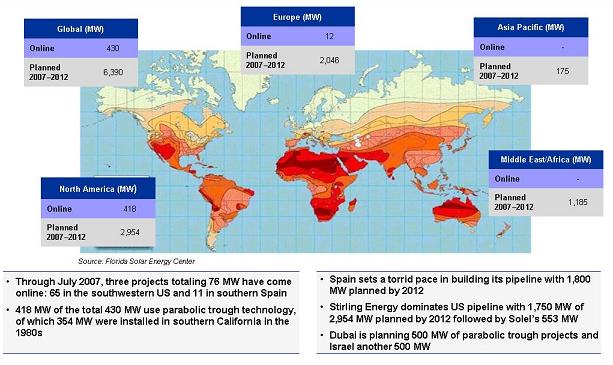
This map is from EER with notations showing where there's use of Concentrated Solar Power, both current and planned. The darker the red, the higher the level of available solar energy.


You can compare this map with one released by NASA recently and blogged here.
For more information on a new EER report on Concentrated Solar, check the blog just below this one.