Too many FaceBook friends? Try some data visualization!

TouchGraph's free data visualization tool for FaceBook really helps make sense out of your interpersonal social network.
Data Visualization tools and Business Intelligence type applications are typically reserved for Fortune 500 number crunchers. But in the age of Social Networking services like FaceBook, LinkedIn and Twitter, it's very easy to get lost when you start accumulating dozens upon dozens of friends. I have over 680 on FaceBook myself, mainly because I'm dumb enough to accept virtually every friend request that comes across my way.
On the Internet, I'm a social networking butterfly. I only wish I was that lucky in High School.
Click on the "Read the rest of this entry" link below for more.
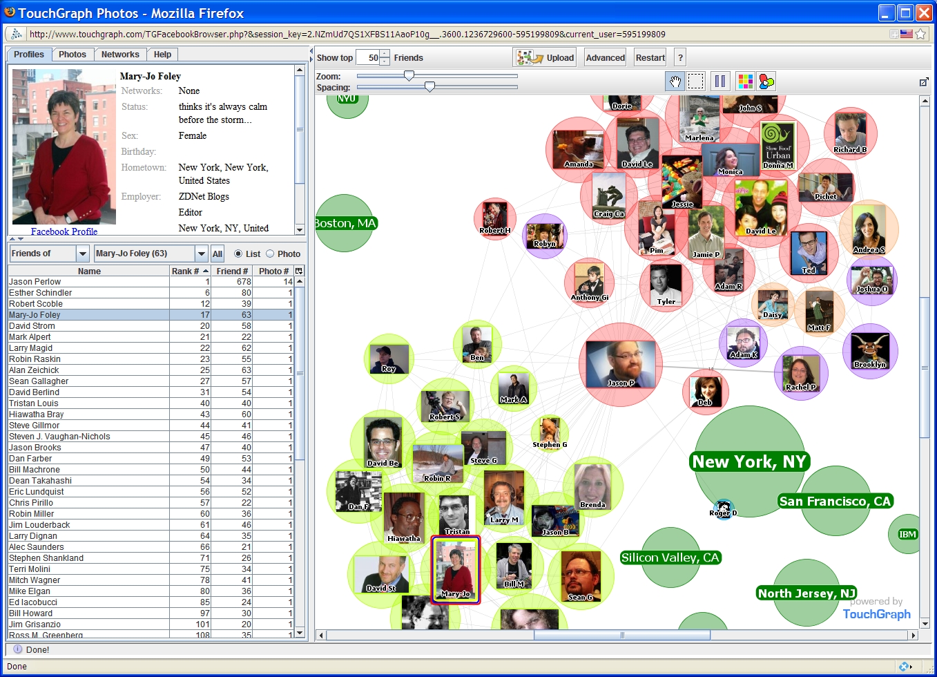
So how do you figure out what friend is related to who? What group of friends does a particular friend belong to? Are there patterns of followers and friends that you might need to understand better? One such application that helped me figure that out was TouchGraph Photos, a Facebook application written in Java that has some very sophisticated relational data visualization capabilities.
Immediately after I started using TouchGraph, I was able to determine that my friends belong to two primary groups -- one related to technology and technology writing, and the other related to food -- the two main areas I write about. I also was able to better understand where most of my friends were located due to their network association and lots of other metrics I wouldn't normally have been aware of had I just used FaceBook itself. The Hoboken, New Jersey-based company also produces a commercial data visualization tool, and has demo applications which do the same thing for Google searches and for books and movies sold on Amazon.
Data Visualization isn't just unique to FaceBook, though. Recently another web site, TwitterSheep started producing "Tag Clouds" for Twitter. My tag cloud yielded interesting results -- unlike my FaceBook network, which had a strong representation of both major industries I write for, it seems that most of the people who follow me on Twitter have something to do with Food. Whereas this guy has a hugely disproportionate number of people following him that have to do with music. I expected politics.
Has your social network gotten so huge that you now need data visualization to get it all figured out? Talk Back and Let Me Know.
